Composition refers to the way you arrange elements in your images, but actually creating beautiful image arrangements can seem like a frustratingly abstract exercise (even to more seasoned photographers).
If you’ve been in the photography space for a while, you may have encountered a few so-called image composition “rules,” yet you might not know exactly how they work or how to use them in your photos. Sometimes you may even start to wonder whether thinking deeply about image arrangements actually matters or whether it’s all just a waste of time.
In this article, I aim to clear up all your confusion and frustration surrounding composition in photography. I start with the basics – what it is and why it’s important – then I share a handful of my favorite techniques for creating effective photos.
I also make sure to include plenty of examples and demonstrations. That way, you can see each technique in action, and you know exactly how to use it to produce amazing images.
Composition in Photography:
What Is Composition in Photography?
Photography composition is all about the way different elements in your images are positioned and how they fit together. Common concerns include:
- Where should you put your subject in the frame?
- Should you include two people or three people?
- Should you include a lot of the sky or a lot of the foreground?
- Should you cut off a person’s limbs?
- Where should you position the horizon?
Ask any professional what matters most in photography, and composition is bound to be in their top five. In fact, for me, it’s probably the most important thing a beginning photographer can master (light is number two, camera settings and technique is number three, and post-processing is number four).
Composition is often the difference between a stunning photo and a terrible one. But why? What does it actually do for a photo?
Why Does Composition Matter?
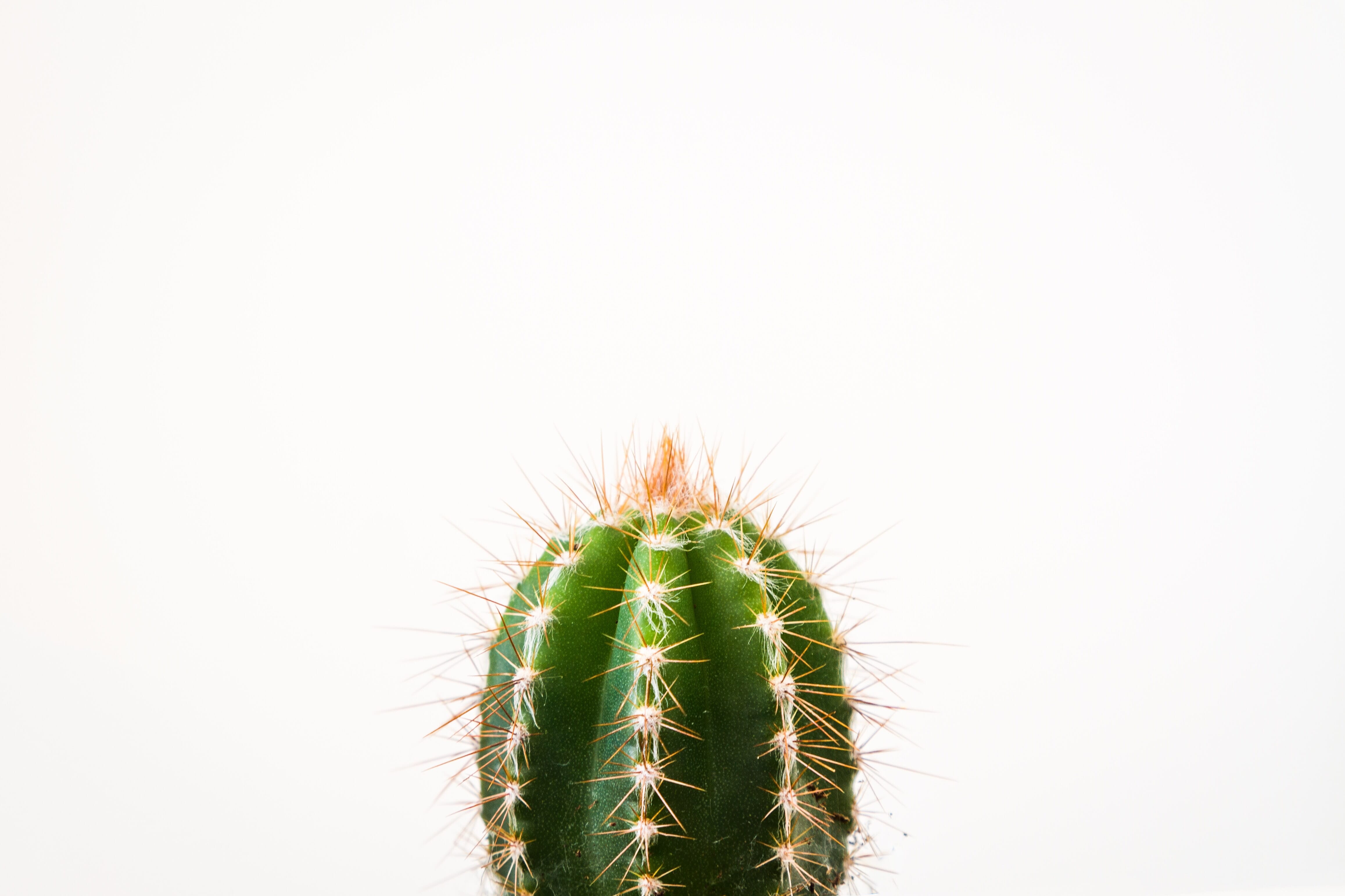
By positioning elements in a specific arrangement, you affect the way the viewer experiences the resulting image. For instance, if you fill the frame with your subject, you’ll end up with a powerful, in-your-face image:
On the other hand, you can create a peaceful, atmospheric result by including lots of empty (negative) space in your shot.
These different effects are due to composition. Of course, this begs the question: If different image arrangements bring about different feelings, is there such a thing as a bad arrangement? Or are they all equally good?
It’s something that photographers and artists debate. But there are a few fundamental elements that underlie most great compositions, including visual flow (which moves the viewer throughout the photo and helps them engage with different elements) as well as balance (which ensures that the image feels satisfyingly equal across the entire frame).
That’s where most of the “rules” come from; they’re shortcuts to achieving balance and/or visual flow.
Are There Really Photo Composition Rules?
You’ve probably heard of some popular composition rules, such as the rule of thirds. But as I explained above, these rules are essentially shortcuts that allow you to achieve balance and visual flow.
So the rule of thirds isn’t actually a rule. Instead, it’s a guideline created to help photographers produce balanced images without spending years struggling to understand how to apply abstract concepts to their photos. The same goes for other image-arrangement “rules” like the rule of odds. Yes, the “rules” generally work, but they’re not ideal for every situation, and you can sometimes create stronger compositions by deliberately violating them.
Therefore, I don’t recommend you think in terms of rules. Instead, think in terms of helpful techniques – approaches that you can put in your photography toolbox and test out when you’re struggling to create an effective image.
In other words: There are no rules! But there are helpful tips and tricks, and you can pick and choose how to apply these tips and tricks depending on the photos you want to take.
Common Image-Arrangement Techniques
Photography compositional rules may not exist, but there are plenty of handy techniques that you can use to create more visually pleasing images, such as:
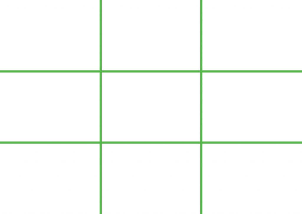
The Rule of Thirds
The rule of thirds states that you should position your main elements a third of the way into the frame, somewhere along these gridlines:
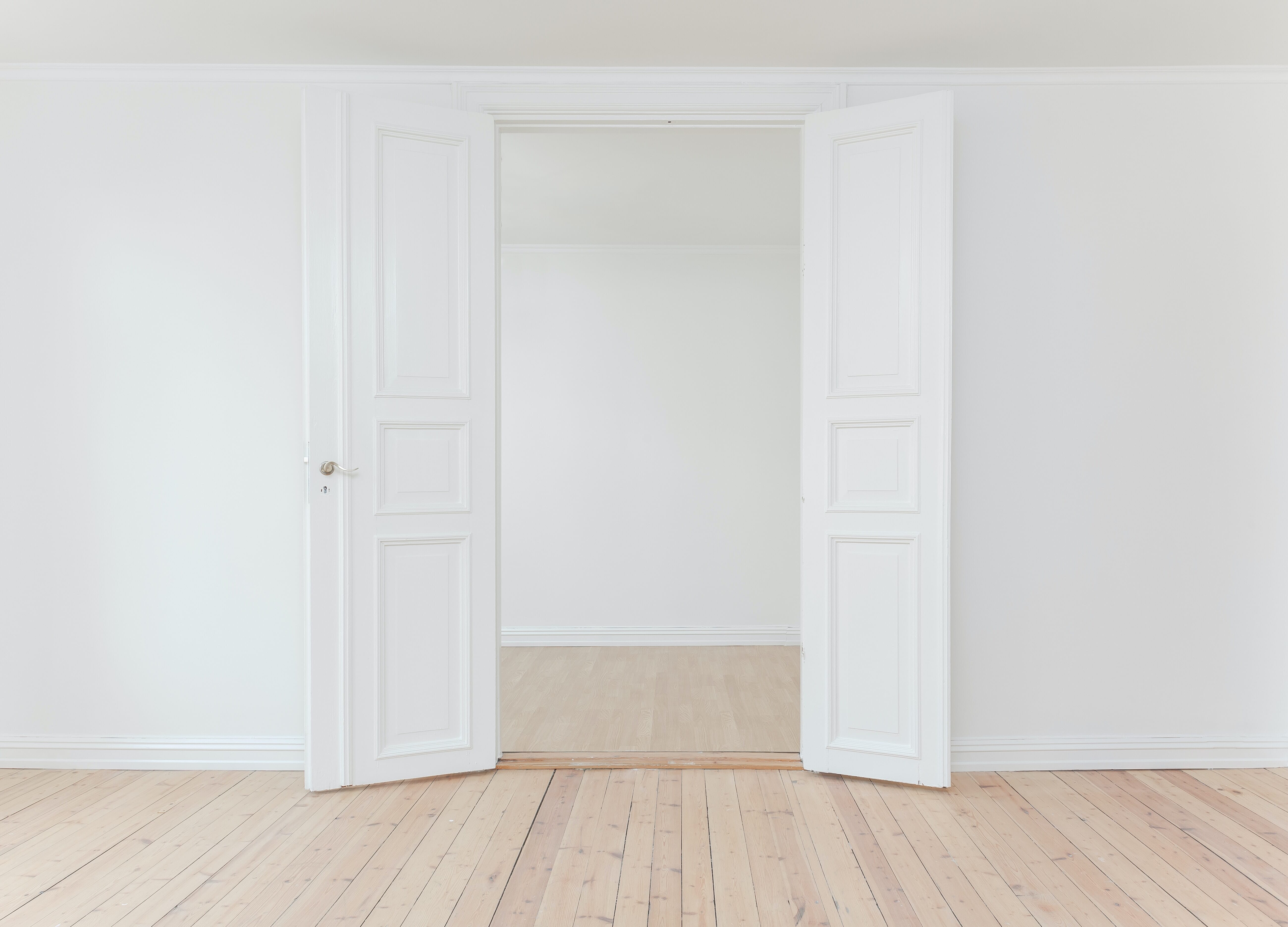
If you were photographing a landscape, you might put the horizon along the top gridline and a mountain pointing up along the right gridline. Alternatively, you could put two vertical elements along each gridline vertical as demonstrated in this photo (where the open doors follow the rule of thirds):
(Also, the intersections of the rule of thirds gridlines are known as power points and are especially good places to put your main subject.)
The rule of thirds is great for creating balance while preventing images from becoming too static. It’s a guideline that you should always keep in mind when out photographing, but don’t become too reliant on it. (There are times when centered compositions that violate the rule of thirds are actually more powerful!)
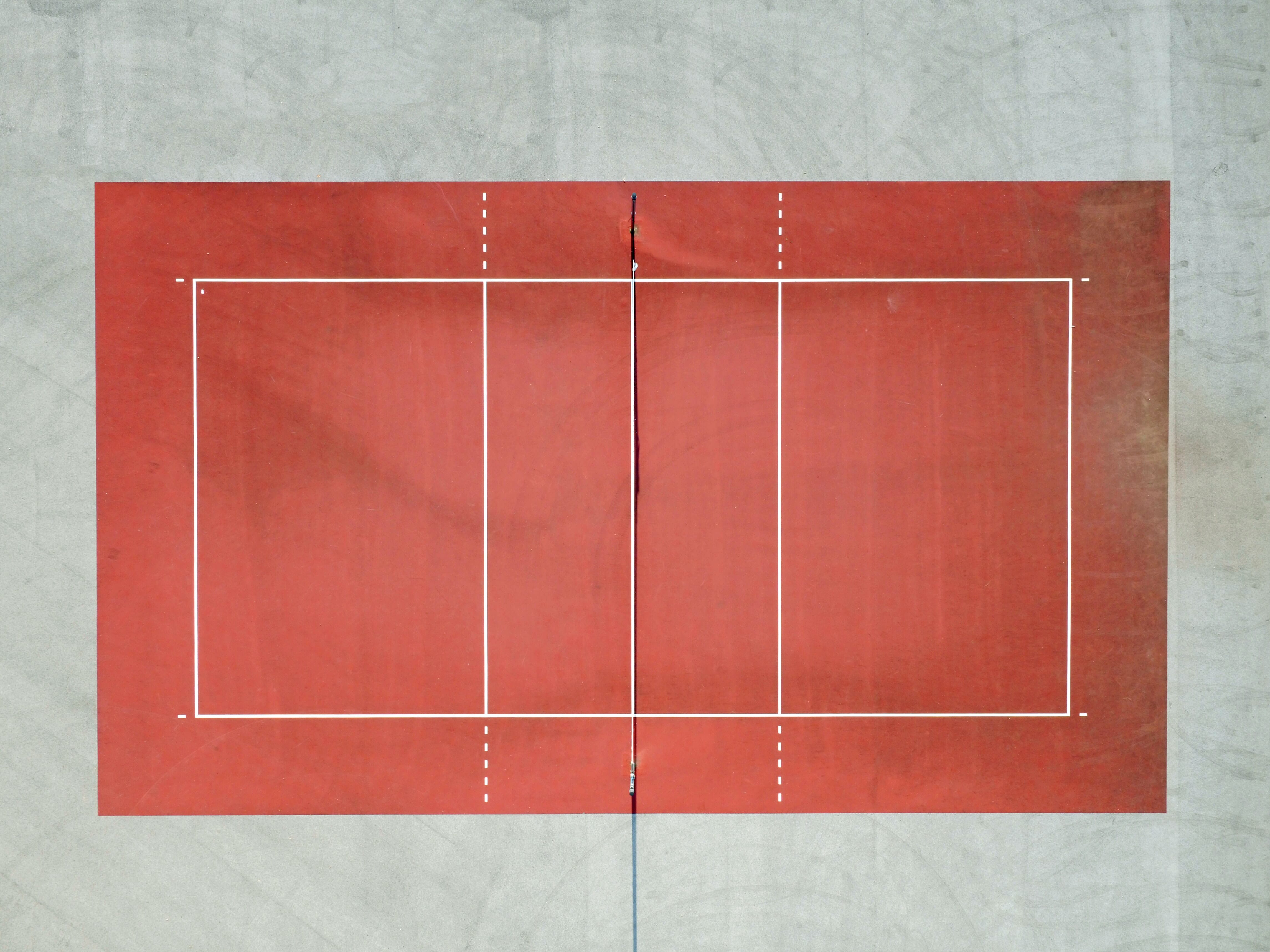
Symmetry
By including symmetry in your images, you can create a sense of boldness and power. The symmetry balances out the frame while also really jumping out at the viewer.
Note that it’s possible to use many different types of symmetry, including radial symmetry (where your photograph is symmetrical around a central point), vertical symmetry (where your photo is symmetrical across the vertical axis), and horizontal symmetry (where your photo is symmetrical across the horizontal axis).
Symmetry tends to violate the rule of thirds because symmetrical subjects are often centered. (Remember: It’s okay to break the “rules.”) But you can also use the rule of thirds and symmetry together to create a more unique image:

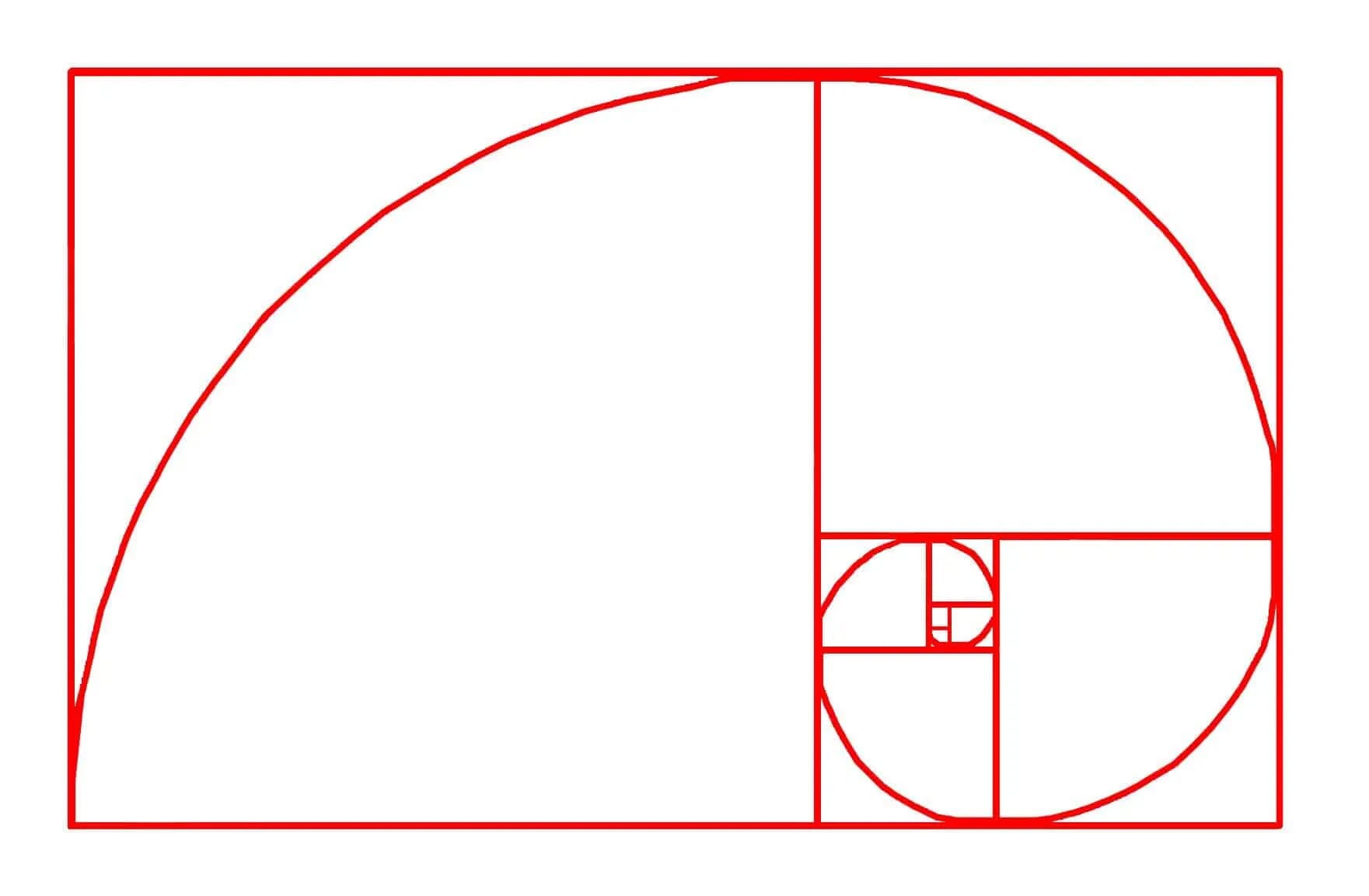
The Golden Ratio
The golden ratio uses a particular number, 1.618, to create visually pleasing, balanced, dynamic compositions, but it comes in a few forms. First, the golden spiral approach uses the ratio to create a pleasing spiral that you can use to position different elements:
Second, the golden ratio approach uses a grid overlay to guide your image arranging:
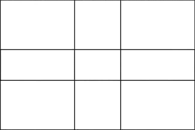
The golden ratio technique is a lot like the rule of thirds, but it offers a slightly different set of proportions. Both can work well, so I encourage you to experiment with both grid overlays when you’re out shooting.
The Golden Triangle
The golden triangle is an overlay that encourages the use of diagonals as well as triangles to create dynamic, flowing, stable compositions:
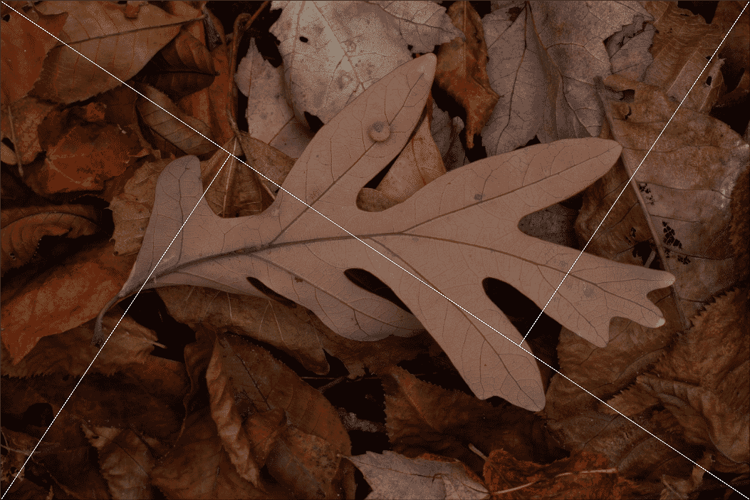
While the golden triangle is less well known than the rule of thirds, you can use it for amazing photos by positioning key elements along the diagonals and the triangles.
(Pay special attention to the intersection of the lines, where you can often position main subjects to achieve good results.)
Triangles
The golden triangle can help you create more triangular arrangements, but triangles in general are highly impactful. In my experience, triangular compositions keep images interesting while making sure they feel harmonious, which is generally a good thing!
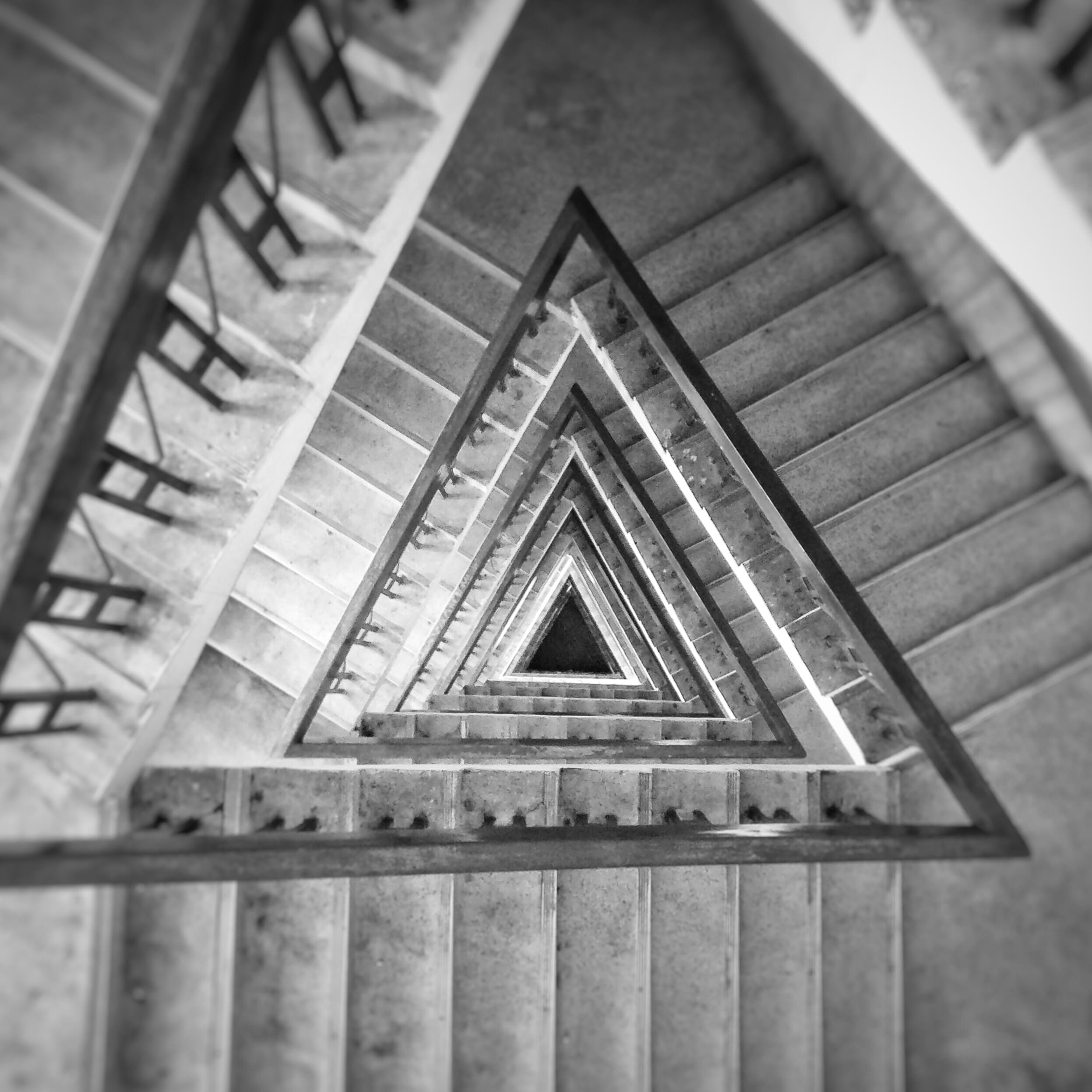
Note that you can find triangles all over the place, including symmetrical triangles, scalene triangles, and implied triangles. And by including these different triangles in your images, you can create slightly different effects.
All in all, triangles are a great way to ensure your composition is balanced and highly dynamic, so I recommend you incorporate triangles into your shots whenever possible.
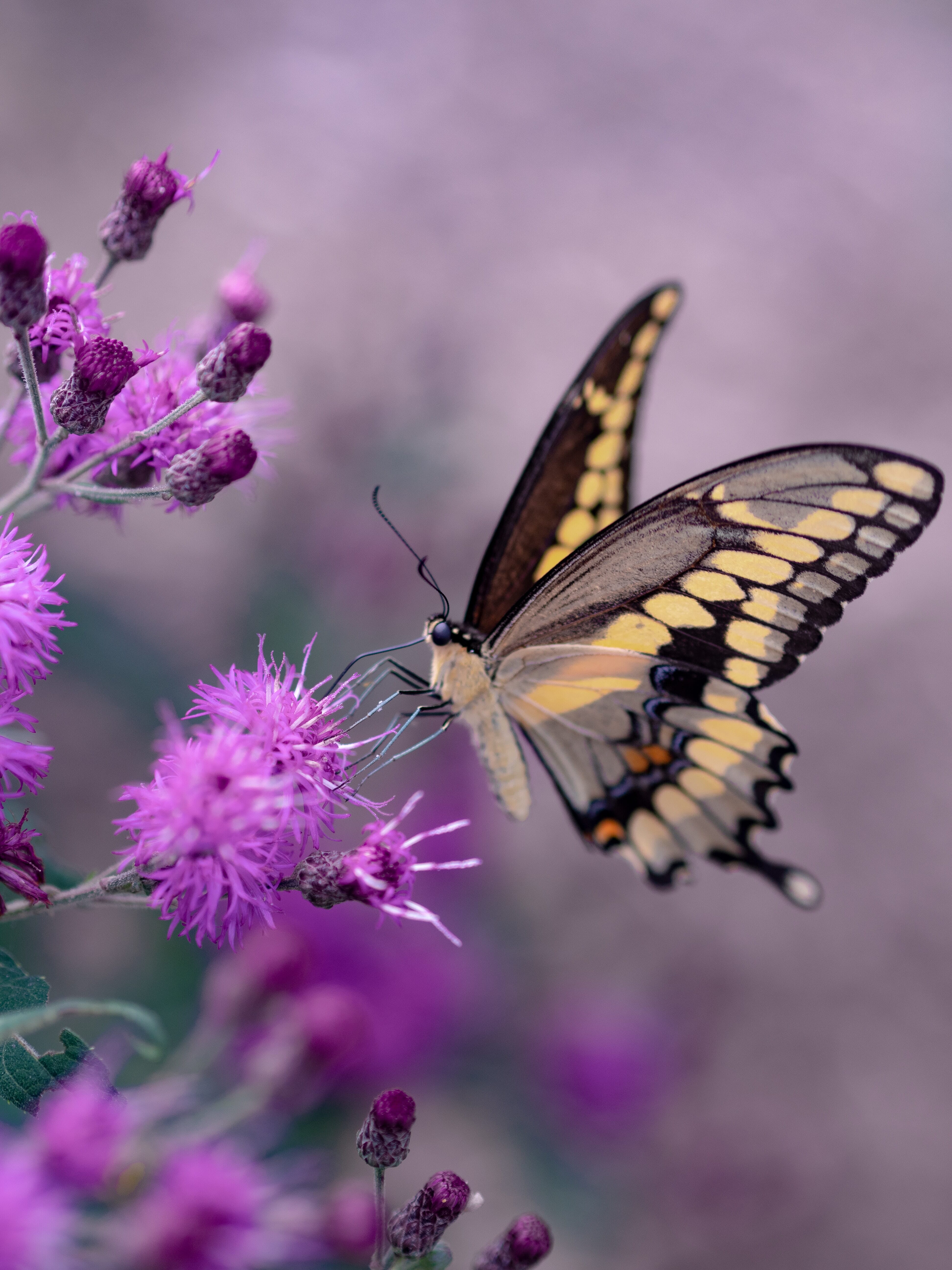
Simplicity
Generally speaking, simple arrangements are better than more complex arrangements. This has to do with distractions – the fewer elements you have, the easier it is to keep the shot looking cohesive without including extraneous items.
That’s why it’s always a good idea to keep the composition as simple as possible. So before taking a shot, ask yourself: Are there any parts that I should try to get rid of? Are there any areas that will take away from the photo, rather than enhance it?
Ideally, every part of an image will contribute to the overall effect, so I encourage you to size up each and every element and decide whether it’s absolutely necessary. By removing extraneous elements, you’ll end up with a much better shot!
Negative Space
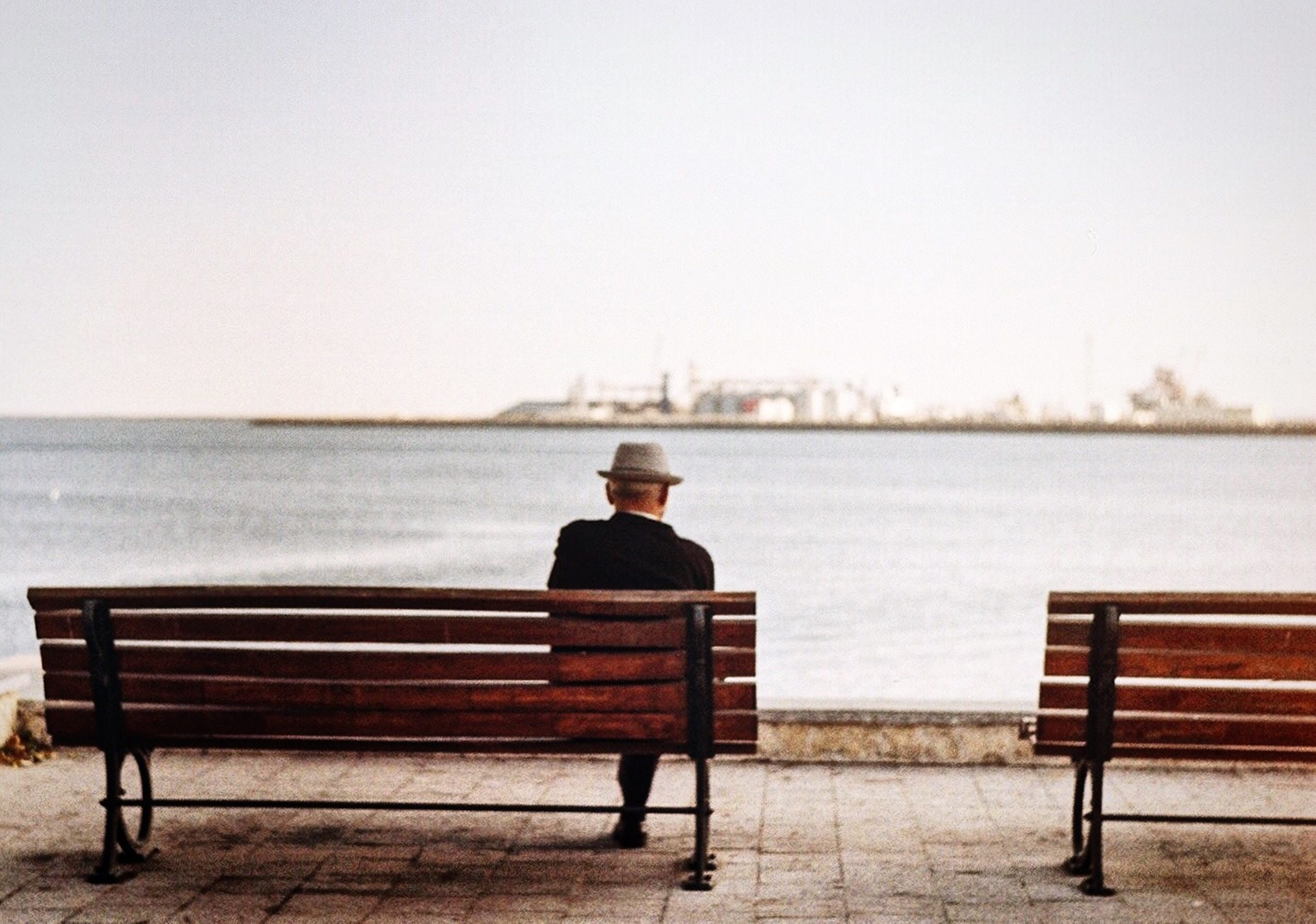
Negative space refers to areas of emptiness in a photo, such as a big expanse of grass, sky, or water.
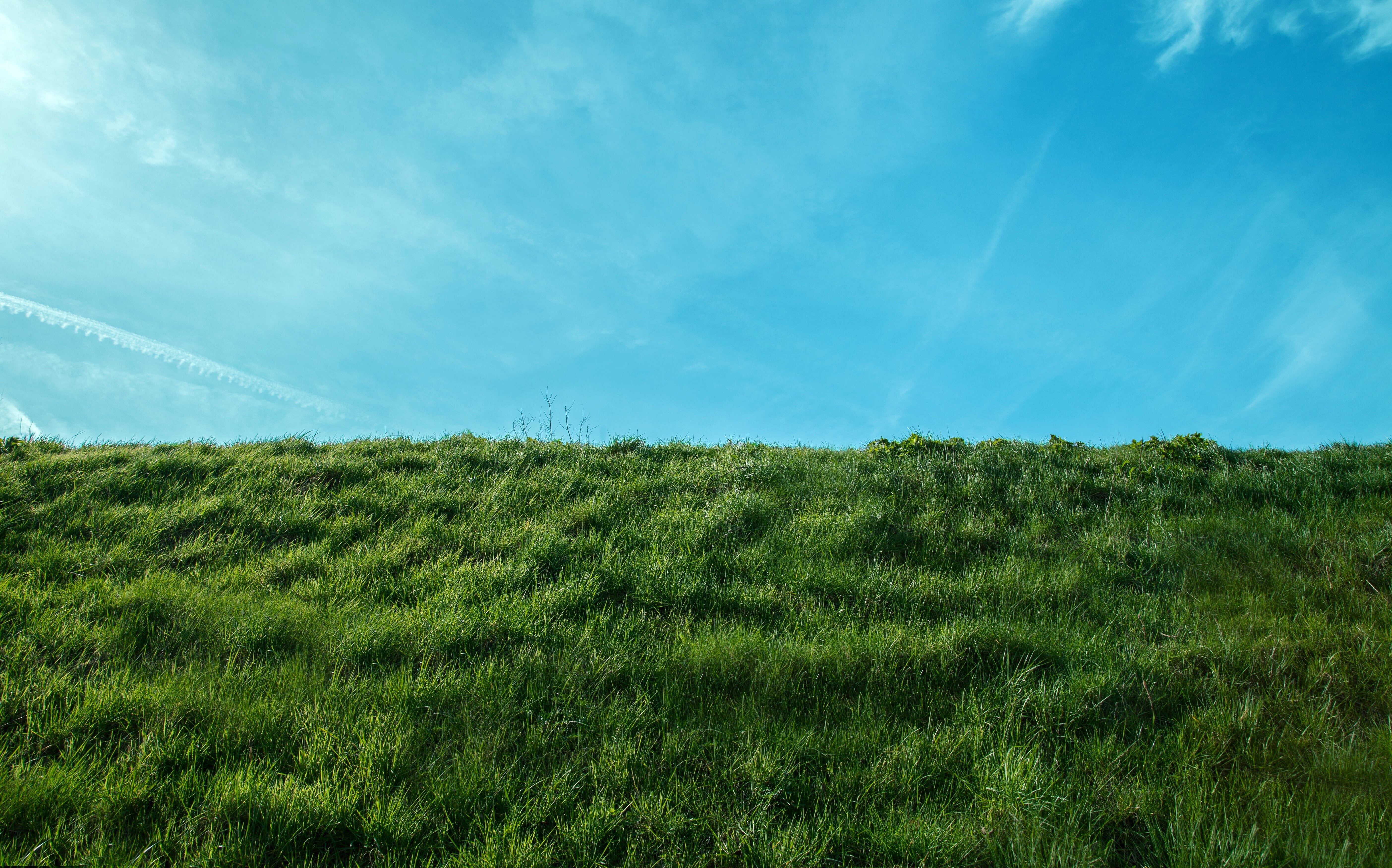
And while negative space may feel pointless, it actually plays a huge role in good photos. You see, negative space helps the subject breathe – which makes for a more balanced, harmonious shot overall.
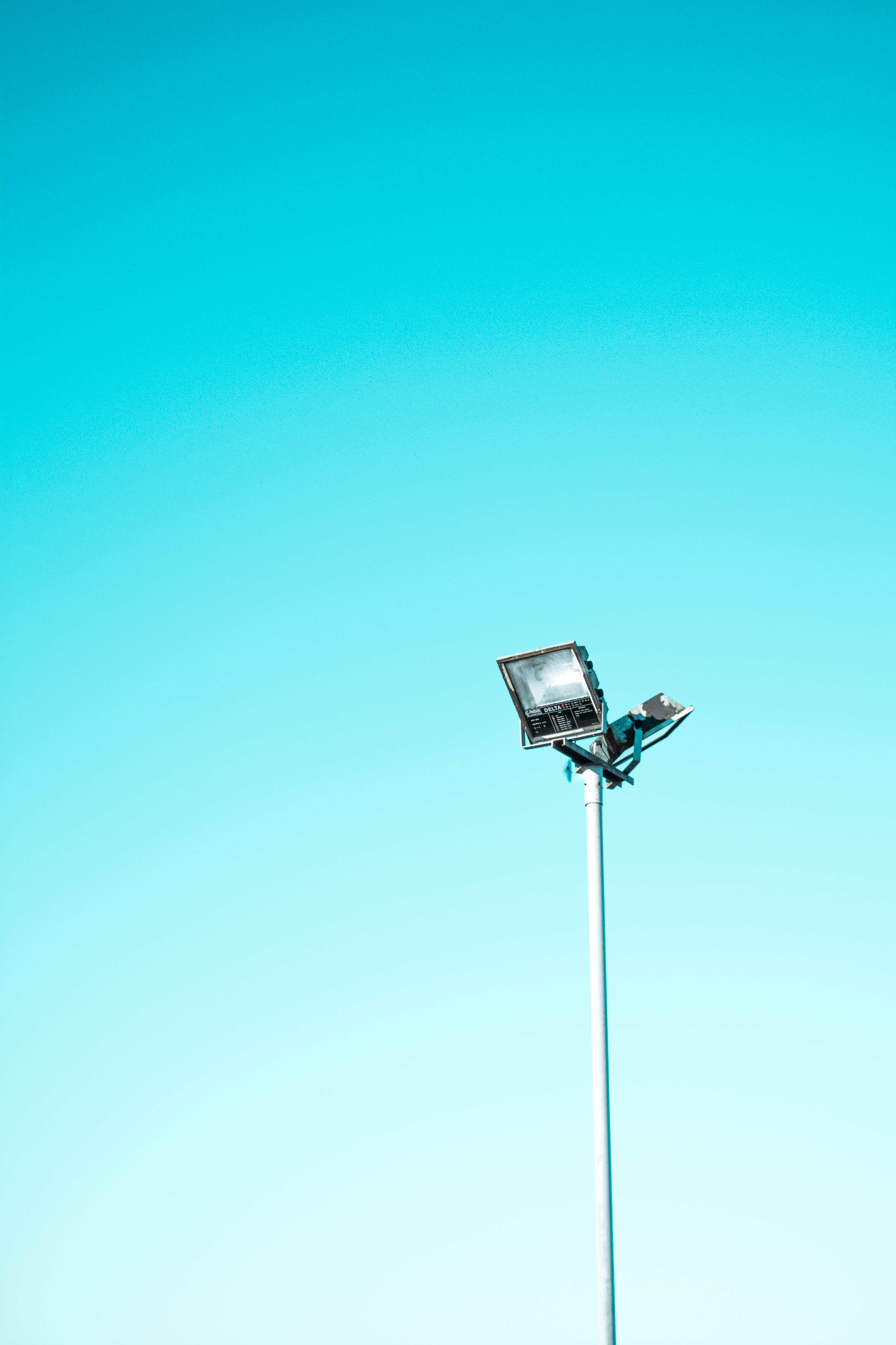
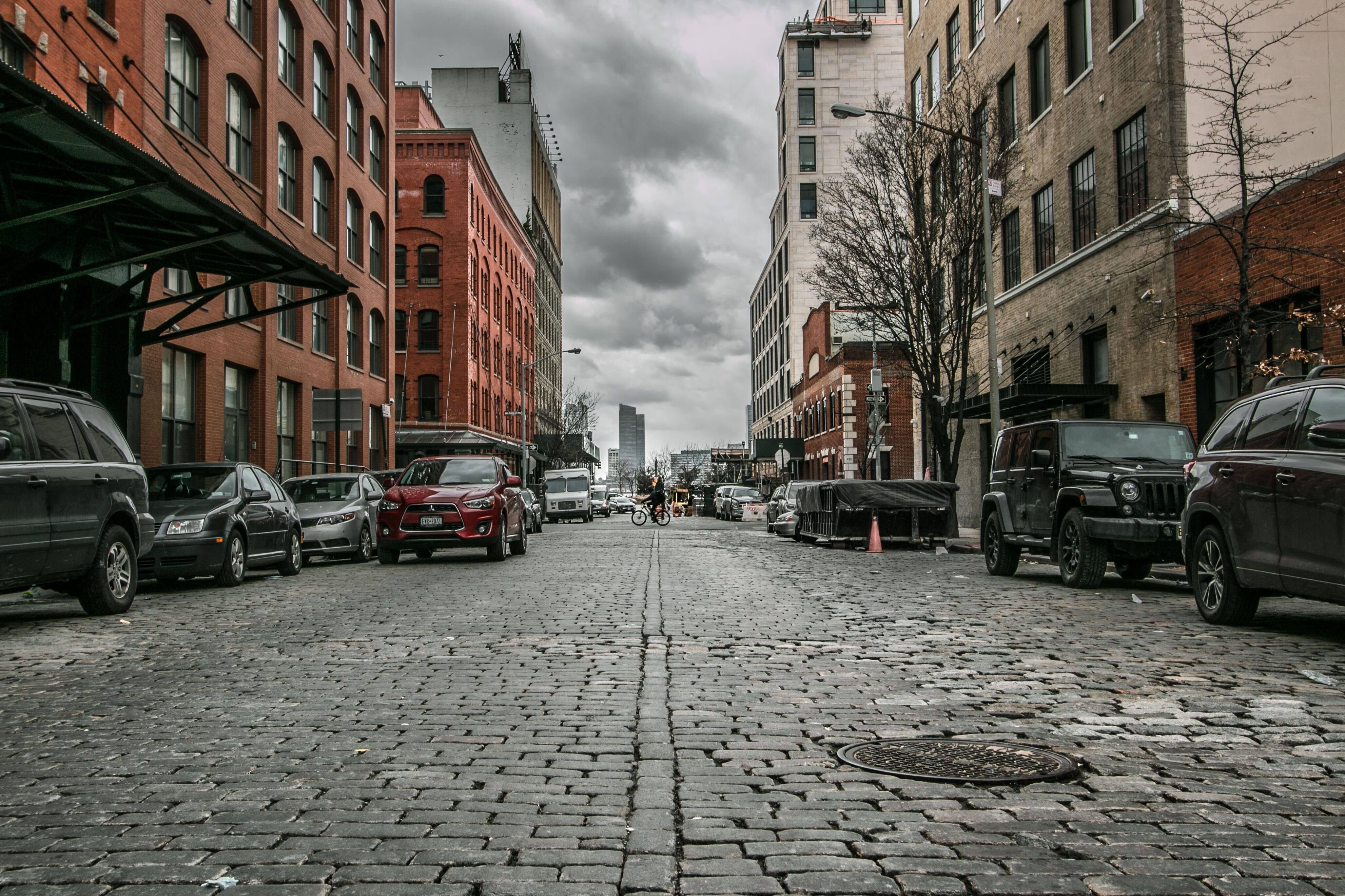
Plus, negative space can help you create powerful and minimalistic photos, like this:
Of course, you don’t need to always include tons of negative space in your images. But it’s important to add a bit of negative space to each photo – you want to let that subject breathe! – so always keep that in mind before you press the shutter button.
The Rule of Space
According to the rule of space, you should put space in front of a moving subject. In other words: If a subject is moving to the left, put some space off to the left, and if a subject is moving to the right, put some space off to the right.
The same is true for gazing subjects. If a subject is looking off to the left, put some space off to the left, and if a subject is looking off to the right, put some space off to the right.
Related Posts
It’s an easy way to make your shots feel more balanced. Wherever the subject is going (either physically or with their gaze), there is space for them to move.
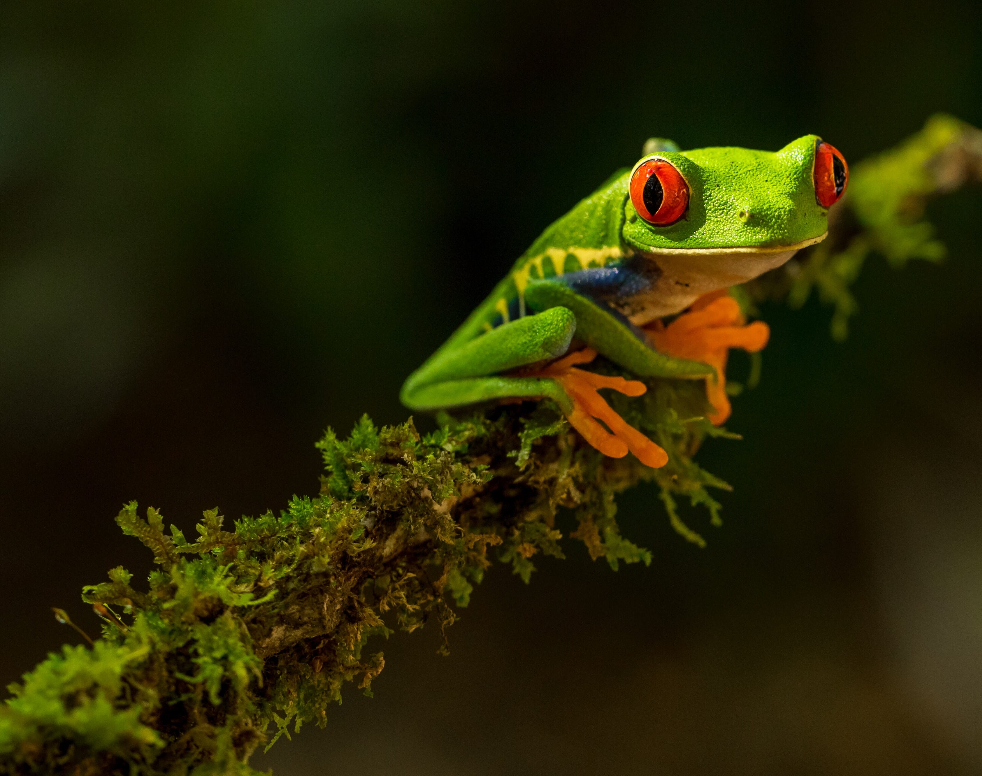
Fill the Frame
To paraphrase (and subtly modify) a famous quote by the photographer Robert Capa: If your composition isn’t working, you may not be close enough.
And while not all scenes benefit from you filling the frame with the main subject, you can often create stronger, more impactful images by really getting close and making sure the subject takes up the whole shot.
It’s very easy to include distractions in your images – distractions that take away from the overall quality of the shot and make it so the viewer becomes unfocused or confused. That’s why I always recommend you think about whether your shots are sufficiently tight. If there’s a possibility that you should’ve gone closer, then at least test it out to see what you think; sometimes you won’t like the result, but sometimes you’ll end up with a better photo.
Use These Guidelines to Create Amazing Images!
As you can see, composition is an essential part of photography. So it pays to understand what it is and how you can use it to produce beautiful photos.
Just remember that there are no real rules – only techniques. And if you want to improve your image arrangements, make sure you add the image compositional approaches I’ve shared to your photographic toolbox!
Composition in Photography FAQ
How important is composition in photography?
Composition is absolutely essential. With good composition comes powerful, breathtaking images; with bad composition comes bland images that don’t really hold the viewer’s attention.
Are there rules of composition in photography?
Sort of. There are many guidelines, which are often referred to as “rules,” and these are designed to help you position key elements within the frame. Sometimes it’s a good idea to violate the rules, however.
How many rules of composition exist in photography?
There are only a few popular “rules,” including the rule of thirds, the rule of space, and the rule of odds. However, there are plenty more guidelines that can really help your images, such as leading lines, negative space, the value of simplicity, and much more.
What is the rule of thirds?
The rule of thirds is a popular compositional guideline, and it suggests that the best photos have key elements a third of the way into the frame.