
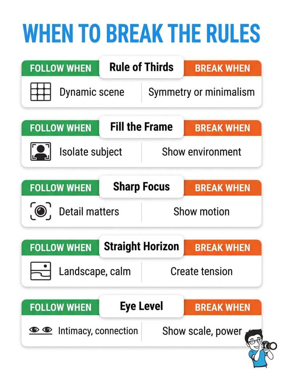
- The rule of thirds works great – until symmetry or minimalism calls for something different.
- Centering your subject creates powerful, symmetrical compositions that demand attention.
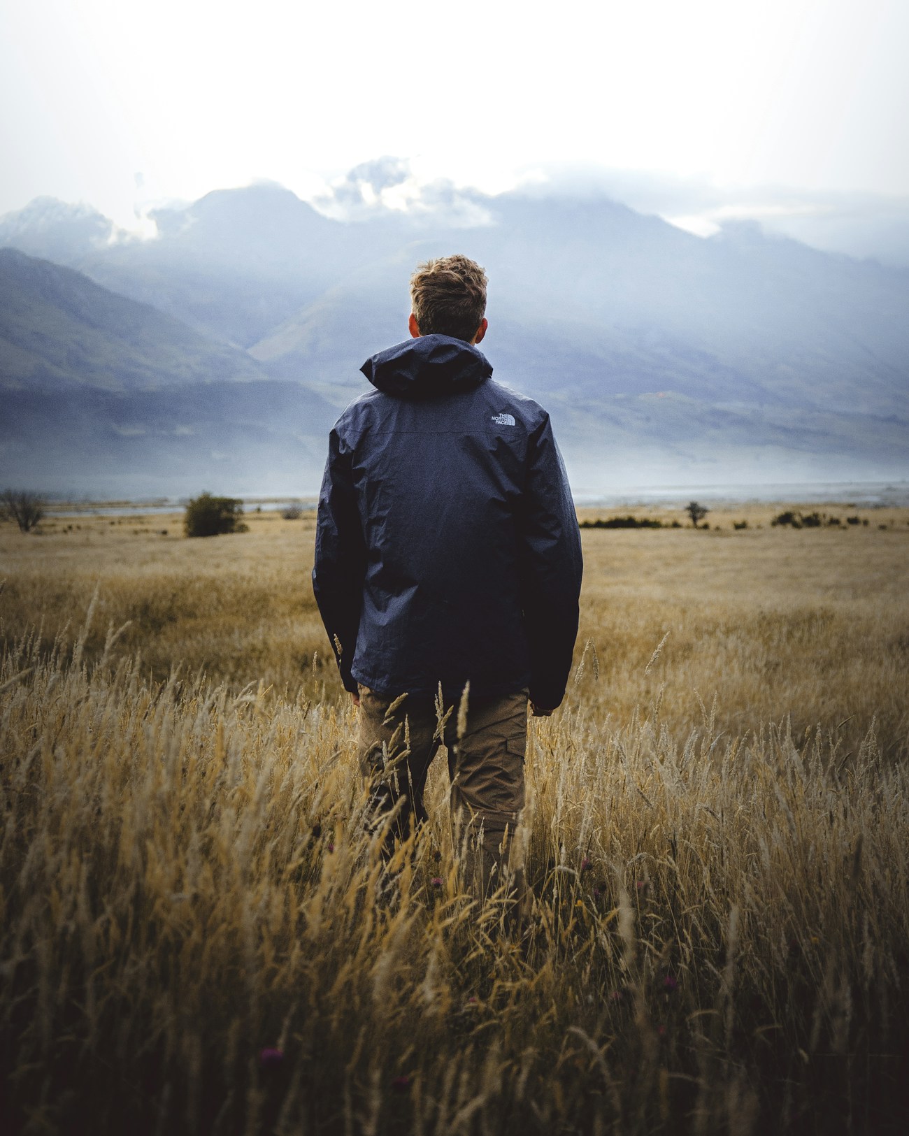
- Sometimes zooming out tells a stronger story than filling the frame.
- Deliberate blur can convey motion, energy, and emotion better than tack-sharp focus.
- A tilted horizon (dutch angle) adds tension and drama when used with intention.
- Extreme angles – shooting from below or above – create fresh perspectives that eye-level can’t match.
- Test your knowledge with our interactive quiz at the end!
Photography rules exist for a reason. The rule of thirds, fill the frame, keep it sharp – these guidelines help beginners create solid images fast.
But here’s what separates good photographers from great ones: knowing when to break the rules deliberately.
Every iconic photograph you’ve admired likely violated at least one “rule.” Tilted horizons, centered subjects, intentional blur – these aren’t mistakes. They’re creative choices made by photographers who understood the rules well enough to know when they didn’t apply.
This guide covers 10 photography rules worth breaking, with concrete examples of when and how to break each one for more impactful images.
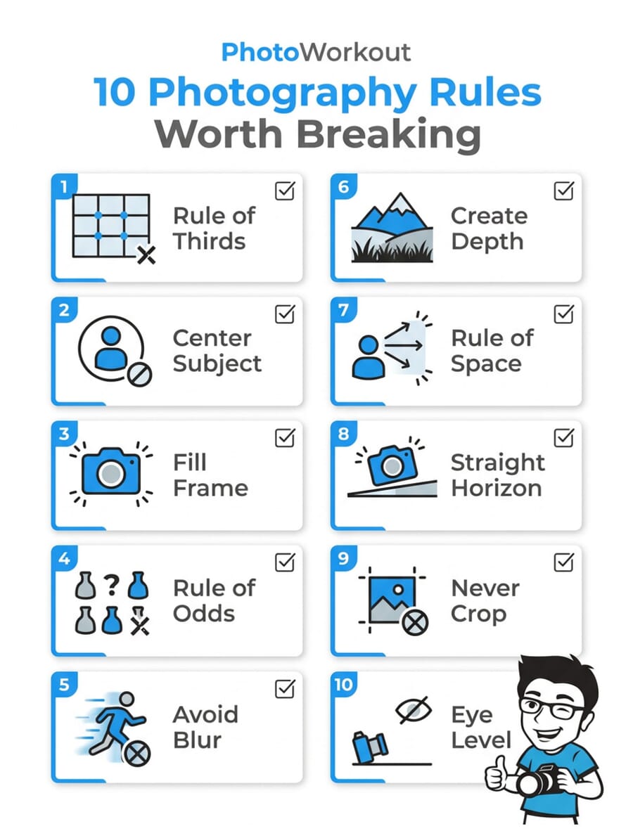
1. The Rule of Thirds
The rule of thirds divides your frame into a 3×3 grid. Place key elements along those lines or at their intersections, and you get balanced, dynamic compositions.
It’s arguably the most well-known composition guideline in photography – and it works brilliantly in most situations.
But it falls short in two key scenarios:
- Minimalist compositions – When you want to emphasize negative space, placing your subject at a thirds intersection can feel too “busy.” Pushing the subject to the extreme edge – or dead center with vast emptiness around it – creates an atmospheric, contemplative mood.
- Symmetrical scenes – Architecture, reflections, and symmetrical subjects often look best with the subject centered, which directly contradicts the rule of thirds.

The takeaway: use the rule of thirds as your default starting point. But when you spot symmetry or want that airy, minimalist feel, don’t be afraid to center your subject or push it to the extremes.
2. Don’t Center Your Subject
“Never put your subject in the middle” is advice every beginner hears. Off-center placement creates visual flow and prevents static-looking images.
And most of the time, it’s solid advice.
But centered subjects can be incredibly powerful – especially with symmetrical subjects. When the composition is perfectly symmetrical, centering doesn’t feel “boring.” It feels intentional, balanced, and commanding.

Think about it: portrait photographers center faces all the time. Architectural photographers center doorways and domes. Street photographers center subjects walking toward the camera.
The key is intentionality. A centered subject that’s clearly deliberate looks confident. A centered subject that happened by accident looks lazy. Know the difference.
3. Fill the Frame with Your Subject
“Fill the frame” is one of the quickest ways to strengthen a composition. Zoom in, cut distractions, and make your subject impossible to miss.
It works because beginners tend to include too much in the frame. A tighter crop almost always improves a weak photo.
But sometimes the environment IS the story.
Environmental portraits – where the subject is shown small within their surroundings – can tell a far richer story than a tight headshot. A fisherman on a misty lake. A climber on a vast rock face. A child in a massive field of sunflowers.
In these cases, the “empty” space isn’t wasted. It provides context, scale, and emotional weight that a close-up simply can’t deliver.
4. The Rule of Odds
The rule of odds says groups of odd numbers (3, 5, 7) are more visually interesting than even numbers. The theory is that odd groupings prevent the brain from “pairing” subjects, keeping the viewer’s eye more engaged.
It’s a useful guideline for still life, food photography, and arranged compositions. Three apples on a table looks more dynamic than two.
But real life doesn’t always come in odd numbers.
Couples exist. Twin towers exist. A pair of shoes, two silhouettes at sunset, four chairs around a table – these can all make compelling compositions. The key is using visual tension, asymmetry, or implied motion to keep even-numbered groupings interesting.

Don’t force a third element into a composition just to satisfy a “rule.” If two subjects tell the story, two is perfect.
5. Avoid Blur in Your Photos
Sharp images are the gold standard. Tack-sharp eyes in portraits, crisp details in landscapes, frozen action in sports – sharpness generally equals quality.
But deliberate blur is one of the most powerful creative tools in photography.
- Motion blur conveys speed and energy. A sharp race car against a blurred background screams velocity. A slow shutter on a waterfall creates that silky flow effect.
- Intentional Camera Movement (ICM) turns ordinary scenes into abstract art. Pan your camera during a long exposure through a forest, and you get painterly vertical streaks.
- Soft focus directs attention. A blurred foreground or background guides the viewer’s eye exactly where you want it.

The difference between a “blurry photo” and an “artistically blurred photo” is intent. If the blur serves the story, use it confidently.
6. Create Depth Throughout the Frame
Photographers are taught to create the illusion of depth – using leading lines, layers, and frame-within-a-frame techniques to make a 2D image feel three-dimensional.
And for most photography, depth is exactly what you want. It draws the viewer in and creates a sense of being there.
But flat, two-dimensional images have their own power.
Abstract photography, pattern work, and minimalist compositions often benefit from deliberately flattening the scene. Use a telephoto lens to compress perspective. Shoot straight-on at a textured wall. Capture repeating patterns from directly above.

The result is images that feel more like graphic design than traditional photography – and that’s exactly the point. When you want to emphasize shape, color, or texture over “being there,” flatten it out.
7. The Rule of Space
The rule of space says you should leave room in front of a moving or looking subject. If someone is running left, put empty space to their left. If they’re gazing right, give them room to gaze into.
This creates a natural sense of resolution and direction. The viewer understands where the subject is going.

But breaking it creates tension.
Place the empty space behind your subject instead. Have them looking or moving toward the edge of the frame with nowhere to go. The result feels confined, uneasy, dramatic – and that might be exactly the mood you’re after.

Think of it like storytelling: the rule of space gives your subject a happy ending. Breaking it leaves the story unresolved – and sometimes that’s more interesting.
8. Keep the Horizon Completely Straight
A crooked horizon is one of the fastest ways to make a photo look amateurish. It’s distracting, it feels “off,” and it’s usually an easy fix in post-processing.
But a deliberately tilted horizon – the “dutch angle” – is a different story entirely.
The key word is deliberately. A 2-degree tilt looks like a mistake. A 30-45 degree tilt looks like a creative choice. Go big or go straight – there’s no middle ground.

Dutch angles work especially well for:
- Street photography – adding energy and urgency to urban scenes
- Action shots – amplifying the sense of movement and chaos
- Creative portraits – conveying unease, rebellion, or playfulness
9. Only Amateurs Crop Their Photos
Some photographers treat cropping like a confession of failure. “Get it right in camera” is the mantra, and any post-processing crop means you didn’t plan your shot properly.
This is purist nonsense.
Professional photographers crop constantly. Wildlife photographers can’t always get close enough. Street photographers work in split seconds with no time to perfectly compose. Sports shooters track fast-moving subjects across the frame.

With modern sensors pushing 40-60+ megapixels, you can crop significantly and still have plenty of resolution for large prints. Cropping is a legitimate compositional tool – treat it as the final step of composition, not a failure of the first.
That said, try to get as close to your final composition in-camera as possible. Less cropping means more pixels, better sharpness, and cleaner images. But never skip a great shot just because you know you’ll need to crop later.
10. Shoot at Eye-Level for the Best Perspective
Eye-level shooting creates a natural, intimate connection with the subject. It’s how we see the world, so it feels comfortable and relatable.
For portraits and wildlife, getting down to eye level is often excellent advice.
But unusual angles create unusual – and often more interesting – images.
- Low angle (shooting up) makes subjects look powerful, imposing, and larger than life. Great for architecture, portraits with authority, and forced perspective effects.
- High angle (shooting down) makes subjects look small, vulnerable, or creates interesting graphic patterns from above.
- Bird’s eye view turns everyday scenes into abstract compositions – think drone photography of beach umbrellas or winding rivers.

Next time you’re about to take a photo, pause and ask: “What would this look like from above? From below? From the ground?” You might discover a far more compelling angle than eye level.
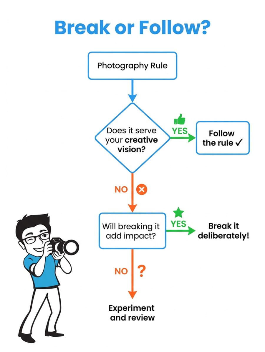
Breaking Photography Rules: The Next Step
The best photographers don’t blindly follow rules or blindly break them. They understand why each rule exists, and they make deliberate choices about when to use it and when to ignore it.
Here’s how to put this into practice:
- Learn the rules first. Study composition fundamentals until they’re second nature.
- Break one rule at a time. Don’t tilt your horizon AND add motion blur AND center your subject in the same shot (at least not until you’re experienced).
- Be intentional. There’s a difference between accidentally crooked and deliberately tilted. Make sure your rule-breaking is a choice, not a mistake.
- Review your results. Some experiments won’t work – and that’s fine. The point is to expand your creative range.
Don’t let “rules” hold your creativity hostage. The guidelines are a starting point, not a ceiling. The more you experiment with breaking them, the more you’ll develop a unique photographic voice that’s entirely your own.
Test Your Knowledge: Breaking Photography Rules Quiz
Think you’ve mastered when to break (and when to follow) the rules? Take this quick quiz to find out:
Featured image: Photo by Chris Yang on Unsplash.
Are photography rules actually rules?
No – they’re guidelines. The rule of thirds, rule of odds, and similar “rules” are patterns that tend to produce pleasing compositions. But they’re not laws of physics. The best photographers treat them as starting points and break them when a different approach serves the image better.
When should you break the rule of thirds?
Break the rule of thirds when shooting symmetrical subjects (center the subject instead), creating minimalist compositions with lots of negative space (push the subject to the extreme edge), or when you want a confrontational, direct-to-camera composition. Symmetry and minimalism are the two strongest reasons to abandon the thirds grid.
Does cropping reduce image quality?
Technically yes – cropping removes pixels, which means less resolution for printing or enlarging. But with modern sensors at 40-60+ megapixels, a moderate crop still leaves you with more than enough detail. The trade-off of a better composition almost always outweighs the minor quality loss. Crop without guilt.
What is a dutch angle in photography?
A dutch angle (also called a dutch tilt) is when you deliberately tilt the camera 15-45 degrees off-level. It creates a sense of tension, energy, or disorientation. The key is going bold enough that it looks intentional – a slight 2-3 degree tilt just looks like a mistake. Dutch angles work well in street photography, action shots, and creative portraits.
Is intentional blur a valid photography technique?
Absolutely. Motion blur, intentional camera movement (ICM), and soft focus are all legitimate creative techniques used by professional photographers. Motion blur conveys speed and energy, ICM creates painterly abstracts, and soft focus directs viewer attention. The difference between a “blurry” photo and an “artistically blurred” photo is intent.