- 110+ photoshoot ideas for every major occasion — couples, friends, kids, birthdays, spring and summer seasonal, drone aerials, and Reels-friendly setups.
- New for 2026: light painting portraits, color hunting, drone cinematic framing, and TikTok-native vertical compositions are all trending right now. Add at least one to every session this year.
- AI-assisted planning with Gemini or Nano Banana 2 prompts is becoming standard — generate reference-face compositions and creative direction boards before the shoot starts.
- Golden hour remains the highest-ROI time block in 2026 — equally true for couples, drone overheads, and the viral color-hunting walk-and-shoot.
- The biggest shift in 2026: TikTok and Reels are now primary delivery surfaces for many photographers. Shoot 9:16 vertical and walking-toward-camera poses alongside the traditional grid.
Introduction
Finding the perfect photoshoot idea can transform an ordinary session into something extraordinary. Whether you’re planning a couples portrait, a birthday celebration, a fun day with friends, or a family session with kids, having creative direction makes all the difference.
This comprehensive guide brings together over 100 photoshoot ideas organized by category. Bookmark this page and return whenever you need fresh inspiration for your next shoot!
2026 Photoshoot Trends Going Viral Right Now
Three trends are dominating photography feeds in 2026. Any one of them transforms a standard shoot into something clients actively request. All three can be layered into the ideas below — they are techniques, not categories.
Light Painting Portraits
Long-exposure portraits with handheld LED wands, glow sticks, or phone flashlights traced around the subject. Senior portrait studios like Braly Studios are reporting this as the single most-requested trend for the 2026 class — clients see it on TikTok and bring it to the booking call. Shoot in a darkened room or at true dusk, set the camera to 2-4 second exposure at ISO 400, f/5.6, and have an assistant trace shapes around the subject while a flash freezes the pose. Works for senior portraits, couples, engagement shoots, and fashion sessions equally.
Color Hunting
The viral skill-builder trend of 2026 — Digital Camera World calls it “the trend that is actually making photographers better.” Pick one color before the shoot (coral, forest green, ochre) and spend the full session framing the subject against environments that contain only that color. The discipline forces cleaner compositions and stronger graphic elements, and the resulting grid feels intentional rather than scattered. Particularly strong for urban sessions, fashion editorial, and lifestyle brand shoots.
Drone Cinematic Framing
Dedicated drone photoshoot ideas get their own section below. The condensed version: 2026’s drone aesthetic is top-down symmetry (not the usual sweeping establishing shot) plus pull-back reveal. A DJI Mini 5 Pro or Mavic 4 at 40-60 meters produces the overhead patterns that dominate wedding and lifestyle Reels right now.
Outdoor Photoshoot Ideas for Couples
Couples photography thrives outdoors where natural light and beautiful backdrops create romantic atmospheres. Here are 20 ideas to capture love in the open air:
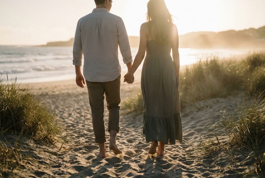
1. Golden Hour Beach Walk
The warm glow of sunset on the beach creates an instantly romantic setting. Have couples walk hand-in-hand along the waterline, letting waves lap at their feet. The backlit silhouettes and warm tones make for stunning portraits.
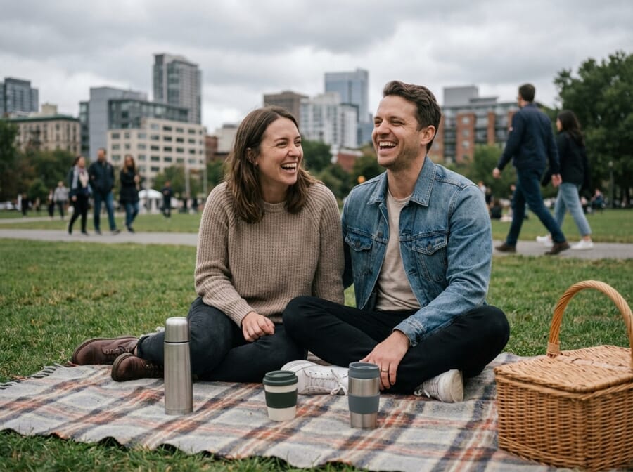
2. Picnic in the Park
Set up a cozy picnic blanket with a basket, wine, and fresh fruit. This relaxed setting helps couples feel natural and gives you plenty of candid moments to capture.
3. Urban Rooftop Session
City skylines provide dramatic backdrops. Find a rooftop with good views and shoot during blue hour for that magical city-lights effect.
4. Forest Adventure
Wooded areas offer dappled light, rich textures, and a sense of seclusion. Have couples explore trails, lean against trees, or sit on fallen logs.
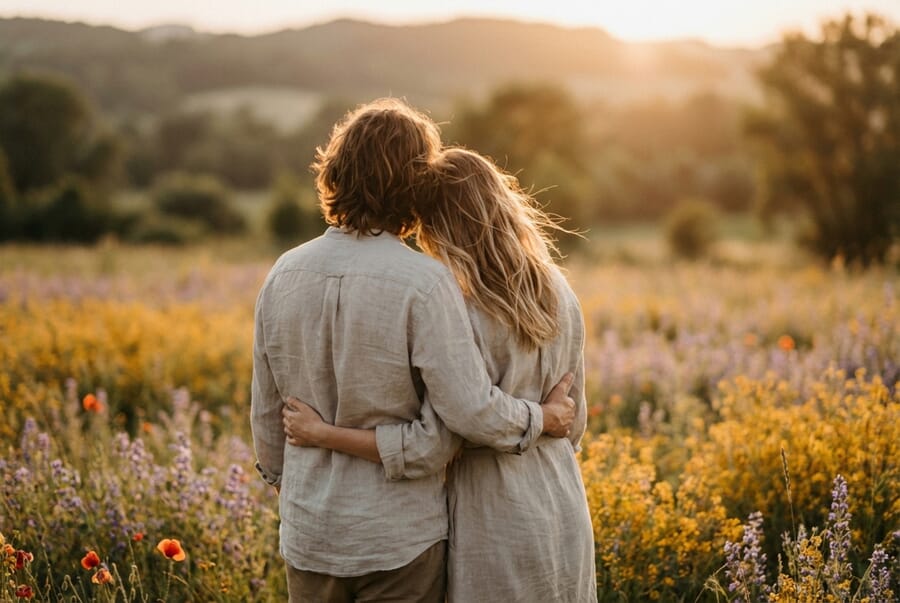
5. Flower Field Romance
Lavender fields, sunflower farms, or wildflower meadows create dreamy, colorful backgrounds. Time your shoot when flowers are in peak bloom.
6. Mountain Overlook
Hiking to a scenic viewpoint rewards you with breathtaking backdrops. The shared adventure also creates genuine connection moments.
7. Vineyard Visit
Rolling hills of grapevines create elegant, sophisticated backdrops. Many vineyards allow photography sessions, especially during golden hour.
8. Rainy Day Romance
Don’t let rain cancel your shoot—embrace it! Couples sharing an umbrella, splashing in puddles, or kissing in the rain make memorable images.
9. Desert Landscape
The stark beauty of desert environments—sand dunes, rock formations, cacti—creates unique, editorial-style couple portraits.
10. Lake or River Reflections
Water provides natural reflections that double your composition’s impact. Shoot at still water during calm conditions for mirror-like effects.
More Couple Ideas
- 11. Coffee shop date – Cozy indoor-outdoor café vibes
- 12. Farmers market stroll – Candid browsing and tasting moments
- 13. Bicycle ride – Tandem bikes or vintage cruisers
- 14. Stargazing – Nighttime shots with blankets and lanterns
- 15. Garden maze – Playful hide-and-seek through hedges
- 16. Waterfall backdrop – Dramatic natural setting
- 17. Old town streets – Cobblestones and historic architecture
- 18. Sunrise session – Soft morning light, fewer crowds
- 19. Boat ride – Canoe, kayak, or rowboat on calm water
- 20. Seasonal festival – Holiday markets, fall fairs, spring celebrations
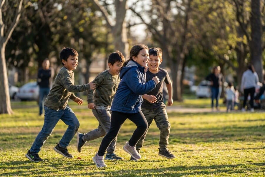
Friend Photoshoot Ideas
Capturing friendship means embracing energy, laughter, and genuine connection. These ideas help you photograph groups of friends in ways that showcase their bond:

21. Matching Outfits
Coordinate colors or wear identical items—white tees with jeans, matching pajamas, or themed costumes. The visual unity emphasizes the friendship.
22. Throwback Recreation
Recreate a childhood photo with the same poses, location, and similar outfits. The then-and-now comparison makes for powerful storytelling.
23. Road Trip Adventure
Document a day trip or weekend getaway. Gas station stops, map reading, singing in the car—these candid moments capture friendship in motion.
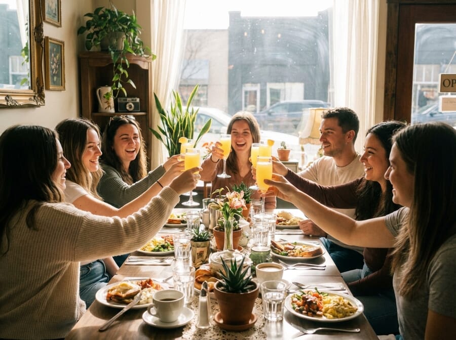
24. Brunch Squad
A stylish brunch setting with good food, mimosas, and laughter creates relaxed, Instagram-worthy shots.
25. Beach Day
Towels, sunglasses, beach games, and ocean waves. The carefree beach vibe naturally produces joyful, energetic images.
26. City Exploration
Wander through an urban area together—murals, architecture, and street scenes provide endless backdrops.
27. Spa Day
Robes, face masks, cucumber slices, and relaxation. This pamper-themed shoot is both fun and visually cohesive.
28. Concert or Festival
Music events bring energy and excitement. Capture dancing, crowd moments, and the shared experience of live music.
29. Fitness Friends
Workout together—yoga in the park, running trails, or gym sessions. Athletic wear and movement create dynamic shots.
30. Sleepover Vibes
Pajamas, popcorn, movies, and pillow fights. This nostalgic theme works for all ages and produces fun, candid moments.
More Friend Ideas
- 31. Bookstore browsing – Quiet, intellectual aesthetic
- 32. Cooking together – Kitchen chaos and collaboration
- 33. Vintage shopping – Thrift store treasure hunting
- 34. Amusement park – Rides, cotton candy, and excitement
- 35. Hiking adventure – Trail conquests and summit celebrations
- 36. Art gallery visit – Sophisticated, thoughtful poses
- 37. Game night – Board games, cards, and competitive fun
- 38. Sunset watch – Silhouettes and golden hour magic
- 39. Holiday themed – Halloween costumes, Christmas sweaters
- 40. Graduation celebration – Caps, gowns, and accomplishment
Kids Photoshoot Ideas
Photographing children requires patience, playfulness, and flexibility. These ideas help you capture genuine childhood moments:
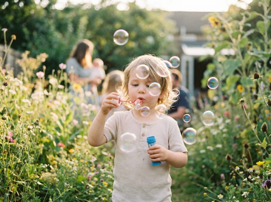
41. Bubble Play
Bubbles create instant magic. Kids chasing, catching, and blowing bubbles produce expressions of pure joy and wonder.
42. Superhero Theme
Let kids dress as their favorite heroes. Capes flying, power poses, and action shots bring their imagination to life.
43. Tea Party Setup
A miniature table with tiny cups, stuffed animal guests, and fancy dress creates an adorable, timeless scene.
44. Reading Corner
Capture kids absorbed in their favorite books. A cozy nook with pillows and soft light produces intimate, thoughtful portraits.
45. Messy Play
Paint, mud, flour, or food—messy activities create dynamic, expressive photos. Just prepare for cleanup!
46. Pet Best Friend
The bond between children and their pets makes for heartwarming images. Let them play naturally together.
47. Seasonal Portraits
Pumpkin patches in fall, snow angels in winter, flower fields in spring, sprinkler fun in summer—each season offers unique opportunities.
48. Mini Adult
Dress kids in grown-up clothes or have them mimic adult activities—cooking, gardening, “working.” The contrast is charming and humorous.
49. Adventure Explorer
Maps, binoculars, safari hats, and backpacks. Set up an “expedition” theme that sparks imagination.
50. Bath Time Fun
Bubble baths with toys create cute, contained setups. Just ensure the child is comfortable and water is properly managed.
More Kids Ideas
- 51. Building blocks – Concentration and creativity
- 52. Sports action – Soccer, baseball, or dance practice
- 53. Fairy tale costume – Princesses, knights, and dragons
- 54. Kitchen helper – Baking cookies or stirring bowls
- 55. Backyard camping – Tents, flashlights, and adventure
- 56. First day of school – Milestone documentation
- 57. Playground action – Swings, slides, and climbing
- 58. Arts and crafts – Creating and showing off projects
- 59. Sibling interaction – Playing, hugging, even arguing
- 60. Sleeping peacefully – Quiet, angelic moments
Birthday Photoshoot Ideas
Birthdays mark milestones worth celebrating and documenting. These ideas work for all ages:
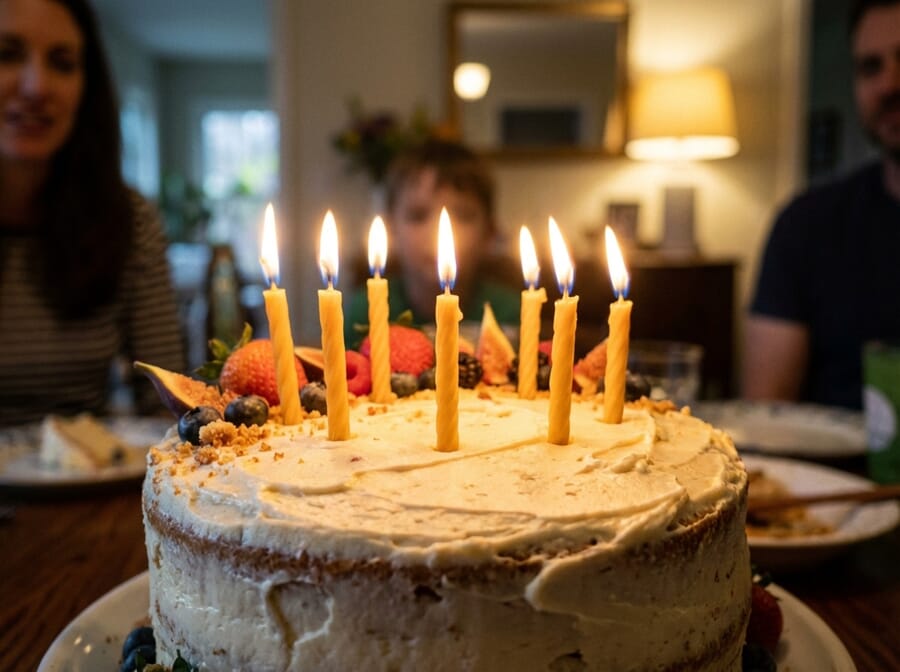
61. Classic Cake Smash
Especially popular for first birthdays, a decorated cake and permission to dig in creates messy, joyful photos.
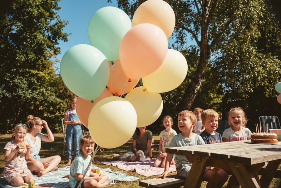
62. Balloon Extravaganza
Fill a room or outdoor space with balloons—same color, gradient, or mixed. The visual impact is immediate and festive.
63. Number Display
Giant number balloons, number candles, or creative props showing the age anchor the milestone visually.
64. Decade Theme
For milestone birthdays (30, 40, 50), embrace the era—70s disco, 80s neon, 90s throwback. Themed costumes and props add fun.
65. Birthday Crown
A sparkly crown or birthday sash instantly signals celebration while keeping setups simple.
66. Party Setup Before Guests
Capture the decorated space before the party chaos—tables set, cake displayed, decorations pristine.
67. Candle Blowing Moment
The anticipation, the glow, the breath, the wish—this traditional moment captures birthday magic.
68. Then and Now
For adults, recreate a childhood birthday photo. The comparison tells a story of growth.
69. Gift Opening
Capture genuine reactions to presents—surprise, delight, gratitude. These candid moments are treasures.
70. Birthday Breakfast
Start the day with a special breakfast—pancakes with candles, birthday banner backdrop, morning light.
More Birthday Ideas
- 71. Confetti throw – Burst of color and celebration
- 72. Champagne toast – For adult milestones
- 73. Sports theme – Jersey, equipment, favorite team
- 74. Hobby showcase – Instruments, art supplies, books
- 75. Family gathering – Generations together
- 76. Outdoor party – Backyard or park celebration
- 77. Spa birthday – Robes and relaxation
- 78. Adventure activity – Skydiving, surfing, climbing
- 79. Pet party – Include furry family members
- 80. Memory lane – Photos from each year displayed
Spring and Summer 2026 Photoshoot Ideas
Spring brings renewal, color, and perfect weather for outdoor photography. Embrace the season:
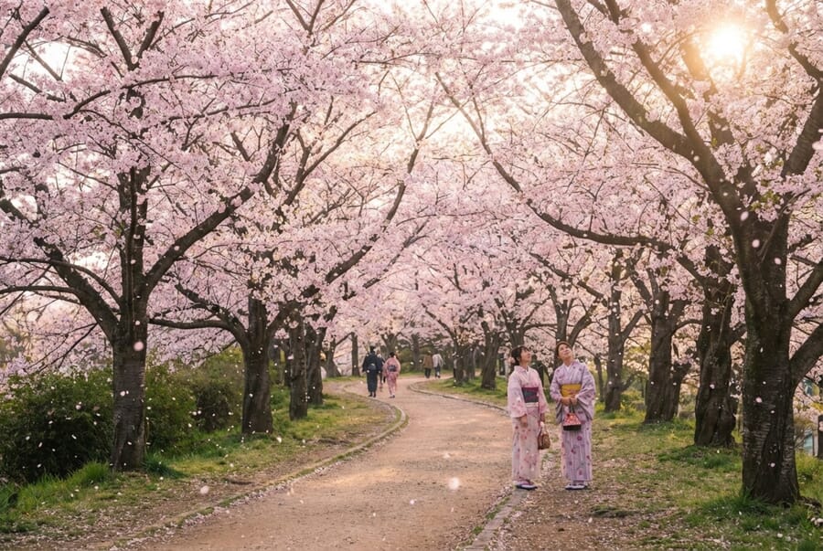
81. Cherry Blossom Session
Pink and white blossoms create dreamy, romantic backdrops. Time your shoot for peak bloom—it only lasts a week or two.
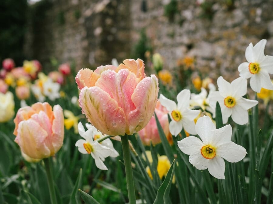
82. Flower Portraits
Incorporate spring flowers as props, crowns, or backgrounds. Tulips, daffodils, and wildflowers add seasonal charm.
83. Rain and Umbrellas
April showers make creative opportunities. Colorful umbrellas, rain boots splashing in puddles, and wet reflections add spring character.
84. Picnic in New Grass
Fresh green grass makes the perfect base for a spring picnic setup. Light blankets and pastel colors complement the season.
85. Easter Theme
Bunnies, eggs, baskets, and pastels create festive spring portraits, especially popular for kids and families.
86. Sunrise Sessions
Spring sunrises come at reasonable hours with soft, golden light. The fresh morning air adds energy to early shoots.
87. Floral Dresses
Flowing dresses with flower prints complement spring landscapes beautifully. Movement adds life to portraits.
88. Baby Animals
Farms with lambs, chicks, and bunnies offer unique spring portrait opportunities—especially charming with children.
89. Garden Greenhouse
Glass greenhouses filled with spring plants create magical, light-filled environments for portraits.
90. Kite Flying
Spring winds make kite flying possible. The activity brings movement, color, and joy to your shots.
More Spring Ideas
- 91. Farmers market – Fresh produce and flowers
- 92. Butterfly garden – Nature’s delicate beauty
- 93. Birds and nests – New life themes
- 94. Bright pastels – Color palette of the season
- 95. Fruit orchards – Blossoming apple or peach trees
- 96. Spring cleaning – Playful, lifestyle concept
- 97. Garden planting – Hands in soil, new growth
- 98. Window light – Soft spring sunshine indoors
- 99. Pastel balloons – Light, airy celebration
- 100. Spring fashion – Light layers, transitional style
Summer Golden-Hour Beach Swim
Backlit silhouettes of a subject wading in shallow water at sunset, framed against reflections. The low-angle sun fills water spray with a golden halo that no post-processing can fake. Shoot wide (24-35mm equivalent) at f/4 to keep both the subject and the reflections sharp.
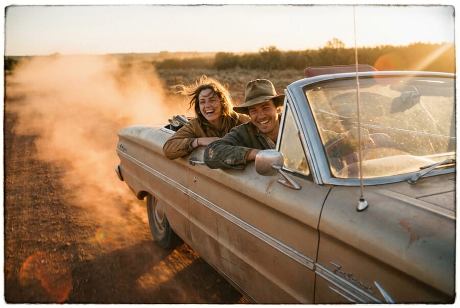
Dusty Country Road at Sunset
Unpaved roads in summer throw light-catching dust when a subject walks, runs, or kicks the ground. Position the sun low and behind the subject, shoot through the backlit dust at f/2.8 for a cinematic haze. Works especially well for couples, family road-trip shots, and senior portraits with truck-and-field aesthetics.
Lavender and Sunflower Fields (Peak: July)
Northern-hemisphere lavender peaks mid-July; sunflower fields hit late July to mid-August. Both work as overhead drone shots (rows become geometric patterns) and as waist-level portraits with soft bokeh. Shoot against the sun in the hour before sunset for the strongest contrast.
Rooftop Pool Reflection at Dusk
Hotel or apartment rooftop pools become mirror compositions right after sunset when the pool lights come on but the sky still holds color. Have the subject sit at the pool edge with feet in the water, or lie flat on the tile for a symmetrical reflection composition.
Summer Storm Chasing
Summer thunderstorms produce the highest-drama skies available to outdoor photographers. Shoot the 30 minutes before the storm (when clouds are dramatic but rain hasn’t started) for golden-green light on prairie or beach locations. Watch radar closely and prioritize safety over the shot.
Drone and Aerial Photoshoot Ideas
Drones moved from novelty to default tool in wedding and lifestyle shoots over 2024-2025. In 2026, the aesthetic is less “sweeping establishing shot” and more deliberate aerial composition — shapes, symmetry, and story. The DJI Mini 5 Pro and Mavic 4 dominate the under-250g and pro tiers respectively; any drone with a 1-inch sensor and 4K video handles these ideas.
Overhead Shape Formations
Arrange people on the ground in a shape — heart, initial, circle, star — and shoot straight down from 15-25 meters. Wedding parties, family reunions, and corporate shoots all work. Plan the shape on paper first; a spotter on the ground calls positioning adjustments over walkie.
Ceremony Layout From Above
A top-down shot of the ceremony site — chairs, aisle, altar, surrounding landscape — captured right before guests are seated. The geometric composition has become a standard wedding album opener. Shoot 30-50 meters high with a 1/2.5-second shutter for visible motion if guests are arriving, or faster for a frozen moment.
Pull-Back Reveal
Start close on the subject, pull the drone back and up to reveal the full environment — a couple alone on a cliff, a family on an empty beach, a bride in the middle of an endless field. Works best as a 10-15 second video clip exported as a key frame for stills, or as a Reel on its own.
Follow-Me Hyperlapse
The drone follows a subject walking through a landscape at 3-5 meters per second while taking a photo every second. The resulting sequence compresses a 20-minute walk into a 20-second cinematic clip. Best on contrasty terrain — a path through snow, a beach, a mountain trail.
Two-Person Top-Down Portrait
Couples or family members lie on a surface that frames the subject — a blanket on grass, a beach, a snow field, a pool float. Drone shoots straight down from 5-10 meters. The deliberately-flat composition removes depth cues and feels more editorial than standard portraits.
Crowd-and-Person Isolation
The subject stands alone in a crowded space — a bride in an empty cathedral, a child in a packed concert crowd, a single figure on a busy plaza. The drone’s height creates the scale contrast that no ground-level shot can deliver. Works best when the crowd is moving and the subject is stationary.
TikTok and Reels-Ready Photoshoot Setups
In 2026, many photographers now deliver 9:16 vertical clips alongside the traditional grid. Reels and TikTok are the discovery surface for potential clients, and the old “shoot stills, grab a BTS clip on the phone” split is insufficient. These setups capture both a strong still and a Reel-ready vertical in a single pose.
Vertical Walk-Toward-Camera
The single highest-performing pose on Reels in 2026. Subject walks slowly toward the camera on a clean backdrop (stone wall, tree-lined street, empty beach). Shoot in 9:16 video, pull a still from the walk. One setup, two deliverables.
Golden Hour Spin
Subject spins in place with the sun behind them, arms out. Shoot at 1/125 or faster for crisp stills, 1/60 for motion-blurred hair and fabric. Works for any subject — couples, kids, individuals — and pairs naturally with editing to music on Reels.
Outfit-Change Jump Cut
Same pose, same location, three or four outfit changes edited as jump cuts. A proven Reel template that doubles as a portfolio-style lookbook still. Works well for fashion, brand, and lifestyle shoots — also increasingly popular in senior portraits.
Reverse Slow-Mo Splash
Any water element — lake jumps, pool splashes, beach runs — shot at high frame rate and played in reverse. The reversed motion is visually surprising and performs well on short-form video. Pull a frame at peak splash for a strong still.
Mirror-Selfie Studio Set
A full-length mirror in the studio with the camera visible in the reflection. The subject poses as if shooting their own mirror selfie; the photographer frames themselves out or in as needed. Captures the self-aware, feed-native aesthetic that reads as 2026.
Product Hand-Off
Commercial and brand shoots: a subject hands a product off-frame to a hand reaching in. The 2026 Reel template uses this as a one-second hook before the product reveal. Shoot wide enough that the still works alone, while the clip slots into any branded Reel.
Plan With AI: Gemini Prompts for Reference Shots
Generative AI — specifically Google’s Gemini 3.1 Flash Image (Nano Banana 2) and OpenAI’s ChatGPT Images 2.0 — is now faster and cheaper than a mood-board Pinterest search. Before the shoot, generate 4 to 8 reference frames the client can react to, then bring the approved references to set as visual direction for the photographer and subjects.
AI-generated references are not the final deliverable — they are planning artifacts. Ethics of AI in photography require transparency; tell clients upfront that references are AI-generated and that the final shoot will look similar but will not copy the reference exactly.
Couples and Engagement Shoot Prompt
“Editorial engagement photography shot on a 35mm lens, golden-hour backlight, couple walking hand-in-hand through a wildflower meadow, natural skin tones, Kodak Portra 400 color palette, subject in focus with soft bokeh background, no text or watermarks, 3:2 landscape.”
Family and Kids Session Prompt
“Documentary family photography, young parents with two children (ages 4 and 7) playing in an autumn park, candid laughter, low-angle perspective at child eye-level, warm afternoon light through leaves, natural expressions, shot on Fujifilm X-T5 with 35mm f/1.4, no brand logos, no text, 4:3 aspect ratio.”
Birthday Shoot Prompt
“Birthday portrait photography, child (age 5) blowing out candles on a decorated cake in a garden setting, backlit by fairy lights and late-afternoon sun, shallow depth of field focusing on the candle flame and child’s expression, warm color grade, authentic natural moment, no logos, no text overlay, 3:2 landscape.”
Drone Wedding Ceremony Prompt
“Aerial wedding photography, top-down view from 40 meters of an outdoor ceremony with curved rows of white chairs, central aisle, couple at altar, surrounded by green lawn and trees, late-afternoon golden light, geometric composition, professional cinematic color, no text, 16:9 landscape.”
Reference-Face Workflow (Advanced)
For higher-stakes sessions where clients want to see “something close to us in the reference,” pass a client-provided photo of themselves as an input image to Gemini and ask for a generated reference in a specific setting (“this couple at a lavender farm at golden hour, editorial photography style”). The result is a reference that feels tailored rather than generic. Use sparingly and always with client consent — AI-generated faces of real people is a trust line to be careful with.
Tips for Successful Photoshoots
No matter which idea you choose, these principles help ensure great results:
- Scout your location in advance to understand lighting and backgrounds
- Shoot during golden hour (shortly after sunrise or before sunset) for the most flattering light
- Communicate with your subjects about what to wear, what to expect, and what you’re going for
- Have backup plans for weather changes or location issues
- Capture candid moments between posed shots—they’re often the best images
- Bring props and snacks to keep energy high, especially with kids
- Take more shots than you think you need—you can always delete later
Trend and workflow references for this 2026 update, verified on April 24, 2026.
2026 trend sources
- Braly Studios — 2026 Senior Portrait Trends: Light Painting – Senior portrait studio reporting light painting as the 2026 class's most-requested technique.
- Digital Camera World — Color Hunting as a skill-builder trend – Analysis of color hunting as the viral technique that is improving photographer compositions.
AI planning references
- Google Gemini 3.1 Flash Image (Nano Banana 2) – Image generation model used in the AI planning section prompts.
- CyberLink Blog — AI prompt guides for couples and friends photoshoots – Consumer-facing AI prompt guides showing strong search demand for AI-integrated creative workflows.


Final Thoughts
The best photoshoot ideas match your subject’s personality with a setting and theme that brings out genuine emotion. Use this guide as a starting point, then adapt and personalize based on who you’re photographing.
Whether you’re capturing couples in love, friends making memories, children at play, birthday milestones, or the beauty of spring, the most important ingredient is authenticity. Create an environment where your subjects feel comfortable, and the magic will follow.
Now grab your camera and start creating!