Editor’s Key Takeaways: Mastering Color: Elevate Your Photography Skills

Color in photography is a critical factor for creating compelling images. This blog post delves into the importance of color and how to utilize it effectively.
- Why Does Color in Photography Matter?
- Colors guide the viewer’s eye, setting focal points in an image.
- They establish a mood, eliciting different emotions and feelings.
- Colors contribute to composition, enhancing overall aesthetics.
- What Is Color Theory in Photography?
- Involves understanding the color wheel and relationships between colors.
- Main components: Hue, Saturation, and Luminance.
- Color as a Compositional Element
- Using contrasting colors to create visual interest.
- Employing complementary colors for a harmonious look.
- Color Grading in Photography
- Techniques to adjust and enhance colors in post-processing.
This comprehensive guide equips you with the necessary tools to master color in your photography, from grasping color theory to practical applications in composition and post-processing.
Introduction
Color in photography is something that you absolutely must pay attention to for great photos.
Because pretty much all the best (color) photos are carefully designed to take advantage of color.
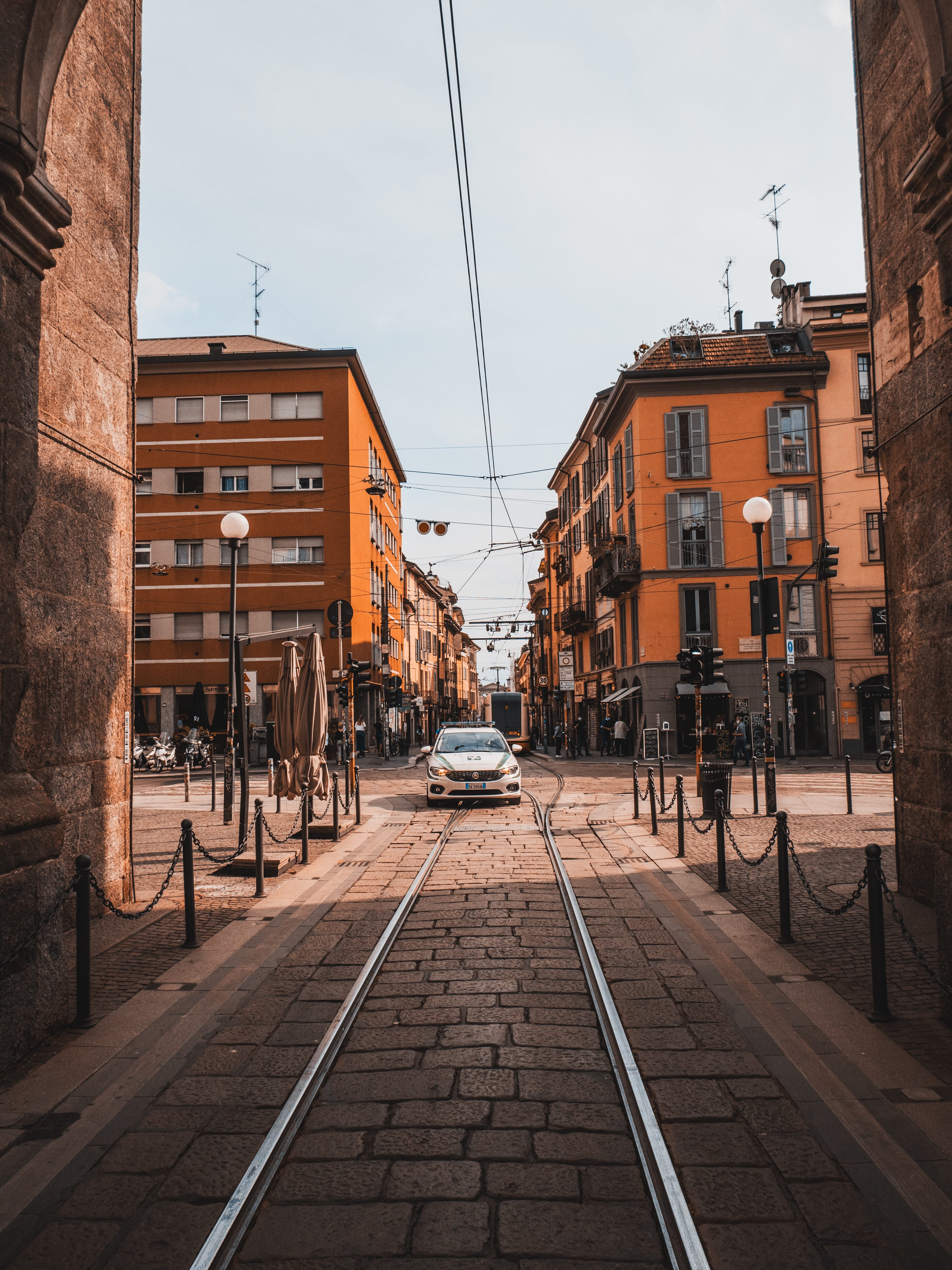
For instance, check out this image:
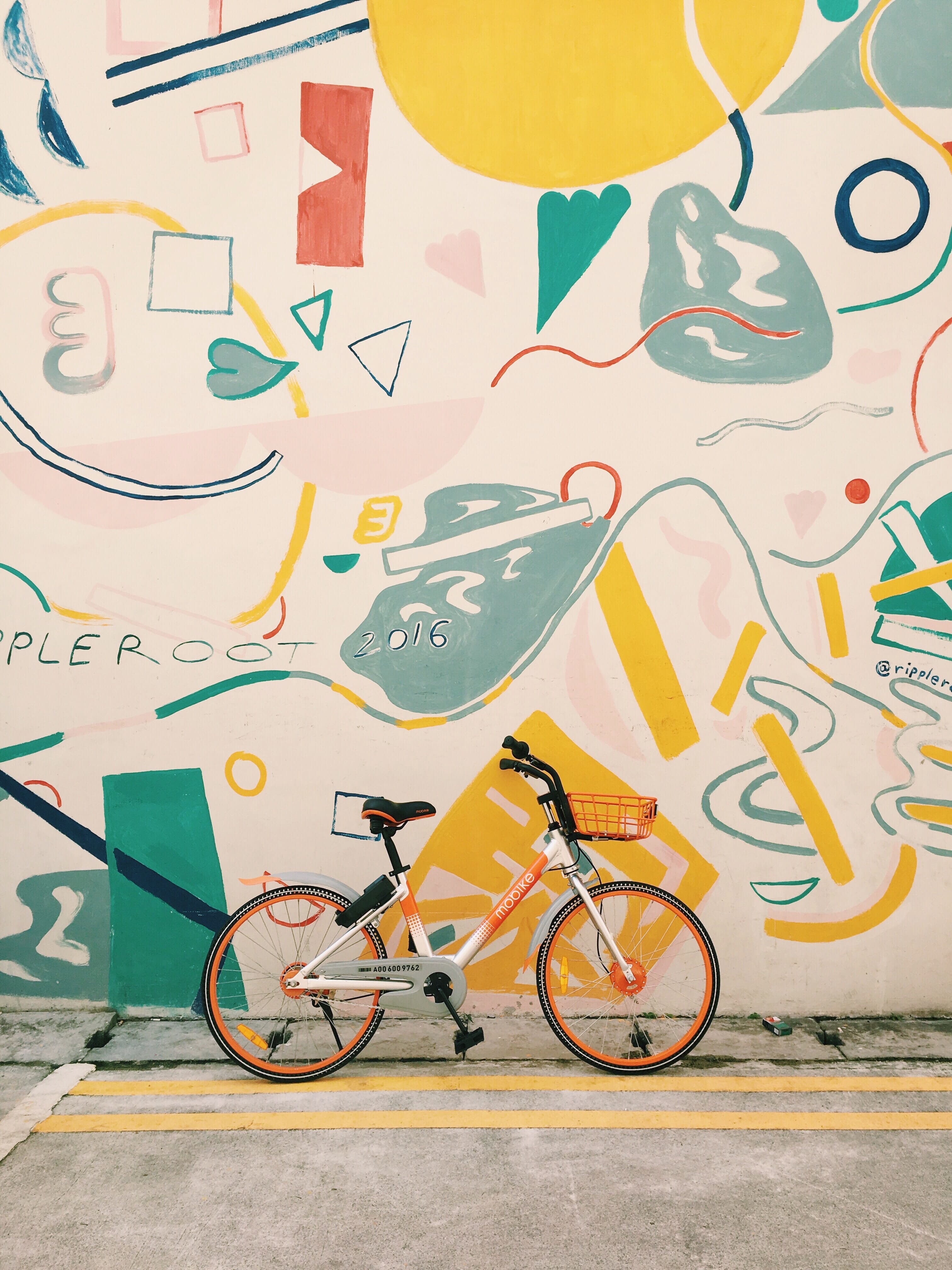
I’m sure it’d be fine without deliberate use of color…
…but when you add in the color, it really pops!
But how do you use color to create stunning images? What do you need to know about color to really take your photography to the next level?
That’s what this article is all about.
I’m going to give you all the tools you need to start working with color like a pro!
Let’s get started.
Colors in Photography:
Why Does Color in Photography Matter?
Taking control of color in photography is absolutely key.
This is because colors do three things:
First, they tell the eye where to look. Bold colors attract the eye more than softer colors; warm colors attract the eye more than cool colors; bright colors attract the eye more than dark colors.
So by using color with care, you can guide the viewer toward your main subject, or from the foreground to the background, or anywhere else you please.
Second, colors set a mood. Colors feel differently to the viewer, which is why green images feel very fresh, blue images feel peaceful, red images feel intense, and so on. Combine this with different amounts of brightness and saturation, and you immediately end up with moody images, uplifting images, disorienting images, and more.
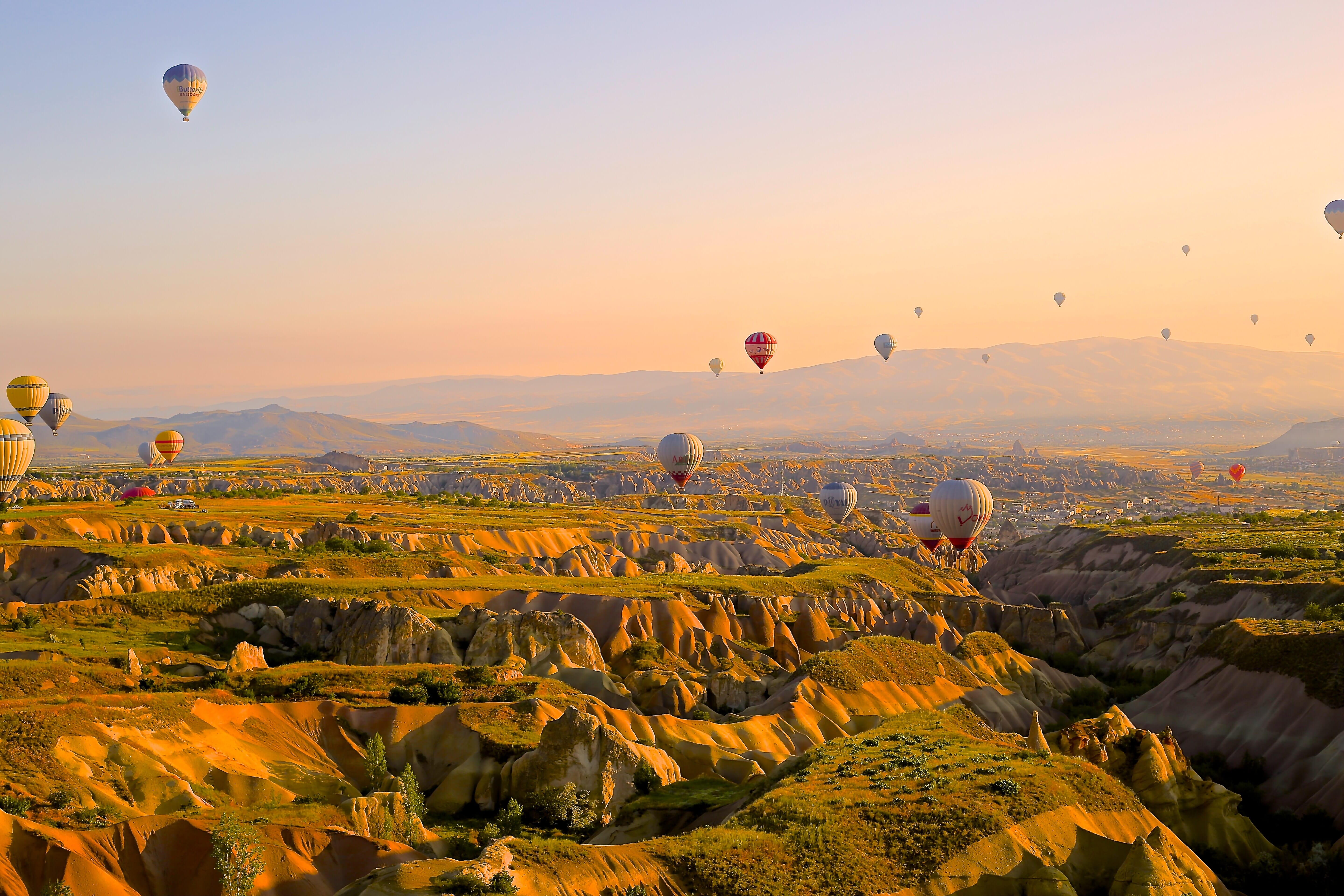
Take a look at this image:
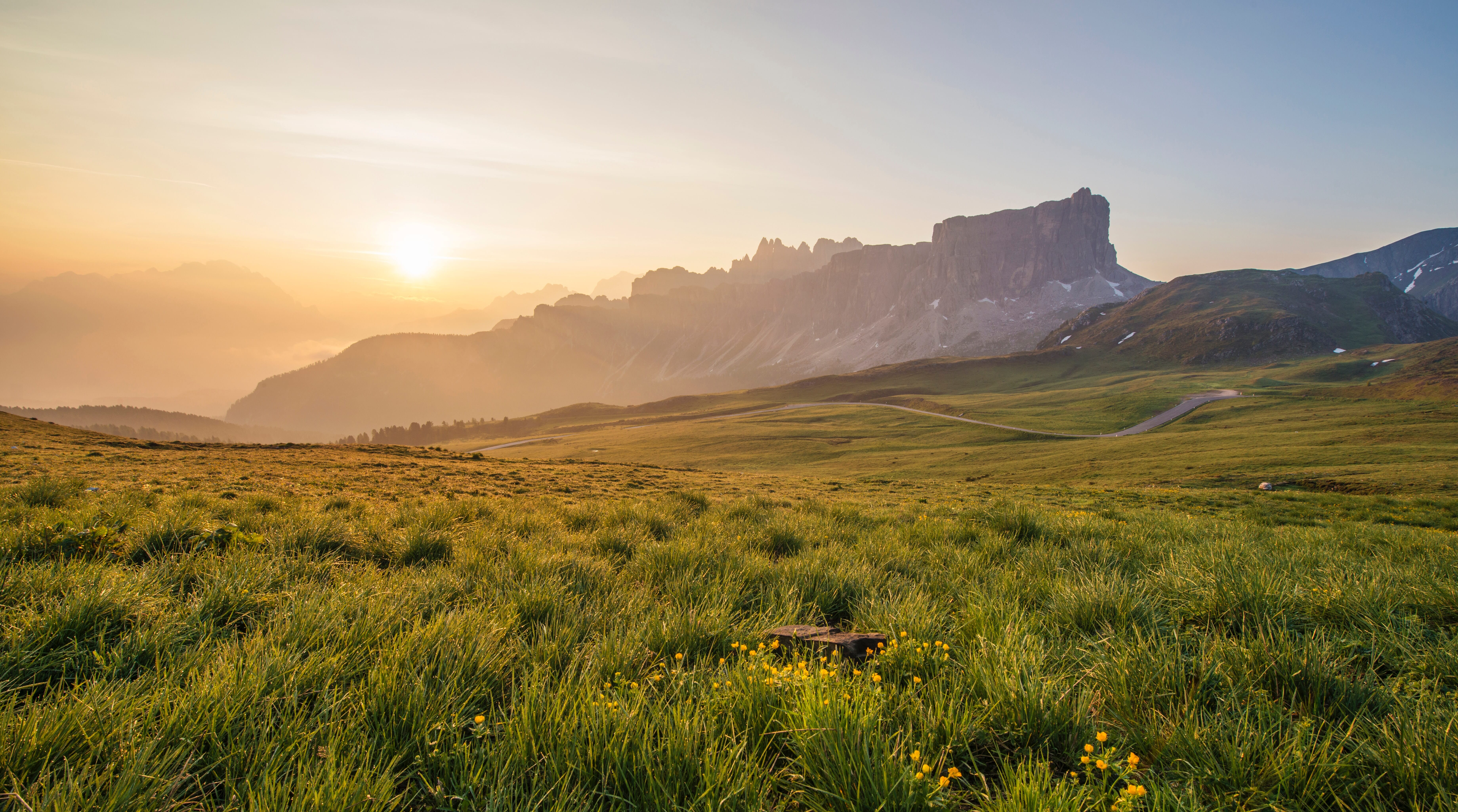
How does it feel? What emotions spring to mind when you first look at it?
Then compare it to your emotions when viewing this shot:
They’re different, right? One is bright and vibrant, whereas the other feels a lot more somber.
All because of differences in color.
And third:
Colors can act as composition elements on their own. A spot of color is similar to an object in the scene; it contributes to the composition.
And if you want to create stunning compositions, you have to be aware of every compositional element in your scene, and how it works with the other compositional elements.
In other words:
Color is something you can’t afford to ignore.
What Is Color Theory in Photography?
Color theory in photography may sound difficult, but it’s actually simple.
It refers to a set of ideas about colors and how they relate to one another.
A fundamental piece of color theory is the color wheel, which looks like this:
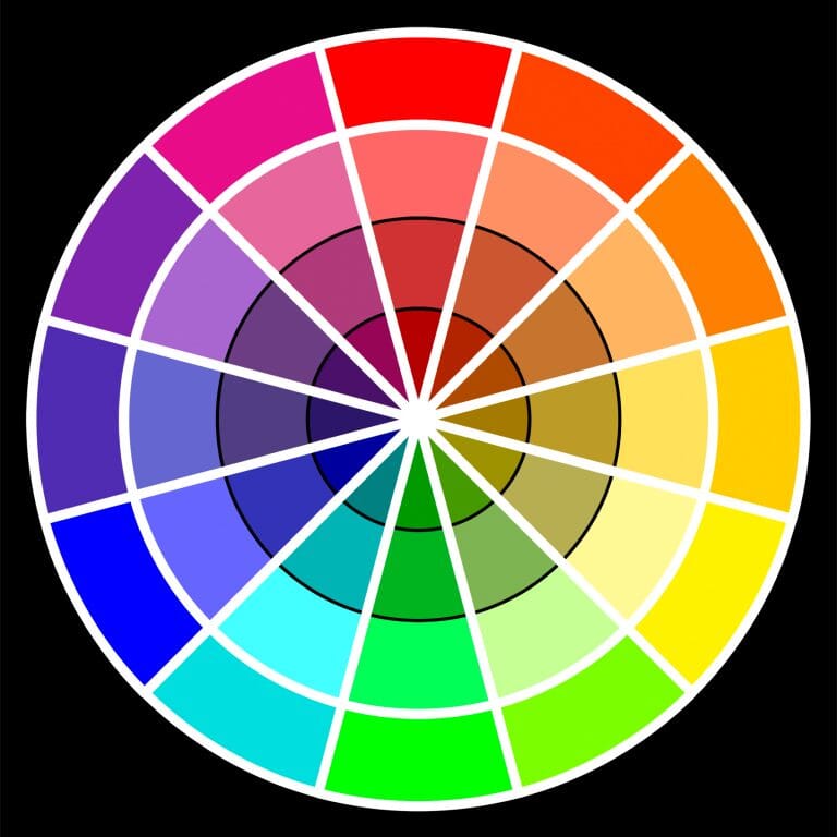
Notice the way the colors sit together, with similar colors next to one another, and different colors opposite one another.
While I’ll go more into these relationships down below, it’s important to recognize that colors relate differently to one another depending where they sit relative to one another on the color wheel.
And when you’re getting started with color theory, the color wheel is a good place to start.
You’ll also want to be familiar with the key characteristics of color:
Hue, saturation, and luminance.
The Key Element of Color in Photography: Hue, Saturation, and Luminance
Every color has these three identifying features:
- A hue.
- A saturation.
- And a luminance.
Let’s take a look at what each of these terms mean:
Hue
Hue refers to what we often think of as color.
For instance, a color might have a red hue, a green hue, a purple hue, or a blue hue.
(I like to think of it as the “true color.”)
It’s important to recognize that hues can come in different saturations and different luminances, which means that there’s not a single red color, but many colors with a red hue.
Does that make sense?
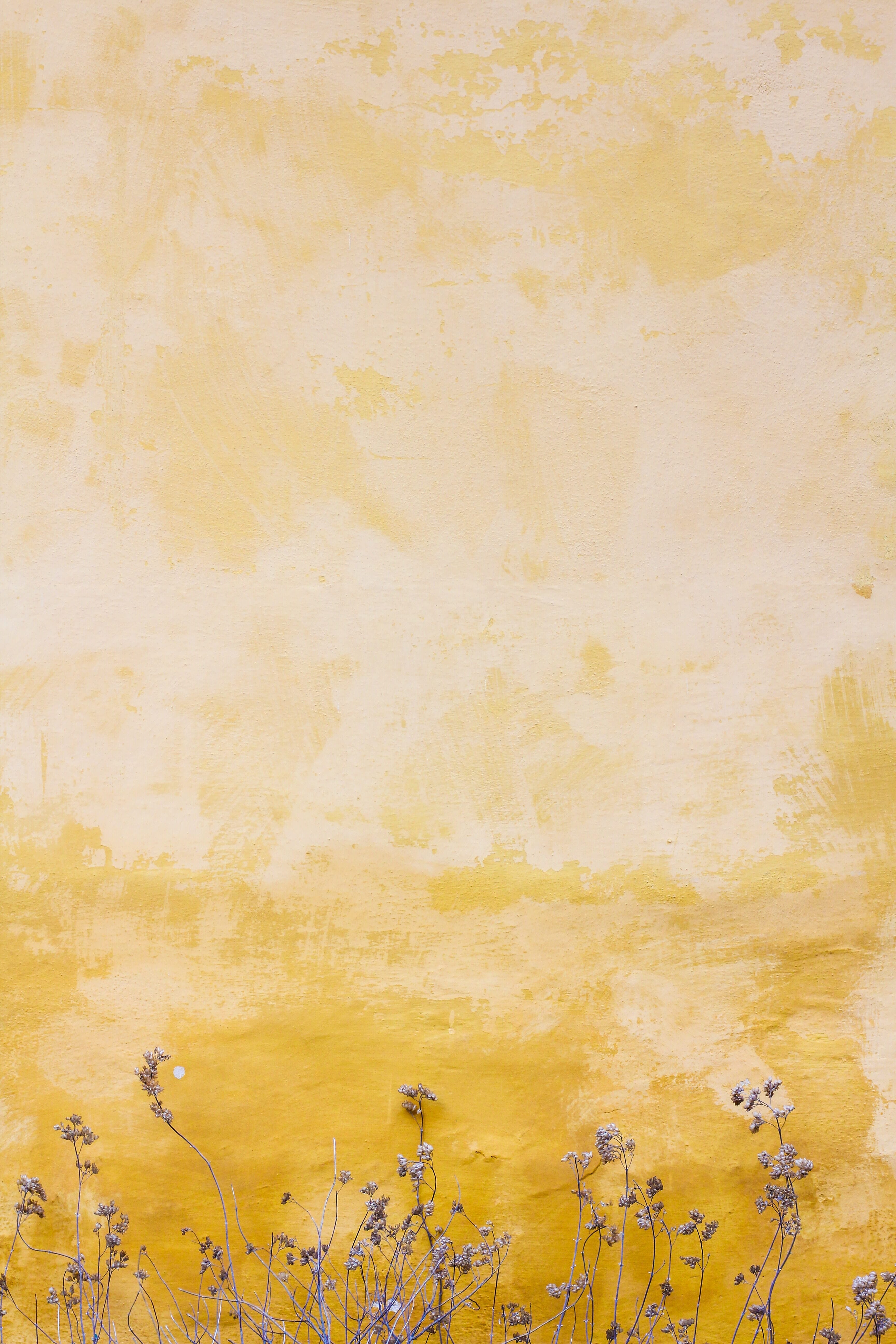
For instance, here’s an image with a desaturated yellow color:
And here’s an image with a vibrant yellow color:
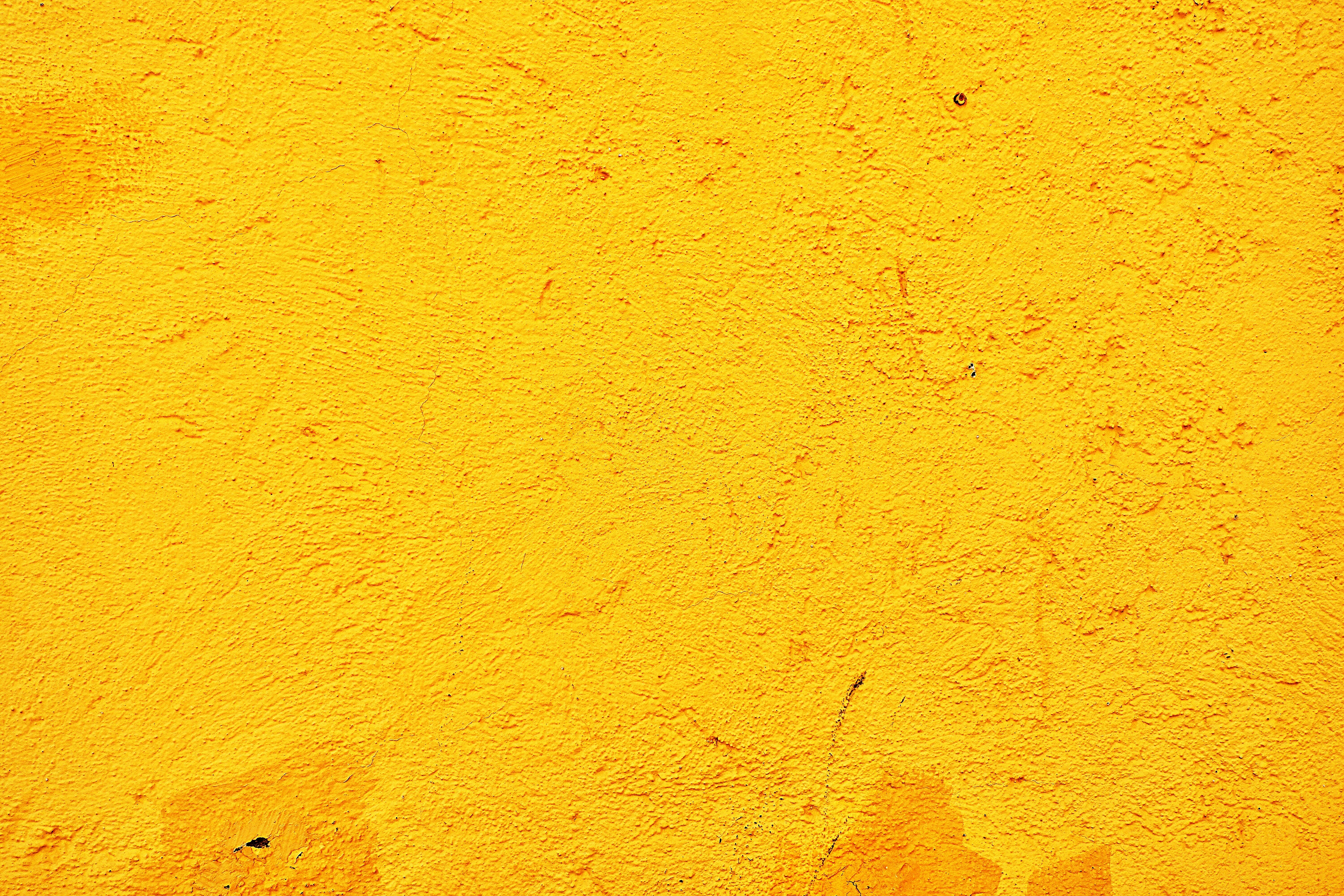
The hues are the same; it’s the saturation that’s changed.
When it comes to evoking emotions, hue is a huge deal. You can use certain hues–such as different hues of blue–to create a more peaceful mood.
And you can use certain hues–such as different hues of orange–to create a more intense, aggressive mood.
Saturation
Saturation refers to the intensity of a color.
In other words:
Is the color very vibrant?
Or is it bland and dull?
Here’s an example of an image with very saturated colors:
Whereas this image has very desaturated colors:
There’s a big difference, right? Desaturation is an easy way to evoke a more somber, even cinematic mood in your images.
Whereas adding saturation creates fresh-looking, eye-popping images.
Luminance
This is the third characteristic of color, and it’s pretty simple:
Luminance refers to a color’s brightness or darkness.
So you might have a red color that’s very bright…
…or a red color that’s very dark.
Note that luminance also contributes to a color’s moodiness; dark colors tend to be moodier, whereas bright colors tend to be much happier and uplifting.
Color Wheel Photography
Now that you’re familiar with a color’s hue, saturation, and luminance, it’s time to talk about the color wheel and how different colors work together for spectacular results.
Note that the color wheel only represents hue, and so the color schemes I’m about to discuss apply to hue only.
Once you have your color scheme, you can adjust it by changing the luminance or the saturation.
Complementary Color Schemes
Complementary color schemes use colors that are opposite one another on the color wheel.
So orange and blue make up a complementary color pair, as do green and red.
Complementary colors contrast heavily with one another, which is why they produce a very intense result.
Now, complementary colors are an easy way to spice up your photos, because they’re so eye-catching.
But if you include both colors at high levels and high saturations, you’ll start to create images that are eye-watering, rather than simply vibrant.
That’s why I’d recommend including one complementary color frequently throughout the frame, while the other color merely accents the image.
Alternatively, you can include both complementary colors, but tone one or both down so you don’t end up with such an in-your-face image.
By the way, complementary colors are extremely popular among professional photographers, and among cinematographers, as well–which is why you’ll often notice complementary colors in your favorite images, TV shows, and movies.
Analogous Color Schemes
Analogous colors refer to colors that sit near each other on the color wheel.
So you might have an analogous color scheme that uses blue and green colors.
Or an analogous color scheme that uses red and orange colors.
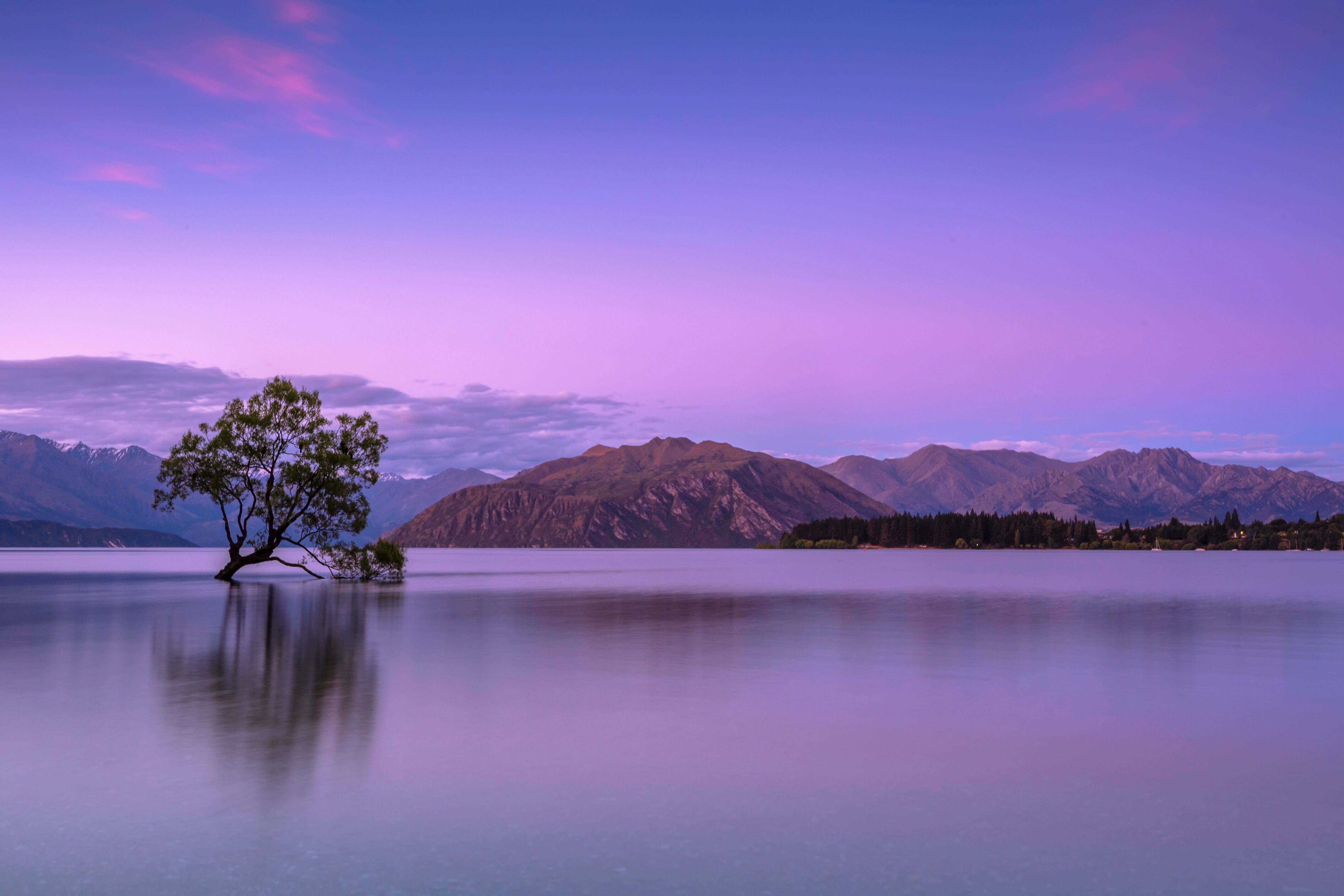
Here’s an image that uses analogous colors to great effect:

Now, because analogous colors are very similar and non-contrasting, they create a more peaceful, harmonious mood.
That’s why it pays to use analogous colors when you’re aiming for a softer, more relaxing image.
(Whereas you can use complementary colors if your goal is to create something more intense.)
Triadic Color Schemes
Color triads refer to a set of three colors that sit at thirds around the color wheel.
The most common color triad is red, yellow, and blue (though red, green, and blue is another, depending on which color wheel you’re using).
Do you recognize the red, yellow, and blue color triad, by the way? Those are the primary colors–the group of colors that make up all the other colors!
Color triads tend to be very strong, without overpowering the viewer, which is why they can make for very cool images.
However, it’s pretty tough to find color triads, which is why you should definitely be prepared to work with complementary or analogous colors, instead.
Color as a Compositional Element
As I explained above, color is a compositional element.
Which means that a swathe of color has weight in a composition; it takes up space, and it draws the eye.
This matters for a few reasons.
First of all, the more colors you have in your scene, the more compositional elements you have in your scene, and the more chaotic the scene becomes.
As you may be aware, simplicity is often key in photography–which is why a lot of colors generally aren’t a good thing.
In fact, many great photos and paintings only use a few colors (i.e., two or three).
So when you’re out shooting, I urge you to actively monitor the colors in your images. Make sure that you’re not overwhelming the viewer with a bundle of unnecessary colors.
And if you do have a lot of colors in your scene, unless you’re going for a generally eye-popping shot, you’re probably going to need to convert to black and white.
Second, the fact that color has weight means that you need to size up every spot of color in your scene.
Ask yourself:
Do I want the eye drawn toward this area?
The more saturated and bright the color is, the heavier it becomes, and the more easily it draws the eye.
So only include bright, saturated colors in areas you want the viewer to see.
Make sense?
Color Grading in Photography
No discussion of color theory would be complete without touching on color grading, which is very popular among modern photographers.
What is color grading?
Well, color grading refers to adjusting the colors in your images in post-processing to achieve a certain mood.
This image, for instance, is color-graded teal and orange for a cinematic effect:
Whereas this image is color-graded yellow for a warm, sunrise-type effect:
Color grading is an easy way to evoke different emotions. But how does color grading work?
One easy way to color grade is via a split toning tool, which you can find in post-processing software such as Lightroom or Luminar Neo.
Simply dial one color into the highlights (the bright portions) of your image.
And dial another color into the shadows (the dark portions) of your image.
And you’ll often end up with a very cool result!
You can also color grade by adjusting the temperature and tint of your image. A colder image will create a moodier, more somber feel, while a warm image will feel happier or more friendly.
Make sense?
The Next Step
Colors are a key part of any photographer’s workflow–which is why you need to master color if you want to take incredible images.
But by paying attention to the color wheel…
And by thinking about different color schemes…
You can improve your photos very, very fast!
What is color theory in photography?
Color theory in photography is the study of colors and how they work together to create different effects in your images. By putting a red and a green next to one another, for instance, you’ll add intensity to your photo. Swap out that red for a blue, and you’ll end up with a much more peaceful, calming image. That’s what color theory can do: Help you achieve the type of image you’re aiming to create.
What colors are best for photography?
There really is no set of best colors for photography. Different colors convey different moods, so you must first identify the mood you’re after, and only then determine the best colors for your image. Note, however, that there are common color patterns in photography (i.e., patterns that work well). For instance, complementary (contrasting) colors create tension and visual contrast, whereas analogous colors tend to feel a lot more harmonious.
What are complementary colors?
Complementary colors sit opposite to one another on the color wheel. These are contrasting colors, which means that they add a level of intensity to your images. For instance, green and red can be complementary colors, just like orange and blue. Because complementary colors increase contrast in a scene, these color pairings are very common in photography, as well as cinema.
What are analogous colors?
Analogous colors sit next to one another on the color wheel. They’re very similar–so blue and green are analogous colors, as are orange and yellow, or purple and red. Analogous colors create very harmonious color schemes; in other words, they’ll give you images that have very little tension.
What’s the difference between hue, saturation, and luminance?
Hue, saturation, and luminance each describe a different characteristic of a color (and all three together tell you all you need to know about a particular color). Hue refers to what we tend to think of as a color’s color; for instance, a bright orange has an orange hue, a pastel pink has a pink hue, a desaturated red has a red hue, and so on. It’s often the thing that sticks out at us most when we’re working with colors, which is why we often refer to colors in terms of their hue. Saturation refers to the intensity of a color. For instance, you can have a vibrant green (such as the color of watered grass), or you can have a desaturated, pale green (such as the color of an algae-covered pond). And luminance refers to the brightness of a color. You can have a bright yellow or a dark yellow, a bright orange or a dark orange. Note that these three characteristics do not affect one another. The saturation doesn’t affect the luminance, and the luminance doesn’t affect the hue, etc. So you can talk about each of these qualities separately!