- Glossy delivers maximum color vibrancy, contrast, and detail sharpness — ideal for landscapes, product shots, and images viewed behind glass.
- Lustre sits between glossy and matte, offering reduced glare, fingerprint resistance, and a subtle sheen that works beautifully for portraits and wedding prints.
- For framing without glass, lustre wins. For framing behind glass, glossy is the better choice.
- Satin is similar to lustre but slightly smoother, while matte eliminates all reflection — best for black-and-white fine art prints.
- Nations Photo Lab and MPIX are top picks for professional-quality glossy and lustre prints shipped to your door.
Choosing the right paper finish can make or break a printed photograph. The same image that looks stunning on one finish can fall flat on another — and the difference comes down to how each surface handles light, color, and texture.
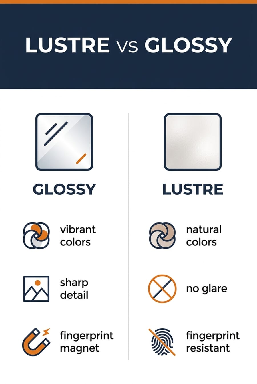
Glossy and lustre are the two most popular finishes for photo prints, and they sit on opposite sides of a spectrum that every photographer eventually needs to understand. This guide breaks down exactly how each finish performs, when to use which, and how newer options like satin fit into the picture.
When you buy through links on our site, we may earn a commission at no cost to you. We evaluate products independently. Commissions do not affect our evaluations.
Lustre vs Glossy: Quick Comparison
| Feature | Glossy | Lustre |
|---|---|---|
| Surface texture | Smooth, glass-like | Fine texture (micro-bumps) |
| Reflectivity | High — mirror-like shine | Low to moderate — subtle sheen |
| Color vibrancy | Maximum saturation | Slightly muted, natural tones |
| Detail sharpness | Highest (smooth surface) | Slightly softened by texture |
| Fingerprint resistance | Poor — shows every touch | Excellent — texture hides marks |
| Glare under light | Significant | Minimal |
| Best for framing | Behind glass | With or without glass |
| Professional use | Product, commercial, landscape | Portraits, weddings, fine art |
| Handling | Needs careful handling | Durable, travel-friendly |
| Price range | $ | $$ |
Why Does Print Paper Finish Matter?
Photo paper isn’t just a surface to hold ink — it actively shapes how an image is perceived. Different materials absorb ink at different rates, and the finish coating on top determines how light interacts with the printed surface.
A high-gloss coating reflects light directly back at the viewer, which amplifies color saturation and perceived sharpness. A textured finish like lustre scatters light at multiple angles, reducing glare but also softening the overall appearance. Matte finishes absorb light almost entirely, which is why they produce the flattest colors but zero reflection.
This isn’t just technical trivia — it has real consequences for how a print feels. A vibrant sunset that pops on glossy paper might look washed out on matte. A soft, intimate portrait that glows on lustre could look harsh and over-saturated on glossy. Matching the finish to the image’s mood is one of the skills that separates a good print from a great one.
For a deeper look at all available paper types, check out the guide to types of photo prints.
About Glossy Paper
Glossy is the finish most people picture when they think “photo print.” It’s the shiny, smooth surface found on everything from drugstore prints to professional product photography.
The glass-like surface of glossy paper reflects light in a uniform direction, which is what creates that characteristic shine. This reflective quality does two things exceptionally well: it makes colors appear more saturated than on any other finish, and it preserves fine detail with remarkable clarity because the smooth surface doesn’t scatter ink.
Contrast also benefits significantly. Blacks appear deeper and whites appear brighter on glossy paper, giving images a punchy, high-impact look that’s hard to replicate on other surfaces.
The trade-off? That smooth, reflective surface is a magnet for fingerprints. Every touch leaves a visible mark, and cleaning glossy prints without damaging them requires care. The reflective surface also creates glare under direct lighting, which can make prints difficult to view depending on where they’re hung.
For this reason, glossy prints work best when placed behind glass in a frame — protecting them from fingers while the glass helps manage reflections when positioned correctly.
Glossy Advantages
- Maximum color vibrancy — colors appear more saturated than on any other finish
- Superior detail sharpness — the smooth surface preserves fine textures and edges
- Deep contrast — blacks are richer and whites are brighter
- Eye-catching presentation — the reflective quality makes prints pop at first glance
- Widely available — offered by virtually every print service at the lowest price point

Glossy Disadvantages
- Fingerprint magnet — every touch leaves a visible mark on the surface
- Glare issues — reflective surface creates hotspots under direct light or near windows
- Requires framing — unframed glossy prints degrade quickly from handling
- Can look too intense — some subjects (portraits, fine art) may appear over-saturated
About Lustre Paper
Lustre (spelled “luster” in American English) occupies the sweet spot between glossy and matte. It’s the finish that most professional portrait photographers default to, and there are good reasons for that.
Under magnification, lustre paper reveals a surface covered in tiny, uniform bumps — sometimes described as a pearl or eggshell texture. These micro-bumps are what give lustre its unique character: they scatter light just enough to eliminate harsh reflections while still allowing a soft, luminous sheen that keeps colors looking rich.
The practical benefit is huge: lustre prints can be handled, passed around, and displayed without glass — all without collecting the fingerprints and smudges that plague glossy prints. The texture also eliminates the glare problem, meaning lustre prints can hang anywhere in a room regardless of lighting conditions.
Color-wise, lustre delivers a natural, true-to-life rendition. Colors aren’t as punchy as glossy, but they’re not muted either. Many photographers describe the look as “luminous” — there’s warmth and depth without the artificial pop that glossy sometimes introduces.
Detail sharpness is slightly reduced compared to glossy because the textured surface diffuses ink microscopically. In practice, this difference is subtle and often works in the image’s favor — particularly for portraits, where slightly softened details create a more flattering look.
Lustre Advantages
- Fingerprint resistant — textured surface hides marks and smudges
- Minimal glare — can be displayed anywhere without reflection problems
- Natural color rendition — rich but not over-saturated
- Versatile display — works framed (with or without glass) or unframed
- Professional standard — the go-to finish for wedding and portrait photographers

Lustre Disadvantages
- Less vibrant than glossy — not the best choice when maximum color pop is the goal
- Slight detail softening — texture reduces the absolute sharpness of fine details
- Higher cost — typically priced above glossy at most print services
Lustre vs Glossy vs Satin vs Matte
Glossy and lustre aren’t the only options. Satin and matte round out the four most common print finishes, and understanding where each one fits helps narrow down the right choice.
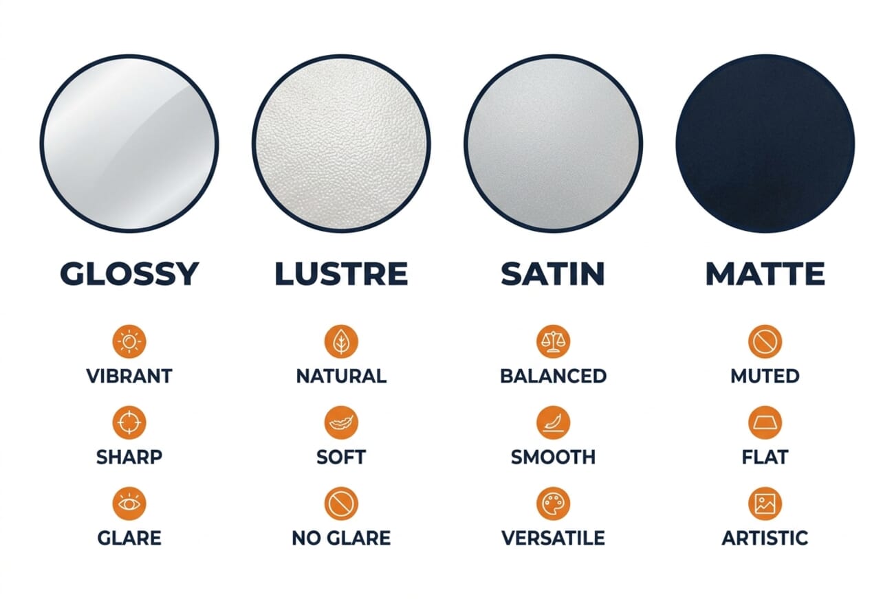
| Finish | Texture | Reflection | Color | Best For |
|---|---|---|---|---|
| Glossy | Smooth | High | Most vibrant | Landscapes, products, commercial |
| Lustre | Fine pearl | Low | Rich, natural | Portraits, weddings, events |
| Satin | Very fine | Low-medium | Rich, balanced | All-around use, albums |
| Matte | Flat | None | Most muted | B&W fine art, text-heavy prints |
Satin is the closest relative to lustre. The two are sometimes confused — and some print labs use the terms interchangeably. The difference is subtle: satin has a smoother texture than lustre, sitting roughly halfway between lustre and glossy. It retains slightly more color vibrancy than lustre while still offering good fingerprint resistance. For photographers who want a versatile “do everything” finish, satin is a strong choice.
Matte sits at the opposite end from glossy. Zero reflection, zero glare, and a completely flat surface. Matte excels for black-and-white photography and fine art prints where the absence of shine lets the image speak entirely on its own terms. The trade-off is significant: colors are noticeably muted, and contrast is reduced. For color-heavy work, matte is rarely the right call.
A quick rule of thumb: if the image is about impact and pop, lean glossy. If it’s about mood and subtlety, lean lustre or satin. If it’s about artistic texture, lean matte.
Best Finish by Photography Genre
Different subjects have different printing needs. Here’s what works best for the most common genres:
Wedding Photography
Lustre is the industry standard for wedding prints — and for good reason. Wedding albums get handled constantly: by the couple, by parents, by guests flipping through at gatherings. Lustre’s fingerprint resistance makes it the practical choice. The natural color rendition also flatters skin tones, which matters more in wedding photography than almost any other genre.
The exception: individual framed prints of a standout ceremony or reception shot can look stunning on glossy when placed behind glass.
Portraits

Lustre wins for portraiture in almost every scenario. The slightly softened detail rendering is actually a feature — it’s forgiving on skin texture in a way that glossy isn’t. Glossy’s razor-sharp detail reproduction can be unflattering for close-up portraits, highlighting pores and imperfections that lustre gently smooths.
For stylized editorial portraits or headshots intended for commercial use, glossy can work if the image has already been retouched extensively.
Landscapes
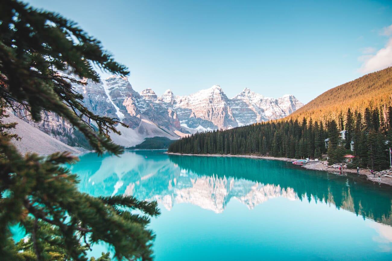
Glossy is the go-to for landscape prints. The enhanced color saturation makes sunsets glow, oceans shimmer, and forests look impossibly lush. The superior detail sharpness also matters for landscapes, where distant textures and fine patterns (tree bark, water ripples, cloud formations) are part of the appeal.
For very large landscape prints (24 inches and above), consider lustre — the reduced glare becomes more important at larger sizes, where reflections from room lighting can obscure significant portions of the image.
Black and White Photography
Black-and-white prints have their own rules. Without color to consider, the decision shifts to tonal range and surface feel:
- Matte — the classic choice for B&W fine art. No reflections, pure tonal gradation, museum-quality feel.
- Lustre — a strong middle ground. Adds a touch of depth to shadows without introducing distracting glare.
- Glossy — can work for high-contrast B&W with deep blacks, but the shine often competes with the image’s mood.
For dedicated black-and-white printing, fine art inkjet papers (cotton rag, baryta) offer even more control than standard lustre or glossy — though they require a compatible inkjet printer. Our guide to the best black-and-white photo printers covers the hardware side.
Fingerprint Resistance and Framing Guide
How a print will be displayed should be one of the first questions to ask when choosing a finish. The framing situation changes the calculus significantly:
Framing Behind Glass
Glass protects against fingerprints, dust, and UV damage — which eliminates glossy’s biggest weakness. Behind glass, glossy’s superior color vibrancy and sharpness come through without the handling concerns. Use museum glass or anti-reflective glass to minimize the double-reflection problem (glossy paper + glass cover).
Framing Without Glass
For open frames, float mounts, or prints displayed without any glass covering, lustre is the clear winner. The textured surface handles ambient dust better, won’t show fingerprints from accidental touches, and the reduced glare means the image looks good from any viewing angle.
Albums and Portfolios
Prints that live in albums get touched — a lot. Lustre or satin finishes are standard for professional photo albums because they resist the wear from repeated handling. Many print services use lustre as the default album finish.
Prints That Travel
Selling prints at craft fairs, showing a portfolio to clients, or mailing prints to customers? Lustre is more forgiving during transport. Glossy prints can stick together in warm conditions and scratch easily without protective sleeves.
Best Print Services for Glossy and Lustre
Not all print labs are created equal. The quality of the paper, color accuracy, and finish options vary significantly between services. Here are the top options for getting professional-quality glossy and lustre prints:
- Nations Photo Lab — The top pick for professional photographers. Offers both glossy and lustre finishes with excellent color accuracy and fast turnaround. Known for consistent quality across large orders. Starting at $0.29 per 4×6 print.
- MPIX — Run by the same parent company as Miller’s Professional Imaging (a lab trusted by pros for decades). Offers glossy, lustre, and satin finishes. Slightly higher pricing but exceptional print quality. A strong choice for portfolio-quality work.
- Shutterfly — The most accessible option for everyday prints. Good enough quality for family albums and gifts at budget-friendly prices. Glossy is the default; lustre is available on larger print sizes.
- Printique (formerly AdoramaPix) — Backed by Adorama’s decades of photography expertise. Offers fine art papers alongside standard glossy and lustre. A solid middle ground between pro lab quality and consumer pricing.
For a more comprehensive breakdown with pricing, quality scores, and sample comparisons, see the full guide to the best online photo printing services.
Which Finish Should You Choose?
After all the comparisons, the decision usually comes down to two questions: what are you printing? and how will it be displayed?
Choose glossy when:
- Color vibrancy is the priority (landscapes, product shots, travel photos)
- The print will be framed behind glass
- Fine detail and maximum sharpness matter (macro, architecture)
- Budget is a factor — glossy is the most affordable finish
Choose lustre when:
- Prints will be handled, passed around, or displayed without glass
- The subject benefits from natural color rendition (portraits, weddings, events)
- The display area has direct lighting or windows nearby
- A professional, gallery-ready appearance is the goal
When in doubt, lustre is the safer bet. It looks good in more situations, survives more handling, and works in more lighting conditions. There’s a reason it’s the default finish for most professional print labs.
For photographers who want to explore beyond prints entirely, acrylic and metal prints offer a completely different presentation — with their own set of trade-offs.
Frequently Asked Questions
Is lustre the same as satin?
They’re similar but not identical. Satin has a slightly smoother texture than lustre, sitting between lustre and glossy on the spectrum. Some print labs use the terms interchangeably, so check a sample print from the specific lab if the distinction matters for a project.
Which finish do professional photographers use most?
Lustre is the most common finish in professional photography, particularly for client deliverables like wedding albums, portrait sessions, and event coverage. Glossy is more common in commercial and product photography where maximum color impact is required.
Can you use glossy paper in any inkjet printer?
Most inkjet printers support glossy paper, but print quality varies significantly. For the best results, use the printer manufacturer’s recommended glossy paper or a high-quality third-party option, and select the correct paper type in the print driver settings. Laser printers generally don’t work well with photo glossy paper.
Does the finish affect how long a print lasts?
The finish itself has minimal impact on print longevity — ink type and paper quality matter far more. However, glossy prints are more susceptible to surface damage (scratches, fingerprints, sticking) over time if not properly stored or framed. Lustre and matte prints are more physically durable for everyday handling.
What finish should I use for prints I’m selling?
Lustre is the safest commercial choice — it looks professional, ships well without scratching, and works in any display environment the buyer might have. For fine art sales, matte or cotton rag papers signal higher quality. Glossy works if the prints will be framed behind glass by the buyer.
Sources used for this article: