- Color management ensures consistent, accurate colors from camera capture through monitor display to final print output.
- sRGB remains the standard for web and social media; Adobe RGB and ProPhoto RGB suit print and advanced editing workflows.
- Monitor calibration with a hardware colorimeter is the single most impactful step for reliable color accuracy.
- OLED and mini-LED displays offer wider gamuts but require careful profiling to avoid oversaturated edits.
- Soft proofing in Lightroom or Photoshop previews how prints will look before committing ink to paper.
- Social media platforms strip ICC profiles and compress to sRGB—always convert before uploading.
- HDR color workflows using HDR10/HLG are emerging for photographers targeting modern HDR-capable displays.
When you buy through links on our site, we may earn a commission at no cost to you. We evaluate products independently. Commissions do not affect our evaluations.
What Is Color Management in Photography?
Color management is the system of controls that keeps colors looking consistent across every device in a photography workflow—from the camera sensor to the editing monitor, from a smartphone screen to a fine-art print.
Without it, the vivid sunset captured in-camera may appear dull on a laptop, oversaturated on a phone, and muddy on paper. Color management solves this by using standardized color spaces, device-specific profiles, and rendering intents to translate color data accurately at every stage.
The core components include:
- Color spaces – Defined ranges of colors (gamuts) such as sRGB, Adobe RGB, and ProPhoto RGB
- ICC profiles – Device-specific files describing exactly which colors a monitor, printer, or paper can reproduce
- Rendering intents – Rules for handling out-of-gamut colors (perceptual, relative colorimetric, etc.)
- Calibration hardware – Colorimeters and spectrophotometers that measure and correct a display’s output
Understanding these building blocks turns color management from an intimidating technical topic into a straightforward, repeatable process. The sections below break down each piece and explain how to apply them in real-world editing and printing scenarios.
Color Spaces Explained: sRGB, Adobe RGB, and ProPhoto RGB
A color space defines the total range—or gamut—of colors available to work with. Think of it as a box of crayons: some boxes hold 24 colors, others hold 120. Larger boxes contain more nuanced shades, but not every coloring book (or device) can use them all.
sRGB
sRGB (Standard Red Green Blue) is the most widely used color space in digital imaging. It was created in 1996 by HP and Microsoft as a universal standard for monitors, printers, and the internet.
- Covers roughly 35% of visible colors
- Default for web browsers, social media platforms, and most consumer displays
- The safest choice when the final destination is a screen
Adobe RGB
Adobe RGB (1998) encompasses about 50% of visible colors—significantly more than sRGB, particularly in the cyan-green range. It was designed for professional print workflows.
- Useful when printing on high-end inkjet printers that can reproduce wider gamuts
- Requires an Adobe RGB–capable monitor to see the full benefit during editing
- If displayed on an sRGB-only screen without conversion, colors may look washed out
ProPhoto RGB
ProPhoto RGB covers roughly 90% of visible colors and is the widest commonly used photographic color space. Adobe Lightroom uses it internally for non-destructive editing.
- Preserves the maximum color information throughout editing
- Should only be used in 16-bit workflows to avoid banding artifacts
- Must be converted to sRGB or Adobe RGB before sharing or printing
For photographers who shoot in RAW, the in-camera color space setting is irrelevant because RAW files contain unprocessed sensor data. The color space only matters at the point of export or output.
Color Space vs. Color Profile: What’s the Difference?
These two terms are often used interchangeably, but they serve distinct roles:
- Color space – A theoretical, standardized gamut (e.g., sRGB, Adobe RGB). It defines the universe of colors available.
- Color profile (ICC profile) – A practical description of what a specific device can actually reproduce and how it interprets color data. Every monitor, printer, and paper combination has its own ICC profile.
A color profile maps the device’s real-world capabilities onto a color space. For instance, a monitor’s ICC profile might say: “This display can show 99% of the sRGB gamut, but its blues tend to shift slightly toward cyan.” The operating system uses this profile to compensate and display colors as accurately as possible.
This distinction matters because even two monitors that both claim “100% sRGB” will produce slightly different colors without proper profiling. The ICC profile bridges the gap between theory (color space) and reality (device output).
Monitor Calibration: The Foundation of Accurate Color
No amount of careful editing matters if the monitor is displaying inaccurate colors. Monitor calibration is the single most important step in any color management workflow.
Why Calibrate?
Displays drift over time. Backlights age, color temperature shifts, and factory presets are rarely accurate enough for critical photo work. Calibration corrects these deviations by:
- Setting a target white point (typically D65/6500K for photography)
- Adjusting gamma to a standard curve (usually 2.2)
- Correcting luminance to a suitable level (80–120 cd/m² for print work, higher for web-focused editing)
- Generating a custom ICC profile for the operating system
Hardware Colorimeters
Software-only calibration tools rely on human eyes, which adapt constantly and can’t judge absolute color. A hardware colorimeter—a small device placed on the screen that measures actual light output—is essential for reliable results.
Popular options include the Datacolor SpyderX and X-Rite i1Display series. These devices walk the user through an automated calibration routine that takes about five minutes and should be repeated every 2–4 weeks.
Calibration Tips
- Let the monitor warm up for at least 20–30 minutes before calibrating
- Calibrate in the same ambient lighting conditions used for editing
- Avoid calibrating in direct sunlight or under mixed lighting
- Re-calibrate monthly, or after any firmware/driver update
OLED and Mini-LED Displays: Color Considerations
Modern display technology has moved well beyond traditional IPS LCDs. OLED and mini-LED panels are increasingly popular among photographers for their contrast ratios and wide color gamuts—but they introduce new color management challenges.
OLED Displays
OLED panels produce true blacks (each pixel emits its own light) and typically cover 95–100% of the DCI-P3 color space, which is significantly wider than sRGB.
- Benefit: Stunning contrast and color vibrancy, excellent for evaluating shadow detail
- Risk: The hyper-vivid display can make edits look more saturated than they actually are—leading to under-saturated prints
- Mitigation: Always calibrate with a colorimeter that supports OLED technology (some older models struggle with OLED’s pixel-level emission). The Calibrite ColorChecker Display Plus and Datacolor SpyderX2 both handle OLED well.
OLED panels can also exhibit ABL (Automatic Brightness Limiting), which dims the screen during sustained bright scenes. This affects perceived luminance during calibration and editing, so it should be disabled if the display allows it.
Mini-LED Displays
Mini-LED backlighting uses thousands of dimming zones behind a traditional LCD panel, offering much better contrast than standard LED-backlit LCDs while avoiding some OLED quirks like burn-in.
- Apple’s Studio Display XDR (and MacBook Pro panels) use mini-LED technology
- Blooming (halos around bright objects on dark backgrounds) can affect how shadow-to-highlight transitions appear
- Calibration should target the SDR luminance range photographers actually work in, not the peak HDR brightness
Regardless of panel technology, the rule remains the same: calibrate with a hardware device, profile the display, and verify results against a known reference.
Apple Reference Mode and iPad Color Workflows
Apple has invested heavily in color accuracy across its ecosystem, making Mac and iPad viable tools for professional color-critical work.
Reference Mode on MacBook Pro and Pro Display XDR
Reference Mode (available on Apple silicon MacBook Pro models with Liquid Retina XDR displays and the Pro Display XDR) locks the display to a specific color standard, disabling all adaptive adjustments like True Tone and Night Shift.
Available presets include:
- Photography (P3-D65) – Targets the DCI-P3 gamut at D65 white point; ideal for photo editing destined for digital screens
- sRGB (IEC 61966-2-1) – Locks to the sRGB gamut; useful for web-targeted work
- Adobe RGB (1998) – Matches the Adobe RGB gamut for print-focused workflows
- HDR Video (P3-ST 2084) – For HDR content mastering
To activate Reference Mode: System Settings → Displays → select the display → Reference Mode preset. When engaged, the display’s ICC profile is fixed to the chosen standard, providing a factory-calibrated reference without additional hardware.
While Reference Mode is impressively accurate out of the box, pairing it with an external colorimeter for verification is still best practice for critical print work.
iPad as a Photo Editing Tool
The iPad Pro (M-series chips) and iPad Air feature P3 wide-gamut displays with factory color calibration. With apps like Adobe Lightroom for iPad and Affinity Photo 2, mobile photo editing has become increasingly viable.
- iPad displays are factory-profiled to P3 and generally accurate for on-screen review
- True Tone (adaptive white balance) should be disabled for color-critical editing: Settings → Display & Brightness → True Tone off
- Night Shift must also be turned off, as it shifts the white point warm
- Currently, iPads do not support external colorimeter calibration natively—rely on factory calibration
For photographers who use an iPad for on-the-go culling and preliminary edits, the key is to treat it as a preview device and perform final color-critical adjustments on a calibrated desktop monitor.
Color Profiles and Printing
Printing adds a layer of complexity because the color profile depends not only on the printer but also on the specific ink and paper combination in use.
A printer using glossy photo paper produces a different color gamut than the same printer using matte fine-art cotton rag. Each combination requires its own ICC profile to ensure accurate color translation from screen to paper.
Where to Get Printer/Paper Profiles
- Manufacturer-provided profiles – Paper manufacturers like Hahnemühle, Canson, and Epson provide free ICC profiles for their papers matched to specific printer models. These are a solid starting point.
- Custom profiles – For the highest accuracy, photographers can create custom profiles using a spectrophotometer (e.g., X-Rite i1Studio) or send test prints to a profiling service like specialized print labs.
- Print lab profiles – When using a commercial printing service, request their ICC profiles and soft-proof against them before submitting files.
Installing ICC Profiles
- macOS: Double-click the .icc file, or copy it to
~/Library/ColorSync/Profiles/ - Windows: Right-click the .icc file → “Install Profile,” or copy to
C:\Windows\System32\spool\drivers\color\
Once installed, the profile becomes available in Lightroom’s Print module and Photoshop’s print dialog for accurate output.
Soft Proofing: Preview Before Printing
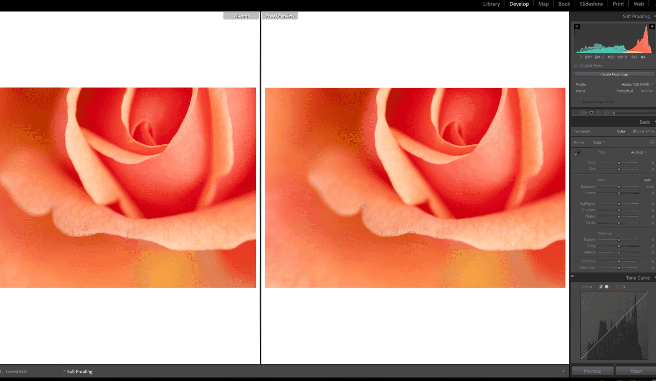
Even with perfect profiles, some colors captured by a camera simply fall outside what a printer can reproduce. Soft proofing simulates the printed output on-screen, revealing potential issues before any ink touches paper.
Soft Proofing in Lightroom
- Open the Develop module and check the Soft Proofing box below the image
- Select the target printer/paper ICC profile from the dropdown
- Choose a rendering intent: Perceptual (compresses all colors proportionally) or Relative Colorimetric (preserves in-gamut colors, clips out-of-gamut ones)
- Enable Simulate Paper & Ink to see the effect of paper white and ink black limits
- Create a proof copy to make print-specific adjustments without altering the master file
Soft Proofing in Photoshop
- Go to View → Proof Setup → Custom
- Select the target ICC profile, rendering intent, and enable Simulate Paper Color
- Toggle the proof on/off with Ctrl+Y (Windows) or Cmd+Y (Mac) to compare
Soft proofing is especially valuable for landscape photography with highly saturated greens and cyans, which are often the first colors to fall outside a printer’s gamut.
Updated Lightroom Color Settings
Adobe Lightroom (both Classic and the cloud-based version) handles color management largely behind the scenes, but understanding its settings ensures optimal results.
Internal Working Space
Lightroom Classic processes images in ProPhoto RGB with a linear tone curve internally. This preserves the maximum color information from RAW files throughout the editing pipeline. There is no option to change this—and no reason to, since it ensures nothing is clipped during editing.
Export Color Space
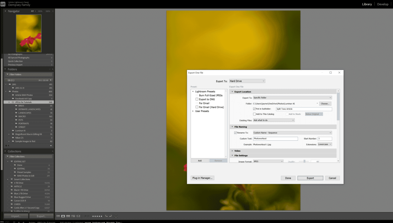
The color space conversion happens at export. In the Export dialog under File Settings:
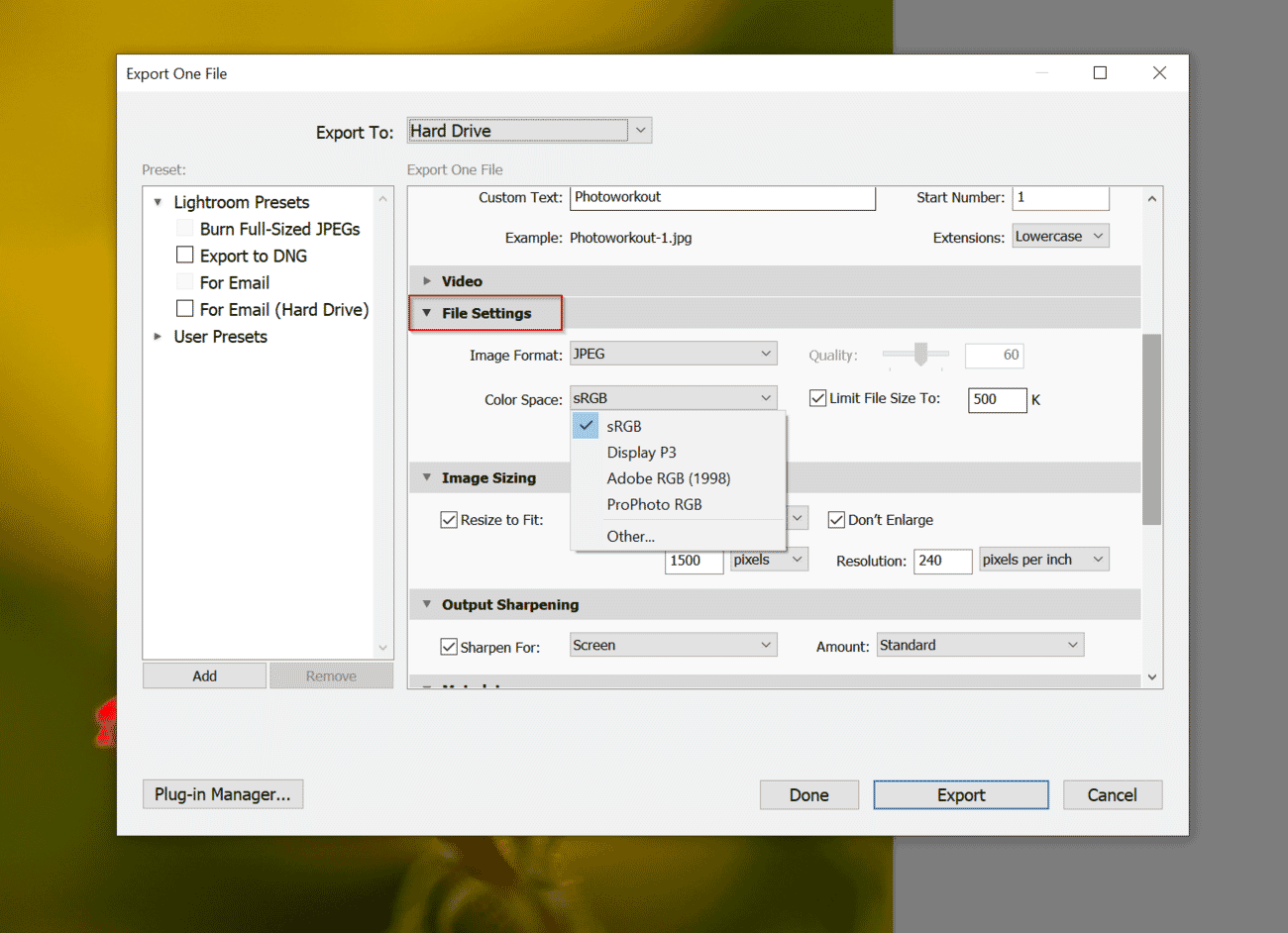
- sRGB – For web, social media, email, and client galleries
- Adobe RGB – For files going to a print lab that accepts Adobe RGB
- ProPhoto RGB – For archival TIFFs or handoff to Photoshop for further editing (use 16-bit)
- Display P3 – A newer option for content targeting Apple devices and modern wide-gamut screens
External Editor Settings
When sending files from Lightroom Classic to Photoshop via Edit → Preferences → External Editing:
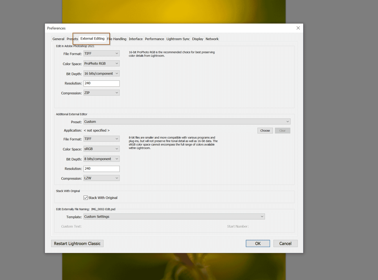
- Set the color space to ProPhoto RGB
- Choose 16 Bits/Component
- Select TIFF for lossless quality
This ensures the maximum color and tonal data is preserved during the Lightroom-to-Photoshop round trip. For a deeper comparison of these tools, see the Lightroom vs. Photoshop guide.
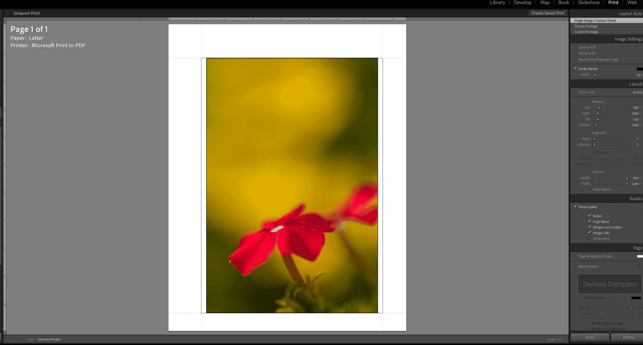
Print Module Color Management
In Lightroom’s Print module, the Color Management section determines who controls the color conversion:
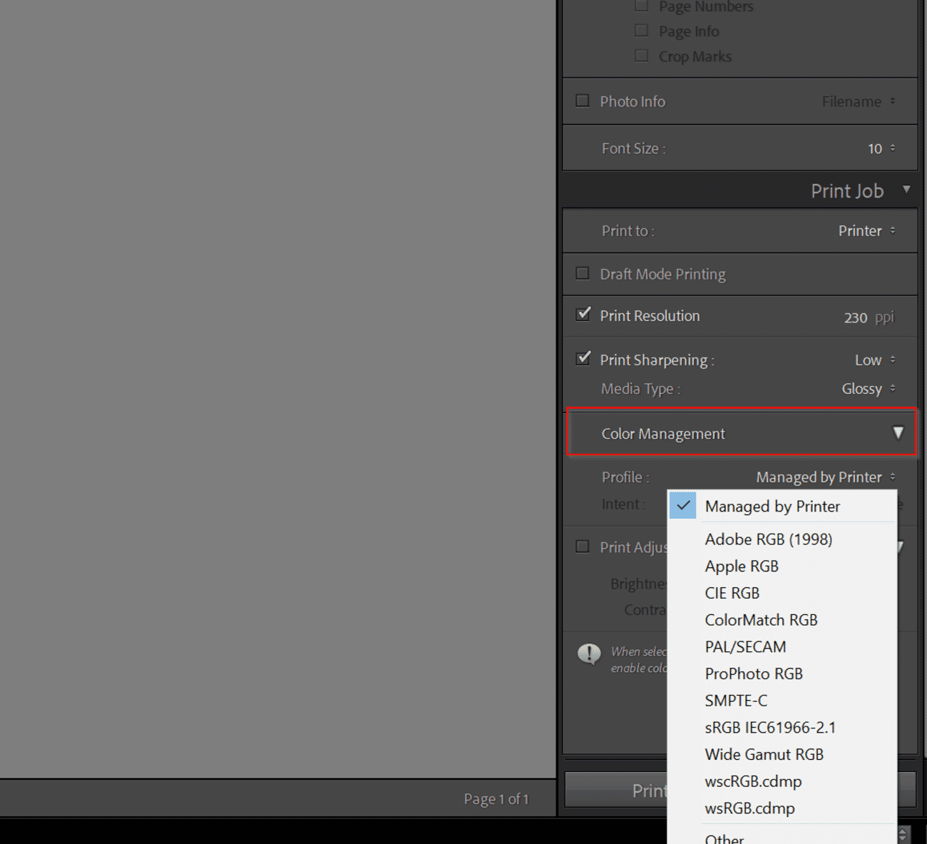
- Managed by Printer – The printer driver handles color conversion. Simpler but less precise.
- Custom Profile – Lets Lightroom handle color conversion using the selected ICC profile. This is the preferred option for fine-art printing.
Important: If Lightroom manages color, disable color management in the printer driver to avoid double profiling.
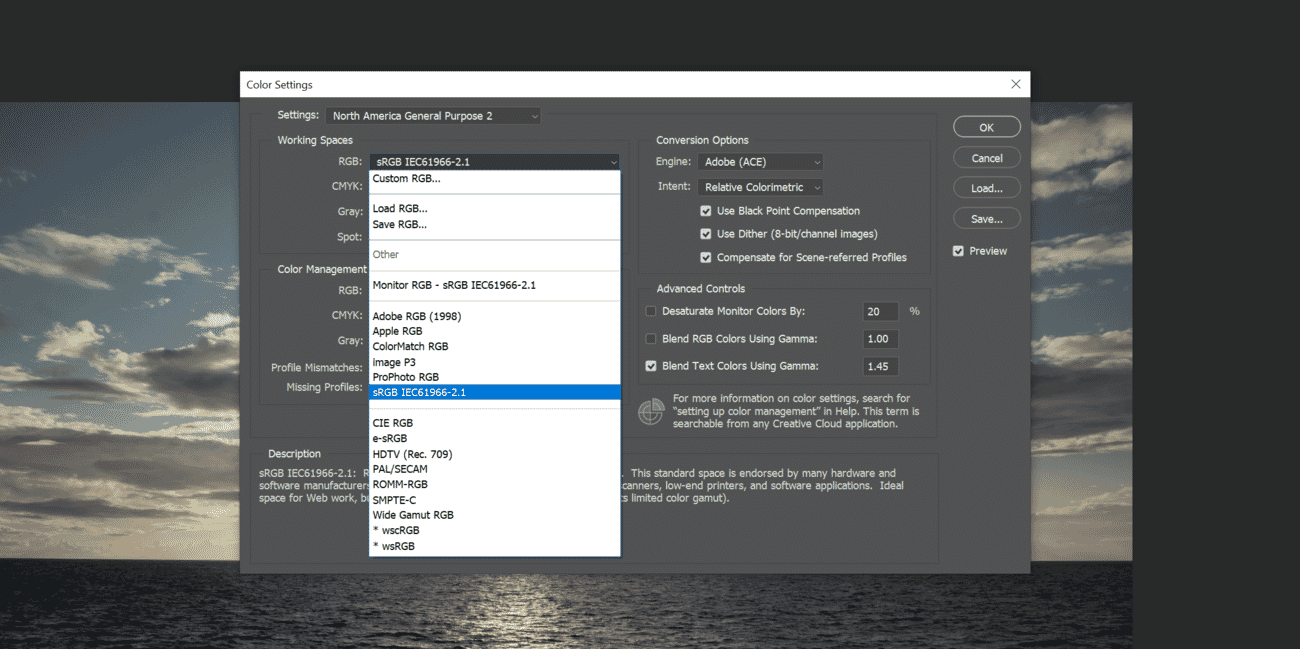
Updated Photoshop Color Settings
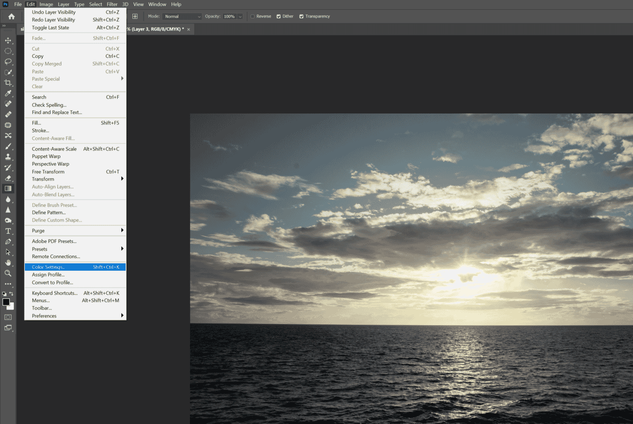
Photoshop offers granular control over color management through Edit → Color Settings (Ctrl+Shift+K / Cmd+Shift+K).
Recommended Settings for Photographers
- Settings preset: Start with “North America Prepress 2” (uses Adobe RGB as the RGB working space) or create a custom preset
- RGB Working Space: Adobe RGB (1998) for print-focused work, or ProPhoto RGB for maximum preservation
- CMYK Working Space: Leave as “U.S. Web Coated (SWOP) v2” unless working with a specific CMYK printer
- Color Management Policies: Set all three to “Preserve Embedded Profiles”
- Profile Mismatches: Check both “Ask When Opening” and “Ask When Pasting”
- Missing Profiles: Check “Ask When Opening”
Converting vs. Assigning Profiles
Two commands exist under Edit:
- Convert to Profile – Changes the underlying color data to match the target profile. Colors look the same on-screen but the numbers change. This is what most photographers need.
- Assign Profile – Re-interprets existing color data with a new profile without changing the numbers. Colors will shift visually. Use this only to correct a wrongly tagged file.
When preparing final files for the web, use Edit → Convert to Profile → sRGB before saving. For comprehensive editing workflows, the complete photo editing guide covers additional export scenarios.
Social Media Color Management: sRGB vs. Wide Gamut
Social media platforms present a unique color management challenge. Despite the rise of wide-gamut displays on phones and laptops, most social platforms handle color inconsistently—or not at all.
How Major Platforms Handle Color
- Instagram – Strips ICC profiles and re-encodes images. Uploading in Adobe RGB often results in desaturated-looking images. Always convert to sRGB before uploading.
- Facebook – Similar behavior to Instagram. sRGB is the only safe choice.
- X (Twitter) – Strips metadata and ICC profiles. Convert to sRGB.
- Flickr – One of the few platforms that preserves embedded ICC profiles, making it more color-accurate for wide-gamut uploads.
- 500px – Preserves ICC profiles in most cases.
- SmugMug / personal websites – Generally serve the file as-is, including embedded profiles. Modern browsers (Chrome, Safari, Firefox) are all ICC-aware and will render wide-gamut images correctly on supported displays.
Best Practices for Social Media Uploads
- Export in sRGB with the ICC profile embedded
- Use JPEG at quality 85–95% (platforms will re-compress regardless)
- Resize to the platform’s recommended dimensions to prevent aggressive resampling
- Add a slight bump in saturation and contrast to compensate for compression artifacts
- Avoid uploading ProPhoto RGB or Adobe RGB files—they will display incorrectly on platforms that strip profiles
For photographers maintaining a portfolio site, embedding the ICC profile in JPEG or PNG files and serving them on a color-managed website provides the most accurate viewing experience for visitors with wide-gamut displays.
HDR Color Workflows for Photographers
High Dynamic Range (HDR) imaging is evolving beyond exposure bracketing and tone mapping. Modern HDR workflows deal with HDR display output—images that take advantage of displays capable of showing brightness levels far beyond traditional SDR (Standard Dynamic Range).
HDR Display Standards
- HDR10 – Uses the PQ (Perceptual Quantizer) transfer function with a Rec. 2020 color space. Supports up to 10,000 nits peak brightness (though most displays top out at 1,000–1,600 nits).
- HLG (Hybrid Log-Gamma) – Backwards-compatible with SDR displays. Used primarily in broadcast but gaining traction for still images.
- Dolby Vision – A proprietary dynamic metadata HDR format. Primarily relevant for video.
HDR Photo Editing in Lightroom and Photoshop
Adobe introduced HDR output support in Lightroom and Adobe Camera Raw. Photographers can now:
- Edit images in an HDR-aware workspace that exceeds the traditional 0–100% brightness range
- Export HDR images as AVIF or JPEG XL with PQ transfer functions
- View HDR edits in real-time on compatible HDR displays connected to the editing workstation
To enable HDR editing in Lightroom Classic: Edit → Preferences → General → check “Use HDR output” (requires a compatible HDR display and GPU).
Practical HDR Considerations
- HDR is primarily a display technology—prints cannot reproduce HDR brightness ranges
- HDR images look stunning on supported screens but need an SDR fallback for traditional displays
- The ecosystem is still maturing; not all browsers or platforms support HDR images yet
- For maximum compatibility, maintain both an SDR (sRGB) version and an HDR version of key portfolio images
HDR color workflows represent the next frontier for digital photographers, but the fundamentals of calibration, profiling, and accurate color spaces remain just as critical.
What Color Space Should Photographers Use?
For the Web and Social Media
Use sRGB. It is the universal standard for web browsers and social platforms. Essentially every screen can display sRGB accurately, and uploading wider-gamut files to platforms that strip ICC profiles leads to unpredictable color shifts.
For Printing
Use Adobe RGB if the printer or print lab supports it—high-end inkjet printers from Epson, Canon, and HP can reproduce much of the Adobe RGB gamut. Otherwise, sRGB works well for consumer printing services.
For the best results when printing, also consider:
- Using the correct print resolution (typically 300 PPI)
- Requesting or downloading the lab’s ICC profile
- Soft proofing before submitting files
For Editing and Archiving
Work in ProPhoto RGB (16-bit) when editing in Photoshop, or let Lightroom handle it automatically in its native ProPhoto RGB workspace. This preserves the widest gamut throughout the editing process and only converts at the point of output.
For Camera Settings
Set the camera to sRGB (or leave it at default). This setting only affects JPEG output and the in-camera preview—RAW files bypass the color space setting entirely, capturing the full sensor data regardless.
Converting Between Color Spaces in Lightroom
Lightroom does not offer an in-app color space conversion tool. Instead, the conversion happens at the point of export or print.
During Export
Open the Export dialog (File → Export), then under File Settings, select the desired color space from the dropdown. Options include sRGB, Adobe RGB, ProPhoto RGB, and Display P3.
During Printing
In the Print module, scroll to the Color Management section and select the appropriate ICC profile. Choose between Perceptual (better for images with many out-of-gamut colors) or Relative Colorimetric (better for preserving in-gamut accuracy).
Converting Between Color Spaces in Photoshop
Photoshop provides direct conversion tools, giving photographers more control than Lightroom.
Setting Up the Working Space
Navigate to Edit → Color Settings and choose the desired RGB working space. This determines the default color space for new documents and is the profile Photoshop uses when no embedded profile is present.
Converting a File’s Profile
To change an open file’s color space: Edit → Convert to Profile. Select the target profile (e.g., sRGB IEC61966-2.1), choose a rendering intent, and click OK. This recalculates the color data to maintain visual consistency in the new space.
For photographers exploring advanced editing techniques, dedicated Photoshop courses cover color management workflows in detail.
Common Color Management Mistakes (and How to Avoid Them)
Even experienced photographers make color management errors. Here are the most frequent pitfalls:
- Editing on an uncalibrated monitor – The most common mistake. Without calibration, every edit is based on guesswork.
- Uploading Adobe RGB to the web – Results in desaturated images on platforms that strip ICC profiles. Always convert to sRGB first.
- Double profiling when printing – If Lightroom/Photoshop manages color AND the printer driver also applies a profile, colors will be wrong. Only one should manage color.
- Editing in 8-bit ProPhoto RGB – ProPhoto RGB’s wide gamut requires 16-bit depth. In 8-bit, posterization and banding occur in gradients.
- Ignoring ambient lighting – A warm desk lamp shifts the perception of monitor colors. Edit in consistent, neutral (5000K–6500K) ambient light.
- Never re-calibrating – Displays drift. A one-time calibration loses accuracy within weeks.
- Skipping soft proofing – Printing without previewing leads to wasted paper and ink.
Step-by-Step Color Management Workflow
Here is a complete, practical workflow that brings all the concepts together:
- Calibrate the monitor – Use a hardware colorimeter to profile the display. Set white point to D65, gamma to 2.2, and luminance to 80–120 cd/m².
- Shoot in RAW – RAW files preserve maximum color data from the sensor, bypassing any in-camera color space limitations.
- Import to Lightroom or Photoshop – Lightroom automatically works in ProPhoto RGB. In Photoshop, set the working space to Adobe RGB or ProPhoto RGB (16-bit).
- Edit with a calibrated display – Make tonal and color adjustments with confidence, knowing the monitor is showing accurate colors.
- Soft proof before printing – Load the printer/paper ICC profile and simulate the output. Adjust if needed.
- Export with the correct color space – sRGB for web/social, Adobe RGB for high-end printing, ProPhoto RGB for archival.
- Handle printing carefully – Let either the application or the printer driver manage color, never both. Select the correct ICC profile and rendering intent.
- Re-calibrate regularly – Repeat the calibration cycle every 2–4 weeks.
Following this workflow consistently eliminates the frustration of unpredictable colors and ensures that what appears on-screen is what arrives in the final output—whether that is a social media upload, a client gallery, or a fine-art print.
Color Management FAQs
What is color management in photography?
Color management is the system of processes that ensures colors remain consistent from capture through editing to final output. It relies on standardized color spaces, device-specific ICC profiles, and calibration hardware to translate color data accurately across cameras, monitors, and printers.
Do photographers need to calibrate their monitors?
Yes. Monitor calibration using a hardware colorimeter is the most impactful step in any color management workflow. Without it, edits are based on inaccurate color display, leading to prints and exports that look different from what appeared on screen.
What is the best color space for photography?
There is no single best color space—it depends on the output. Use sRGB for web and social media, Adobe RGB for high-end printing, and ProPhoto RGB (16-bit) for editing and archiving. RAW files bypass in-camera color space settings entirely.
Is color management important for printing?
Absolutely. Without proper color management—including the correct ICC profile for the specific printer, ink, and paper combination—prints will not match what appears on a calibrated monitor. Soft proofing before printing helps catch issues in advance.
What is the difference between a color space and a color profile?
A color space is a standardized, theoretical range of colors (e.g., sRGB, Adobe RGB). A color profile (ICC profile) describes the actual colors a specific device can reproduce and how it translates color data. Profiles map real-world device behavior onto color spaces.
Should photos be uploaded to social media in sRGB?
Yes. Most social media platforms strip ICC profiles during upload. Uploading files in Adobe RGB or ProPhoto RGB to platforms like Instagram or Facebook results in desaturated or color-shifted images. Always convert to sRGB before uploading.
What is soft proofing?
Soft proofing is a feature in Lightroom and Photoshop that simulates how an image will appear when printed on a specific paper with a specific printer. It uses the printer/paper ICC profile to show potential color shifts on-screen before printing.
Do OLED monitors need special calibration for photo editing?
Yes. OLED displays cover wider color gamuts (often 95-100% DCI-P3) and produce true blacks, which can make images appear more vibrant than they actually are. Use a colorimeter that supports OLED technology, and disable automatic brightness limiting (ABL) during calibration.