Editor’s Key Takeaways: Mastering Color Temperature for Perfect Photos

- What Is Color Temperature? — How the Kelvin scale measures light color, from warm amber to cool blue.
- The Kelvin Scale — A visual chart of common light sources and their color temperatures.
- Warm vs Cool Light — Understanding the visual and emotional differences between warm and cool lighting.
- Color Tint — The often-overlooked green-magenta axis and why it matters.
- Why It Matters — How color temperature affects the look and feel of every photograph.
- Mixed Lighting — Strategies for handling multiple light sources with different color temperatures.
- White Balance — Complete guide to auto, preset, custom, and post-processing white balance.
- Smartphone WB — Managing color temperature on phone cameras.
- AI Color Correction — How modern AI tools handle white balance automatically.
- Creative White Balance — Using color temperature as a deliberate artistic tool.
What Is Color Temperature?
Color temperature describes the color of light emitted by a source, measured in degrees Kelvin (K). It ranges from warm amber tones at lower values to cool blue tones at higher values — and it affects every single photograph, whether the photographer realizes it or not.
The concept originates from blackbody radiation in physics. When a theoretical “black body” object is heated, it first glows red, then orange, then white, and eventually blue as the temperature increases. Photographers don’t need to understand the physics deeply, but this explains why the scale works the way it does: lower Kelvin values produce warmer (more orange) light, while higher values produce cooler (more blue) light.
Human eyes are remarkably good at compensating for color casts. The brain automatically adjusts perception so that a white sheet of paper looks white under tungsten light, fluorescent light, or daylight. Cameras, however, don’t have this built-in adaptation — they record exactly what the sensor sees. That’s why understanding color temperature is essential for producing images with accurate, natural-looking colors.
One common point of confusion: the terms “warm” and “cool” in photography are opposite to what the Kelvin numbers suggest. A candle flame at 1800K is physically cooler than blue sky at 10000K, yet photographers call candlelight “warm” and blue sky light “cool.” This is based on the visual and emotional perception of the colors, not the physics. Lower Kelvin = warm orange tones. Higher Kelvin = cool blue tones.
The Kelvin Scale: Common Light Sources
Understanding where common light sources fall on the Kelvin scale is one of the most practical skills a photographer can develop. Here’s a reference chart:
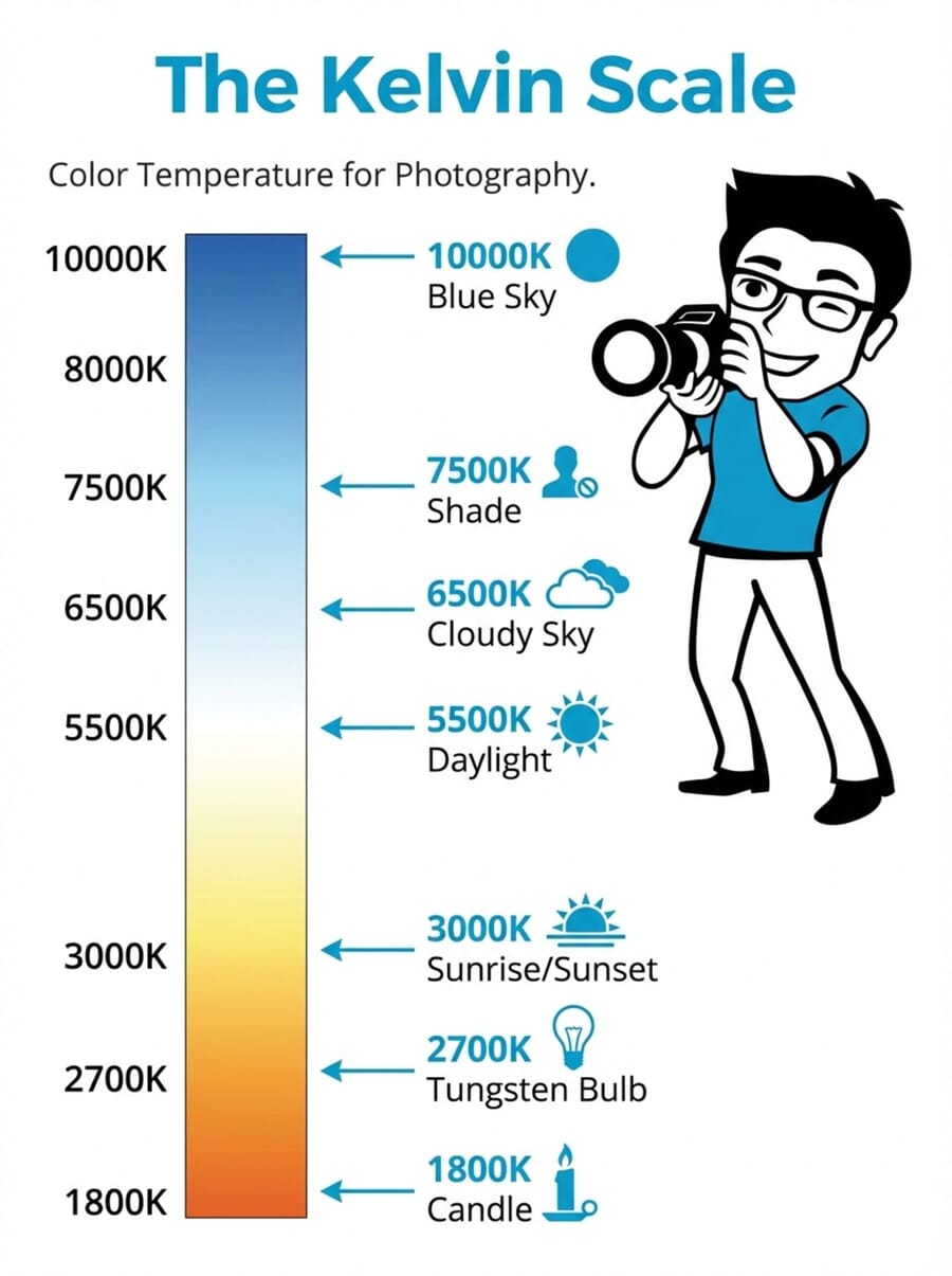
- ~1,800K — Candle light: Deep orange-amber glow. Creates intimate, moody atmospheres in portraits and still life photography.
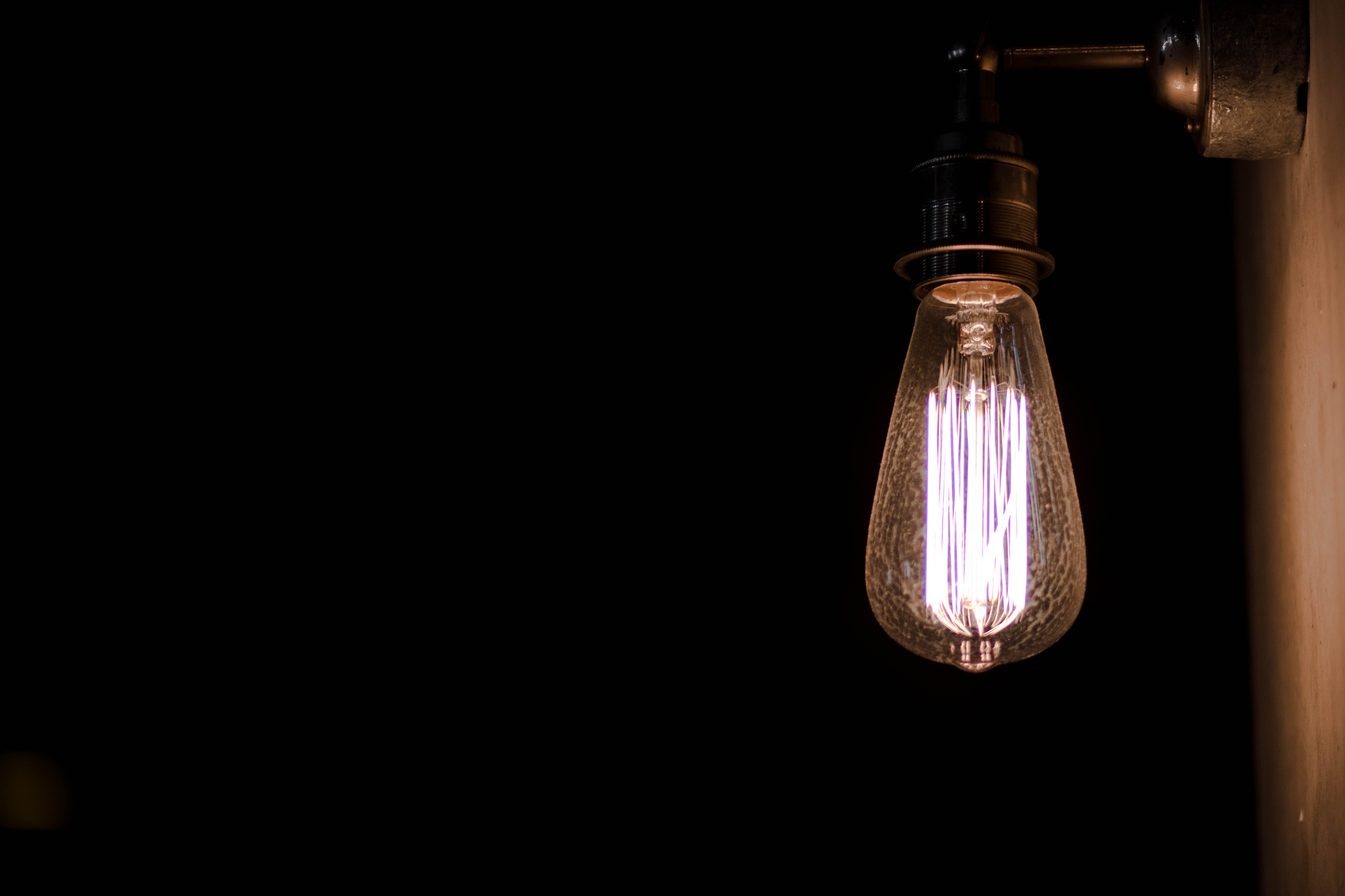
- ~2,700K — Tungsten/incandescent bulbs: Warm yellow-orange light. The classic “indoor lighting” look that gives photos a cozy, golden feel.
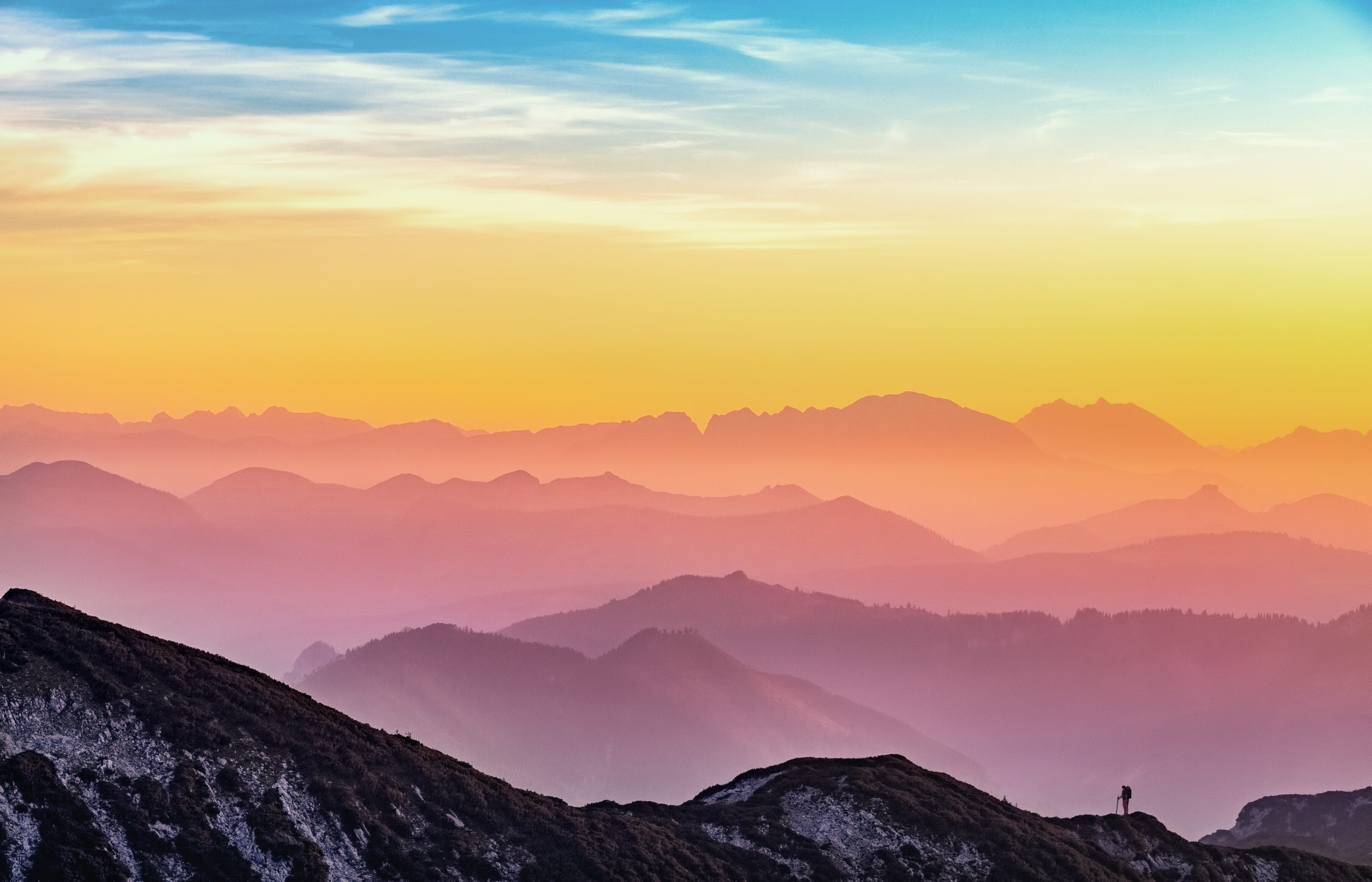
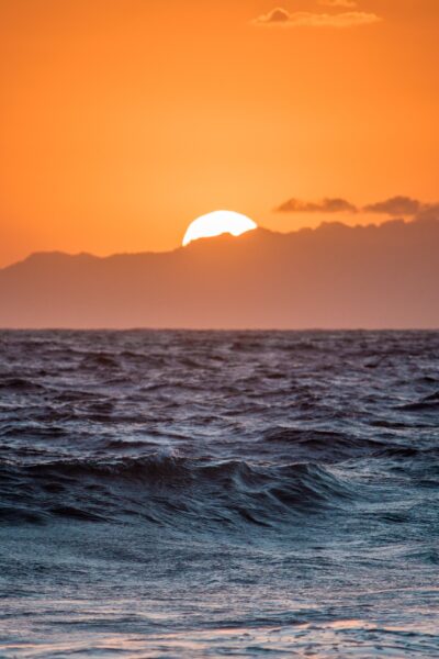
- ~3,000–3,500K — Sunrise and sunset: The warm golden-hour light that landscape and portrait photographers prize for its flattering quality.
- ~4,000K — Fluorescent light: Varies widely depending on the bulb type. Often carries a slight green tint alongside its temperature.
- ~5,500K — Midday daylight: Considered “neutral” white light. This is the standard reference point for most photography and the baseline for many camera flash units.
- ~6,500K — Overcast/cloudy sky: Slightly cool with a subtle blue cast. Provides soft, even lighting that’s excellent for portraits.
- ~7,500K — Open shade: Noticeably blue. Subjects in shade on a sunny day are illuminated primarily by blue sky light rather than direct sunlight.
- ~10,000K+ — Deep blue sky / heavy overcast: Very cool blue light. Rarely encountered as a primary light source, but it affects shadow areas significantly.
These values are approximate — actual color temperatures vary based on atmospheric conditions, altitude, time of year, and the specific light source. LED bulbs, for instance, can be manufactured at virtually any color temperature, which is why many modern LED panels for photography offer adjustable ranges from around 2700K to 6500K.
Related Posts
Warm vs Cool Light
Beyond the technical numbers, warm and cool light have fundamentally different visual and emotional impacts on photographs.
Warm light (lower Kelvin values) creates feelings of comfort, intimacy, and nostalgia. It’s flattering for skin tones, which is why portrait photographers often prefer golden-hour shooting or warm-toned studio lighting. Warm light emphasizes reds, oranges, and yellows while muting blues and greens.
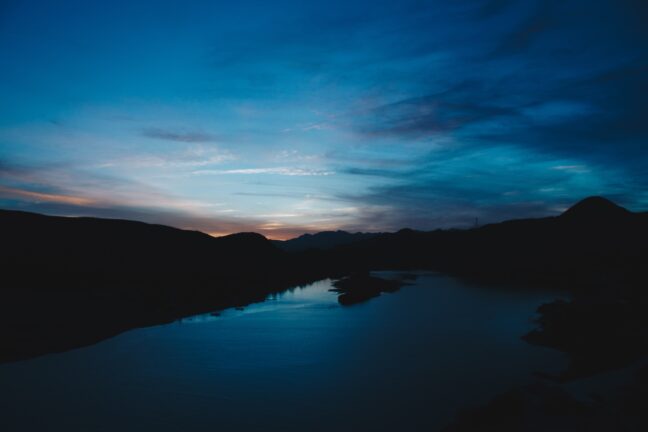
Cool light (higher Kelvin values) conveys calmness, distance, or even sadness. It enhances blues and greens while subduing warm tones. Cool light is common in shade, on overcast days, and during twilight — and it can create striking, atmospheric images when used intentionally.
Neither warm nor cool light is inherently “better.” The key is understanding what each does to an image and choosing the right approach for the intended mood. A sunset portrait benefits from warm tones, while a moody cityscape at dawn might call for cool blue hues.
Color Tint: The Green-Magenta Axis
Color temperature covers the warm-to-cool (orange-to-blue) spectrum, but there’s a second axis that photographers need to understand: color tint, which runs from green to magenta.
While most natural light sources stay relatively neutral on the tint axis, certain artificial lights — particularly older fluorescent tubes, some LED panels, and mercury vapor lamps — can produce a noticeable green or magenta cast. This is why many editing programs offer both a Temperature slider and a Tint slider: they address two independent color shifts.
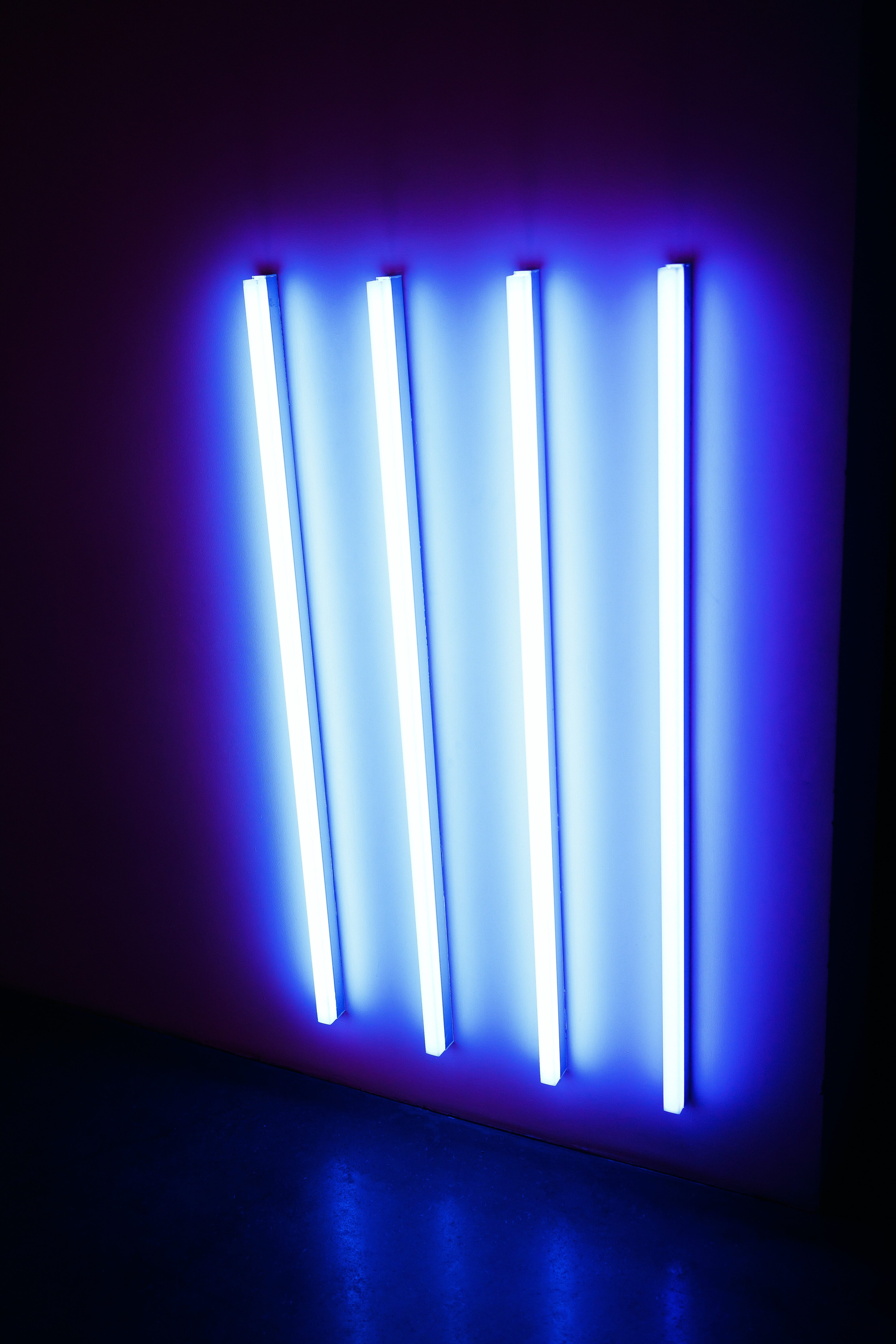
Fluorescent lights are the most common culprit for green tint issues. Even “daylight-balanced” fluorescent bulbs often have a subtle green spike in their spectrum that cameras pick up readily. The camera’s Fluorescent white balance preset attempts to correct this by adding magenta, but the results vary depending on the specific bulb.
When correcting tint in post-processing, look at skin tones and neutral gray areas. If skin looks sickly green, shift the tint toward magenta. If it looks unnaturally pink, shift toward green. Small tint adjustments — even just 3–5 points — can make a significant difference in how natural an image appears.
Why Color Temperature Matters in Photography
Color temperature affects photographs in ways that go far beyond simple “correctness.” Here’s why every photographer should understand it:
Accurate color reproduction. Product photographers, food photographers, and anyone shooting for commercial purposes needs colors to appear true to life. A white dress that looks yellow or a blue car that looks gray won’t satisfy clients. Proper color temperature management ensures that whites look white and colors are faithful.
Skin tone accuracy. Portraits live and die by skin tones. Too warm and the subject looks jaundiced; too cool and they look ill. Getting color temperature right — or close enough to correct easily in post — is critical for portrait work.
Mood and atmosphere. Color temperature is one of the most powerful tools for establishing mood. A warm-toned image feels inviting and cheerful. A cool-toned image feels somber or serene. Photographers who understand this can make deliberate creative choices rather than leaving color to chance.
Consistency across a series. Wedding photographers, event shooters, and anyone delivering a set of images needs consistent color throughout. Moving between indoor and outdoor locations, or between different rooms with different lighting, creates color temperature shifts that must be managed for a cohesive final product.
Mixed Lighting: The Biggest Challenge
One of the trickiest situations photographers face is mixed lighting — when a scene contains two or more light sources with different color temperatures. A common example: a room lit by tungsten table lamps (2700K) with daylight streaming through windows (5500K). No single white balance setting can correct both simultaneously.
Here are practical strategies for handling mixed lighting:
Gel your lights. Color correction gels (CTO for warming, CTB for cooling) can be placed over flash units or LED panels to match the ambient light. For example, placing a CTO gel over a flash makes its output match tungsten lighting, allowing a single white balance setting to work for the entire scene.
Use bi-color LED panels. Modern LED panels with adjustable color temperature (typically 2700K–6500K) make it easy to dial in a temperature that matches the ambient light. This is one of the biggest advantages of LED lighting for photography and videography in 2026.
Overpower the ambient light. In some situations, the simplest solution is to use flash or studio strobes powerful enough to become the dominant light source, effectively eliminating the mixed-lighting problem.
Embrace the mix. Sometimes mixed lighting creates interesting color contrasts — cool window light on one side of a subject and warm lamp light on the other. If it serves the image, there’s no rule that says all light must match.
Fix it in post. Local adjustments in Lightroom or Capture One allow photographers to apply different white balance corrections to different parts of an image using brushes, gradients, or masks. This is a powerful option when the mixed lighting wasn’t avoidable during the shoot.
White Balance Explained
White balance is the camera’s mechanism for compensating for color casts. It works by adding the opposite color on the spectrum: if the light is warm (orange), the camera adds blue to neutralize it; if the light is cool (blue), it adds warmth. The goal is to make neutral tones — whites and grays — appear truly neutral in the final image.
Every camera offers multiple approaches to setting white balance, from fully automatic to fully manual. Understanding each option helps photographers choose the right tool for the situation.
Auto White Balance: When It Works (and When It Doesn’t)
Auto White Balance (AWB) is the default setting on virtually every camera, and for good reason — it works well in a surprising number of situations. Modern AWB algorithms analyze the scene, identify neutral tones, and apply corrections automatically.
AWB works well when:
- Shooting in daylight or overcast conditions
- The scene contains clearly white or gray elements the camera can reference
- The lighting is relatively uniform (single source)
- Speed matters more than precision (street photography, photojournalism)
AWB struggles when:
- The scene is dominated by a single color (a field of green grass, a red wall)
- Shooting under very warm light — AWB often overcorrects, stripping away the golden warmth of sunset or candlelight
- Mixed lighting with multiple color temperatures
- Consistency is needed across a series of shots (AWB may shift between frames)
For casual shooting and when working in RAW format, AWB combined with post-processing corrections is an excellent workflow. The RAW file preserves all the color data, so white balance can be adjusted freely after the fact with no quality loss.
White Balance Presets
Most cameras include preset white balance options designed for common lighting scenarios:
- Daylight (~5200K): For direct sunlight around midday
- Cloudy (~6000K): Adds slight warmth to compensate for the blue cast of overcast skies
- Shade (~7000K): Adds more warmth for the strong blue cast found in open shade
- Tungsten (~3200K): Adds blue to counteract the warm orange of incandescent bulbs
- Fluorescent (~4000K): Adjusts for the green tint common in fluorescent lighting
- Flash (~5500K): Calibrated for the slightly cool output of most camera flashes
Presets are a good middle ground between AWB and full manual control. They provide consistency (every shot in the same lighting uses the same correction) and are easy to change as conditions shift. The main limitation is that they offer fixed values that may not precisely match the actual light in a scene.
Custom/Manual White Balance
For maximum accuracy, photographers can set a custom white balance by giving the camera a reference point. There are two common methods:
Gray card method: Place an 18% gray card in the scene under the same lighting as the subject. Take a photo of it, then use the camera’s custom white balance function to set that image as the reference. The camera calculates the exact correction needed. This is the gold standard for product and commercial photography.
ExpoDisc method: An ExpoDisc is a white balance filter that fits over the lens. Point the camera toward the light source with the ExpoDisc attached, take a reference shot, and set it as the custom white balance. This is faster than a gray card and works well for event and portrait photographers who need to adjust quickly between locations.
Manual Kelvin dial: Some cameras allow direct input of a Kelvin value. This gives full control but requires the photographer to know (or estimate) the color temperature of the ambient light. A color meter provides precise readings, though many experienced photographers develop a good intuition for estimating Kelvin values over time.
White Balance in Post-Processing
Post-processing is where most photographers fine-tune their white balance, and shooting in RAW format makes this process lossless and fully reversible.
Adobe Lightroom offers a Temperature slider (blue to yellow) and a Tint slider (green to magenta), plus an eyedropper tool for one-click correction. Click the eyedropper on any area that should be neutral gray, and Lightroom adjusts both temperature and tint automatically. Lightroom also allows copying white balance settings across multiple images — essential for maintaining consistency in a series.
Capture One provides similar controls with arguably finer precision and additional tools like separate adjustments for skin tones. Many commercial and fashion photographers prefer it for this reason.
Free alternatives like darktable and RawTherapee also offer full white balance control with temperature and tint sliders. These open-source tools are capable of professional-quality corrections at no cost.
Important: For post-processing white balance to work effectively, photographs must be shot in RAW format. JPEG and HEIF files bake in the white balance at the time of capture, leaving very limited room for adjustment. RAW files preserve the full sensor data, making white balance corrections non-destructive and virtually unlimited.

Smartphone White Balance
Smartphone cameras have come a long way in handling color temperature, but they still present unique challenges compared to dedicated cameras.
By default, smartphone cameras use Auto White Balance exclusively, and the algorithms are generally quite good — especially on flagship devices from Apple, Samsung, and Google. The computational photography pipelines in modern phones often analyze the scene using AI to determine not just the overall color temperature but also identify and correct for mixed lighting automatically.
However, smartphone AWB shares the same weaknesses as camera AWB: it can overcorrect warm light (ruining the mood of golden-hour photos) and struggle with monochromatic scenes.
For more control, several options exist:
- Built-in Pro/Manual mode: Many Android phones (Samsung, Google Pixel, OnePlus) include a manual mode that exposes white balance controls. iPhones don’t offer this natively but allow WB lock by tapping and holding the screen.
- Third-party camera apps: Apps like Halide (iOS) and Open Camera (Android) provide full manual white balance control, including Kelvin value input.
- Shoot in RAW (DNG): Many smartphones can capture RAW files, which allows full white balance adjustment in post-processing — just like with a dedicated camera.
For serious mobile photography, shooting in RAW and adjusting white balance in Lightroom Mobile or Snapseed provides the best results and most flexibility.
AI-Powered Color Correction
Artificial intelligence is transforming how photographers handle color temperature and white balance. In 2026, AI-powered tools are faster and more accurate than ever:
Adobe Lightroom’s AI features can automatically detect and correct white balance across batches of images, identify mixed lighting scenarios, and even suggest corrections based on the content of the scene. The “Auto” button in Lightroom’s Basic panel uses machine learning to analyze the image and apply temperature, tint, and other adjustments simultaneously.
Smartphone computational photography is perhaps the most visible application of AI color correction. When a phone camera takes a photo, it typically captures multiple frames at different exposures and combines them — and part of that processing pipeline includes intelligent white balance that can handle mixed lighting by applying different corrections to different areas of the image in real time.
Dedicated AI tools like Luminar Neo and ON1 Photo RAW offer one-click color correction that analyzes the image content — identifying sky, skin, foliage, and other elements — and applies targeted corrections to each. These tools can save significant time during culling and editing large shoots.
While AI color correction is impressive, it’s not infallible. Creative intent can be lost when algorithms “correct” a deliberate color cast. Photographers should use AI tools as a starting point and retain final creative control over their white balance decisions.
Creative White Balance: Using Color Temperature as a Tool
While much of this guide focuses on achieving accurate, neutral color, there’s an equally important side to color temperature: using it deliberately as a creative tool.
Color casts aren’t always problems to solve. Different temperatures evoke different emotions, and intentionally warming or cooling an image can transform its impact:
- Warming a portrait creates a sense of comfort, health, and approachability. Many portrait photographers deliberately set their white balance a few hundred Kelvin warmer than “accurate” to flatter skin tones.
- Cooling a landscape at blue hour enhances the serene, ethereal quality of twilight scenes. Landscapes shot in shade can be left cool for a moody, atmospheric effect.
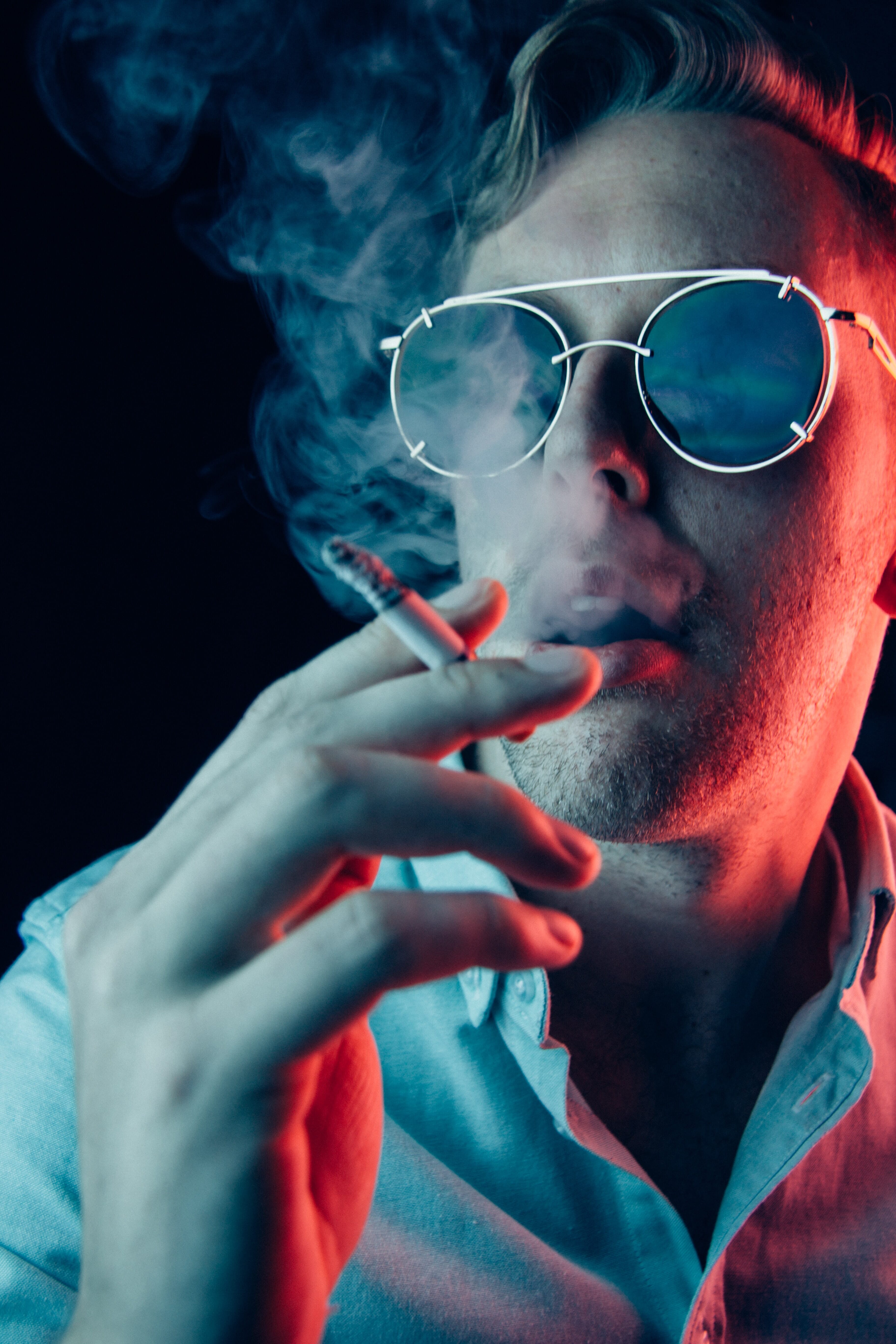
- Mixing warm and cool in a single image creates visual tension and draws the eye. A subject lit by warm light against a cool-toned background immediately stands out.
- Extreme color casts can be used for artistic effect — deep orange for a nostalgic film look, heavy blue for a cinematic noir feel, or even green-tinted for an unsettling, otherworldly mood.
The key to creative white balance is intentionality. Rather than accepting whatever the camera produces or blindly correcting to neutral, consider what the color temperature adds to (or takes away from) the image. Some of the most striking photographs in history use color temperature as a primary compositional element.
To experiment, try shooting the same scene with different white balance settings — Tungsten, Daylight, and Shade — and compare the results. The differences can be dramatic and will quickly build an intuitive understanding of how color temperature shapes the viewer’s experience.
Related Posts
Color Temperature FAQ
What is the best white balance setting for indoor photography?
For most indoor situations, the Tungsten preset (around 3200K) works well under incandescent lighting. Under fluorescent lights, use the Fluorescent preset. For mixed indoor lighting, Auto White Balance combined with RAW shooting provides the most flexibility, as the white balance can be fine-tuned in post-processing.
Does color temperature affect exposure?
No. Color temperature and exposure are independent settings. Changing the white balance does not affect the brightness, shutter speed, aperture, or ISO of an image. However, perceived brightness can shift slightly when white balance changes, because the human eye responds differently to warm and cool tones.
Can white balance be fixed after the photo is taken?
Yes — but only effectively if the photo was shot in RAW format. RAW files preserve all color data from the sensor, allowing complete white balance adjustment in post-processing with no quality loss. JPEG files bake in the white balance at capture, making significant corrections difficult and often introducing artifacts or banding.
What Kelvin value should flash be set to?
Most camera flashes and studio strobes output light at approximately 5500K, which is close to midday daylight. When mixing flash with ambient light, match the flash to the ambient color temperature using gels: a CTO (Color Temperature Orange) gel warms the flash to match tungsten, while a CTB (Color Temperature Blue) gel cools it for shade or overcast conditions.