- Two paths exist: scan flat, untextured originals (under A3) for fastest workflow; photograph anything textured, glossy, or larger than A3.
- A 24MP+ mirrorless body with a 50mm prime is still the top tier — but in 2026 a Pixel 9 Pro, iPhone 17 Pro Max, or Galaxy S26 Ultra can match an entry DSLR for flat artwork under 24×36 inches.
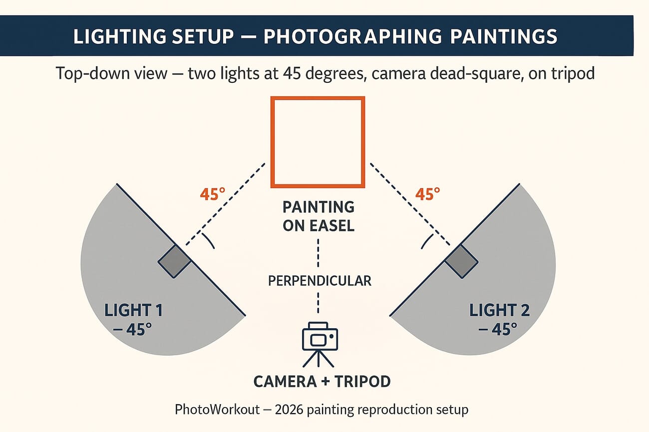
- Light at 45 degrees from both sides, never centered. Use diffused continuous lights or strobes; avoid natural light unless overcast.
- Camera dead-square parallel to the painting on a tripod, with a circular polariser to kill reflections on glossy paint.
- Shoot RAW, ISO 100, f/8–f/11, neutral grey card in the first frame for white balance.
- Export TIFF (or PNG) for archival, JPEG only for client preview. 300 DPI minimum for print, 360 DPI for high-end labs.
- Adobe RGB for the master file (wider gamut for print); convert to sRGB only for web preview. Calibrate the monitor or all the colour work is wasted.
Introduction
There is one original painting and 30 people who want it on their walls. Reproductions make that math work — but the digitisation step has to be near-perfect, because any flaw in the master file scales straight into the prints. This 2026-refreshed guide walks through the full workflow: when scanning beats photography, when photography beats scanning, the camera and lighting setup that gets a textured canvas right on the first frame, and the file-format and colour-profile choices that determine whether the print looks like the original or a slightly off cousin of it.
If the goal is print-on-demand income from a portfolio of original paintings, this is the stack to learn once and run on every new piece.
.jpg?w=1300)
Scan or Photograph? A Decision Tree
Both UK printer theprintspace and New York’s Tribeca Printworks lead their 2026 artist guides with the same framework, and it deserves to be the first decision before any other step. The medium and size of the work determine which tool is correct — the wrong tool wastes hours and degrades the master.
Scan when…
- The artwork is on flat paper (watercolour, ink, pencil, gouache, photographs).
- The piece is smaller than A3 (roughly 11.7 × 16.5 inches) and fits a consumer or pro flatbed scanner.
- There is no perceptible texture — no impasto, no thick acrylic, no canvas weave that catches the light.
- The artwork has no glass or glossy varnish over it.
For these cases a 1,200 DPI flatbed scanner produces a faster, sharper, more colour-faithful master than any camera setup short of a copy-stand rig with full studio lighting. The Epson Perfection V600 ($300) and the Epson Expression 12000XL ($3,500) bracket the consumer and pro tiers respectively.
Photograph when…
- The artwork has any visible texture: oil impasto, thick acrylic, mixed media, collage, embedded objects, canvas weave.
- The piece is larger than A3 — anything bigger forces awkward stitch-and-merge from multiple scans, with seam errors.
- The medium is glossy, varnished, or under glass — scanners produce hard reflection bands on these surfaces.
- The original is on a stretched canvas that won’t lie flat on a scanner bed.
- The piece has 3D elements — relief, sculpted gesso, glued objects, frames the artist wants captured.
Photography preserves texture, handles any size, controls reflection through lighting geometry, and produces a single-frame capture without stitching. The catch: it requires careful setup. The rest of this guide walks through that setup.
Three Reasons Scanning Falls Short for Most Paintings
The decision-tree framing above answers the question for most cases. For the borderline ones — a flat acrylic that’s right at the A3 size limit, or a watercolour that’s slightly textured — these three failure modes are why photography still wins.
1. Scanners flatten texture
The scanning head presses against the artwork (or a glass plate over it). On any textured medium — globs of paint, stretched canvas, layered acrylic — the result is a digital file that reads the texture as noise rather than dimension. Photography preserves the play of light across the surface, which is half of what gives an oil painting its physical presence.
.jpg?w=1300)
2. Consumer scanners lose fine detail
A 600 DPI flatbed picks up flat detail well, but the dynamic range is narrower than a modern mirrorless sensor. Subtle gradations — the soft shadow of a brushstroke, the interplay of close colours in a sky — get crushed into uniform blocks. A 24MP mirrorless body with a properly profiled sensor outresolves a $200 scanner on every dimension that matters for print.
.jpg?w=1300)
3. Many paintings simply don’t fit
Consumer scanners cap at A4 (8.5 × 11 inches). Pro flatbeds reach A3 (11.7 × 16.5). Larger artwork forces a stitch workflow: scan the painting in overlapping sections, then stitch them in Photoshop. Lighting variation between scans, geometric distortion at the edges, and stitch seams all leak into the final master. A single photograph from a tripod-mounted 24MP camera at the right distance avoids the entire stitching problem.
.jpg?w=1300)
The Camera Setup
Tools matter. For digitising paintings, three specifications carry the work: resolution (megapixels for capturing detail), lens distortion (low to zero, so straight lines stay straight), and colour depth (a 14-bit raw file vs an 8-bit JPEG decides how much room there is in post for white-balance correction).
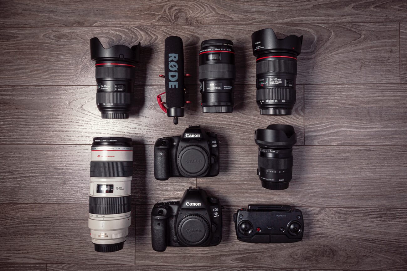
DSLR / mirrorless: the gold standard
Any 24MP-or-better mirrorless body or DSLR with interchangeable lenses is more than enough. Mid-tier picks that cover the genre well: a Sony A7 IV (33MP), a Nikon Z6 III (24.5MP), or a Canon EOS R6 Mark II (24MP). For the resolution-obsessed, the Sony A7R V (61MP) is the upper end and lets a single frame become a museum-grade scan. The roundup in our guide to the best cameras for beginners covers the entry-level mirrorless lineup if a body purchase is on the table.
Smartphones in 2026 — viable for smaller, flat work
The 2026 generation of flagship smartphones changes the calculus for artists who don’t want to commit to a $1,500 camera body. The iPhone 17 Pro Max, Pixel 9 Pro, and Samsung Galaxy S26 Ultra each ship a 48MP-or-higher main sensor with 14-bit ProRAW (or its Android equivalent), pixel-binned to clean 12MP files with dynamic range that genuinely rivals an entry DSLR for flat artwork under 24 × 36 inches.
- Use ProRAW (iPhone) or Expert Raw (Samsung / Pixel) — the standard JPEG pipeline crushes shadow detail and bakes in computational colour shifts that wreck print fidelity.
- Mount the phone on a tripod with a rigid clamp. Even tiny movement at slow shutter speeds blurs the file beyond recovery.
- Lock white balance manually off a grey card (the iPhone 17 Pro Max has a Pro Camera mode that exposes this).
- Use the main 24mm equivalent lens, never the ultra-wide. The ultra-wide warps edges; the main camera is the one with the cleanest geometry and best lens.
What smartphones still don’t do well: oversized canvases (the lens distortion shows on anything over 36 inches), heavily textured oils (the smaller sensor’s dynamic range compresses subtle highlight gradations), and museum-grade reproduction work (where 61MP and a profiled lens still win). For everything else — a watercolour, a small acrylic, an ink illustration, a flat collage — a 2026 flagship smartphone delivers a print-ready master if the rest of the workflow is correct. That’s the angle Art Storefronts has been pushing in their educational content, and it holds up in practice.
The lens
On a DSLR or mirrorless body, lenses in the 35mm to 70mm range match the human eye’s field of view and minimise distortion. A 50mm prime is the workhorse — sharp, near-zero distortion, fast enough for the studio. Larger paintings benefit from a 35mm to keep the working distance reasonable. Avoid wide-angle (under 28mm) — barrel distortion warps the edges and no amount of lens correction in Lightroom fully unwinds it on a busy composition.
Camera settings
- Aperture: f/8 to f/11 for full sharpness corner-to-corner. f/9 is the sweet spot on most lenses.
- ISO: 100. Maybe 200 if the available light forces it. Higher introduces noise that reads as fake texture.
- Shutter speed: Whatever the meter calls for at f/9 + ISO 100. With studio lights and a tripod, anything from 1/60s to several seconds is fine.
- Focus mode: Single-shot AF (AF-S / One Shot). Focus once on the surface texture, lock, fire.
- File format: RAW. Always. JPEG bakes in irreversible decisions about colour and sharpening that the print process will then re-bake.
- Colour space (in-camera): Adobe RGB. The wider gamut survives the export-to-print conversion better than sRGB. More on this in the Colour Profiles section below.
Lighting: The Single Most Important Variable
Even, neutral, diffuse lighting from both sides at 45 degrees — that’s the entire lighting recipe. Get it right and the rest of the workflow becomes mechanical; get it wrong and no amount of post-processing unwinds it.
The most common beginner mistake is one centred light pointed straight at the painting. It produces a hot spot in the middle and falls off toward the edges, and on textured paint it creates a directional shadow on every brushstroke that points away from the centre. The correct setup uses two equal lights, one on each side, angled in at 45 degrees so their pools meet across the surface.
Continuous LEDs vs strobes
Either works. Continuous LEDs let the photographer see the lighting before the shutter fires, which is forgiving for the genre — there are no humans to coach, no decisive moment to wait for. Strobes deliver more power per dollar and freeze any subtle vibration in the room. The roundup in our continuous lighting guide and our strobe lights guide covers the buy-once options.
.jpg?w=1300)
Use diffusion. Always.
Bare bulbs are too directional and produce hot reflections on glossy or varnished surfaces. Mount each light in a softbox, an umbrella, or a diffusion frame at minimum 60 × 80 cm. The larger the modifier, the softer the light spread. Equal-sized modifiers on both sides keep the lighting symmetric.
Avoid natural light
.jpg?w=1300)
It’s tempting. It’s also the wrong call. Natural light shifts colour temperature minute to minute, varies in intensity through the day, and angles in different ways depending on where the studio is. Reproduction work needs repeatable, calibrated light — and studio lights are the only way to get it.
Heavy overcast at noon comes closest to ideal natural light, but it’s not worth waiting for the right weather every time a painting needs digitising. A two-light kit pays for itself across roughly 20 paintings vs. the income lost to weather delays.
Position the Artwork and the Camera Correctly
.jpg?w=1300)
Three rules cover positioning, and the third one is the one beginners get wrong:
- The artwork is vertical. Mount it on a wall or an easel. Never lay it on the floor — top-down photography forces awkward lighting and the photographer leaning over the camera, which inevitably tilts the lens.
- The camera is on a tripod. Hand-held shots at f/9 and ISO 100 will be sharp on a moment-to-moment basis but introduce micro-variations that ruin a series of files.
- The lens is dead-square parallel to the painting and centred on it. A bubble level on the camera hot-shoe and a small spirit level on the easel verifies both axes. A lens that’s tilted even 2 degrees off perpendicular produces a trapezoid instead of a rectangle and makes geometry correction an extra step.
Mark the floor where the tripod legs sit and the wall position of the painting. That way the second piece in the series goes in the same place as the first, and the lighting stays consistent across an entire portfolio shoot.
Wonky perspective is one of the few errors that becomes harder, not easier, to fix in post-processing — perspective correction crops into the painting, costing pixels at the edges. Get it right at capture.
Kill Reflections With a Polarising Filter
Glossy oils, varnished acrylics, and any artwork under glass produce reflection bands that no amount of editing fully removes. The fix is a circular polarising filter on the lens, rotated until the reflection drops out of the viewfinder.
A circular polariser screws onto the front element of the lens and selectively cuts reflected light. For most painting work, a basic 67mm or 77mm CPL from B+W, Hoya, or K&F Concept does the job. For a curated lineup, see our guide to the best polarising filters.
Two practical notes:
- Polarisers cost light. Expect a 1.5 to 2 stop reduction. Compensate with a slower shutter (the camera is on a tripod, so this is free).
- Polarising the lights as well as the lens (cross-polarisation) is the museum-grade approach. Tape a sheet of linear polarising film over each studio light, then rotate the lens-mounted CPL until reflections vanish completely. It’s a $40 upgrade that produces results normally associated with $5,000 reproduction setups.
Capture Colour Correctly: Grey Card + Calibrated Monitor
.jpg?w=1300)
Colour fidelity is half of why a painting reproduction looks like the painting. Two tools handle most of it: a neutral grey card on the capture side, a calibrated monitor on the review side.
Grey card workflow
An 18% neutral grey card placed in the first frame of the session — held by an assistant or propped beside the painting — gives Lightroom or Capture One a white balance reference point. One click of the eyedropper on the grey card neutralises any colour cast from the lights, the room, or the lens.
Sync the white balance setting from that reference frame to every other frame in the session. The entire batch is now colour-anchored.
Calibrate the monitor
A monitor that displays colours inaccurately makes every editing decision wrong. The fix is a hardware calibration tool — Calibrite Display Pro HL or Datacolor Spyder X2 Pro — run monthly against the monitor. The roundup in our monitor calibrators guide covers the buy-once options at every budget.
On the editing side, our color management complete guide covers the deeper theory. For artists pricing a workflow, just buy a calibrator and run it monthly — the rest is mechanical.
Post-Process for Faithful Reproduction
.jpg?w=1300)
The goal of post-processing is conservative: bring the digital file as close to the physical painting as possible. This is not the place to apply creative grading or stylise the image. The artist already made every artistic decision; the job here is to faithfully record those decisions.
Adobe Lightroom is the standard tool. Capture One is the alternative, with marginally better default colour science for some camera systems. Either works. The workflow:
- Set white balance off the grey card and sync to the rest of the session.
- Apply lens corrections (Profile correction, chromatic aberration removal). Lightroom auto-detects the lens; verify the box is ticked.
- Crop and straighten against the painting’s edges. Use the geometry tool if the camera was slightly off-perpendicular.
- Compare to the original under the same lighting. Place the laptop monitor next to the physical painting under daylight-balanced lights and adjust exposure, contrast, and individual colour channels until they match.
- Sharpen sparingly. Texture should already be there from the capture; over-sharpening produces a halo around brushwork that prints as artefact.
- Export at the right format and DPI — covered in the next two sections.
File Formats and DPI for Print
The file format and resolution determine whether the print sells at the size the artist wants, or whether it caps out at 18 × 24 inches before falling apart. Two decisions matter: format (lossless vs lossy) and DPI (resolution at the print size).
Master file: TIFF (or PNG)
The master archival file should be a 16-bit TIFF with no compression, exported from the RAW. PNG is the second-best choice — also lossless, but capped at 8 bits per channel in most pipelines. Both preserve every pixel from the capture; both are large (a 24MP 16-bit TIFF lands at roughly 140 MB) but storage is cheap and re-editing the master is the whole point of keeping it lossless.
Print files: TIFF for the lab, JPEG only for previews
Most print labs accept TIFF (preferred) or high-quality JPEG (acceptable). Send the master TIFF for the highest-quality prints — there’s no compression artefact on a TIFF. Save JPEG for client preview emails and web galleries, where a 90% quality JPEG is indistinguishable from the master at typical screen sizes.
DPI: 300 minimum, 360 for high-end labs
Print resolution is measured in dots per inch (DPI). The industry minimum for a professional print is 300 DPI at the final print size — below that, the print starts to look soft. High-end labs that work with art reproductions (Miller’s, Tribeca Printworks, Whitewall) often request 360 DPI for fine-art papers, which extracts a marginal but visible quality bump on textured stocks.
Maximum print size at 300 DPI is a simple division: capture resolution / 300. A 24MP image (roughly 6,000 × 4,000 pixels) prints up to 20 × 13.3 inches at 300 DPI. A 61MP Sony A7R V image (9,504 × 6,336 pixels) prints up to 31.7 × 21.1 inches. For larger prints, either a higher-resolution capture or AI upscaling (Topaz Gigapixel, Photoshop Super Resolution) gets the file there with minimal quality loss.
For the deeper printing workflow inside Lightroom, our guide on how to print in Lightroom covers the export panel options. For paper choice — which determines the right DPI target — see our roundup of the best fine art inkjet papers.
Colour Profiles: sRGB vs Adobe RGB vs ProPhoto RGB
Colour profiles are the second half of the colour-fidelity puzzle. The wrong profile decision crushes saturated reds and rich greens at the print stage — common, frustrating, and entirely avoidable.
What a colour profile actually is
A colour profile defines the gamut — the range of colours — a file can describe. sRGB is the smallest of the three common profiles. Adobe RGB is roughly 35% larger, with notably more saturated greens and cyans. ProPhoto RGB is larger still and exists for very high-end fine-art work.
The right profile for each stage
- In-camera capture: Adobe RGB. Most mirrorless and DSLR bodies let you set the colour space in the menu. Adobe RGB gives the file more colour to work with in post.
- Editing and master file: Adobe RGB or ProPhoto RGB. Lightroom internally uses ProPhoto RGB regardless of what’s selected, so the editing stage benefits from the wider gamut. Save the master as Adobe RGB unless the print lab specifically requests ProPhoto.
- Print export to a fine-art lab: Adobe RGB. Most professional labs work in Adobe RGB. ProPhoto is overkill for almost all painting reproduction.
- Web preview / client email: sRGB. Web browsers default to sRGB. Sending an Adobe RGB JPEG to a client produces colour shifts on phones and untagged monitors. Always export a separate sRGB JPEG for web/screen use.
The conversion that breaks files
Converting from a wider profile (Adobe RGB) to a narrower one (sRGB) using the Perceptual rendering intent compresses the entire colour range proportionally — saturated colours stay relatively saturated. Converting using Relative Colorimetric clips out-of-gamut colours abruptly, which is what produces the dead-flat reds and greens. In Lightroom and Photoshop, set rendering intent to Perceptual when exporting JPEGs for web.
For the deeper colour-management theory, our guide to colour in photography covers gamut, rendering intent, and the maths behind colour spaces.
The Bottom Line
Photographing paintings for prints is a stack of small, repeatable decisions: scan or shoot, gear, lighting, position, polariser, grey card, calibration, post-processing, format, DPI, colour profile. None of them is hard. Skipping any one of them is what separates a print that looks like the original from a print that almost looks like the original.
Build the workflow once on a single test painting. Mark the tripod position and light stands with floor tape. Save the Lightroom develop settings as a preset. From there, every new painting flows through the same pipe in 20 minutes from setup to exported TIFF — and the prints come back from the lab matching the artist’s intent rather than the camera’s interpretation of it.
Frequently Asked Questions
What’s the minimum camera resolution for digitising a painting for print?
24MP is the practical floor. It produces a 6,000 × 4,000 pixel file that prints up to 20 × 13.3 inches at 300 DPI — covering the most common print-on-demand sizes. Below 24MP, the maximum print size starts shrinking; above 24MP (33, 45, 61MP), prints scale up to wall-size without AI upscaling.
Can I really photograph paintings for print with my smartphone?
For flat artwork under 24 × 36 inches, yes — a 2026 flagship (iPhone 17 Pro Max, Pixel 9 Pro, Galaxy S26 Ultra) captures in ProRAW or Expert RAW, mounts on a tripod, and produces a 12 to 50MP file with dynamic range close to an entry DSLR. For textured oils, very large pieces, or museum-grade reproduction, a dedicated mirrorless body still wins. The gap has narrowed considerably in 2025–2026.
What’s the best resolution to send a print lab?
300 DPI is the professional minimum. High-end fine-art labs (Miller’s, Tribeca Printworks, Whitewall) often request 360 DPI on textured fine-art papers. Below 300 DPI the print softens visibly; above 360 DPI the gain is invisible on most papers.
TIFF or JPEG for the print file?
TIFF for the master and for the print file sent to the lab — it’s lossless and preserves every pixel. JPEG only for client preview emails and web galleries. Many labs accept both, but TIFF guarantees no compression artefacts in the final print.
Should I use sRGB or Adobe RGB?
Adobe RGB for the master file, the editing stage, and the print export. sRGB only for web preview JPEGs. Adobe RGB has roughly 35% more colour gamut than sRGB, particularly in the greens and cyans, and most professional print labs work in Adobe RGB end-to-end.
Where should I get the prints made?
For fine-art reproductions, professional labs are essential — consumer-market services (Walmart, CVS, Costco) use printers calibrated for snapshots, not art. Reliable picks: Miller’s Professional Imaging, Bay Photo, Whitewall, Mpix Pro, and Tribeca Printworks. Our guide to print services for artists covers the full lineup with strengths and weaknesses.
What paper should I print on?
Paper choice depends on the look the artist wants. Glossy is best for photographs and vibrant posters. Lustre is the all-rounder, fingerprint-resistant and reflection-low (see our lustre vs glossy comparison). Matte fine-art papers — Hahnemühle Photo Rag, Canson Infinity Rag — are the right match for painting reproductions that need to read as art rather than as a photograph of art.
Sources used for this 2026 update:
Industry & Workflow References
- theprintspace — Photographing artwork: a 2026 guide – Source for the scan-vs-photograph decision tree framing.
- Tribeca Printworks — Photographing artwork for fine art reproduction – Step-by-step workflow for artists selling print reproductions, used as reference for DPI and format recommendations.
- Art Storefronts — Smartphone photography for fine art reproduction – 2026 educational coverage on flagship smartphones as alternatives to DSLRs for artists.
Technical & Color References
- X-Rite — Color management fundamentals for photographers – Background reference for the colour profile section (sRGB / Adobe RGB / ProPhoto).
- International Color Consortium — ICC Profile specifications – Authoritative source for colour profile specifications cited in the export workflow.
Image Sources
- PhotoWorkout original photography – All inline photographs of paintings, easels, and lighting setups are PhotoWorkout editorial photography.
- PhotoWorkout — Lighting-setup diagram (editorial infographic) – 45-degree two-light diagram generated for this article. No external license.